WorkWell Unveils New Logo Design
WorkWell, an American company that aims to prevent and treat sprains, strains, and back pain in the workplace, has unveiled a refreshed logo, brand identity, and website.
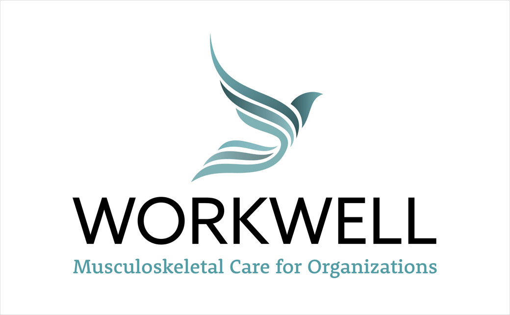
The logo has been completely redesigned, adopting a modernised look that company bosses say better reflects who WorkWell is today; it is further claimed to symbolise a “dynamic future”.
“The phoenix’s upward motion is a visual representation of the importance of treating employees throughout their entire employment journey – before, during, and post-employment as they transcend to future success,” says the company.
“As we redesigned the creative, we wanted to match our visual identity with our overarching mission to make people and organisations better tomorrow than they were today,” further comments Karil Reibold, acting chief executive officer at WorkWell. “The phoenix is a symbol of hope and safety.”
The fully-redesigned website, meanwhile, gets a more streamlined user interface as well as an easier-to-use navigation system than before; these changes are claimed to offer access to essential service and company information quicker and more efficiently than previously.
Founded in 1998, WorkWell is headquartered in Duluth, Minnesota and provides musculoskeletal wellness and soft tissue illness treatment and prevention solutions to employers throughout the United States.
Its prevention, treatment, and training programs are delivered by a network of 10,000 credentialed physical therapist and occupational therapist professionals.


Source: WorkWell


