Women in Tech World Series Gets New Logo and Branding by Form
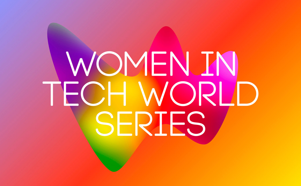
British design and branding agency Form has created an all-new look for Women in Tech World Series.
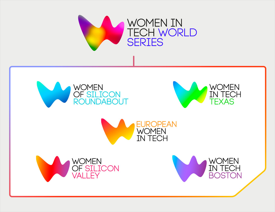
Described as “lyrical, colourful and non-techie”, it encompasses not only the Women in Tech World Series brand itself, but also its associated global events, namely, Women of Silicon Roundabout, Women of Silicon Valley, Women in Tech Texas, European Women in Tech and Women in Tech Boston – all of which form part of organiser Ascend Global Media’s portfolio.
The aesthetic for the refreshed identity was rooted in a concept dubbed “Tech-Organic” by the designers, where the aim was to create an identity that would be more “festival than work conference”.
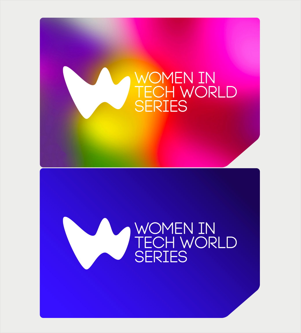
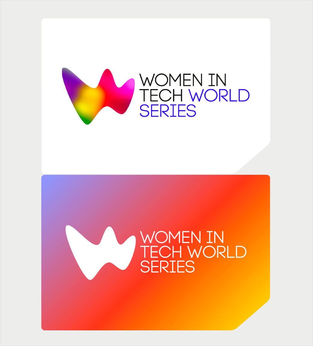
“The hero of the identity is the vibrant ‘W’ logo – shorthand for ‘Women in Tech’ – reflecting the concept that the tech industry is always evolving and innovating, while the lyrical, organic shape of the ‘W’ deliberately avoids the visual clichés so often associated with tech,” explains the design team.
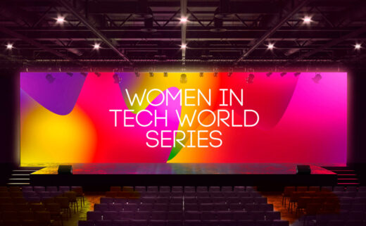
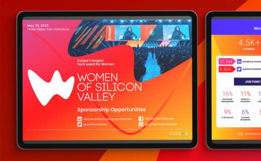
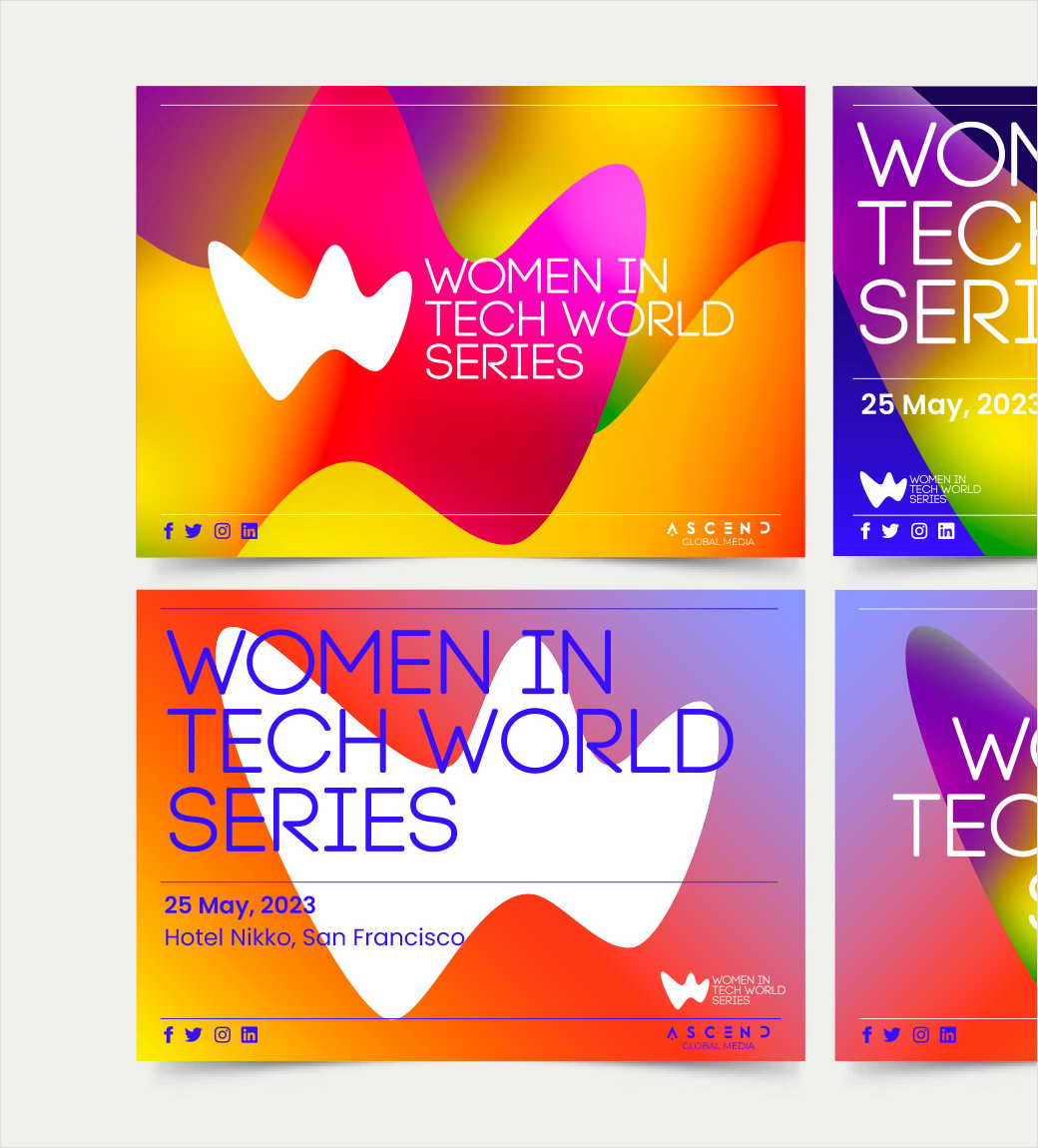
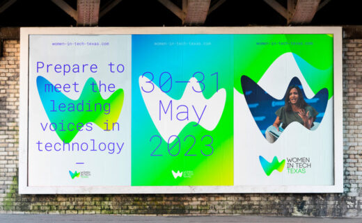
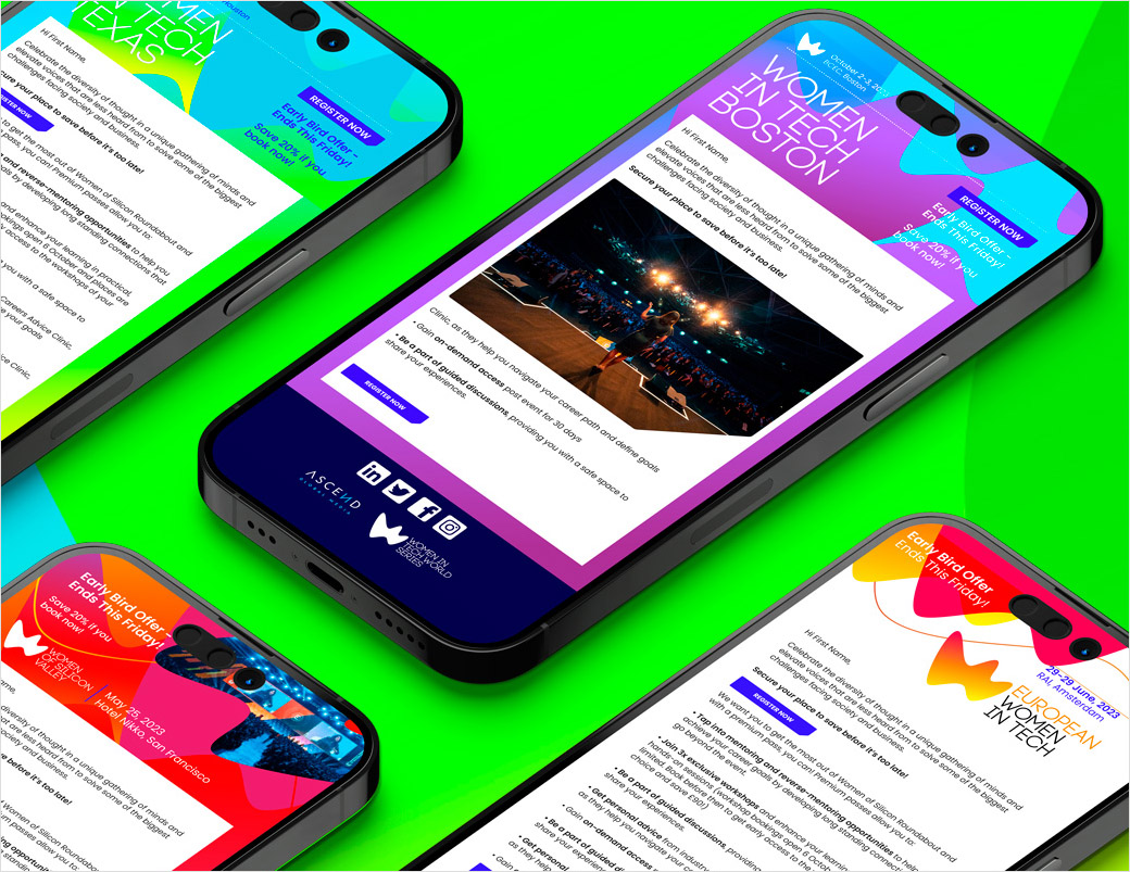
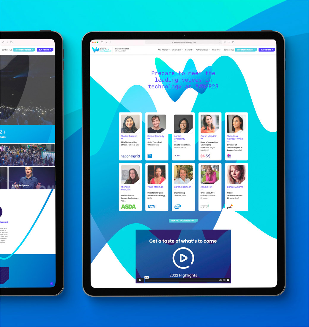
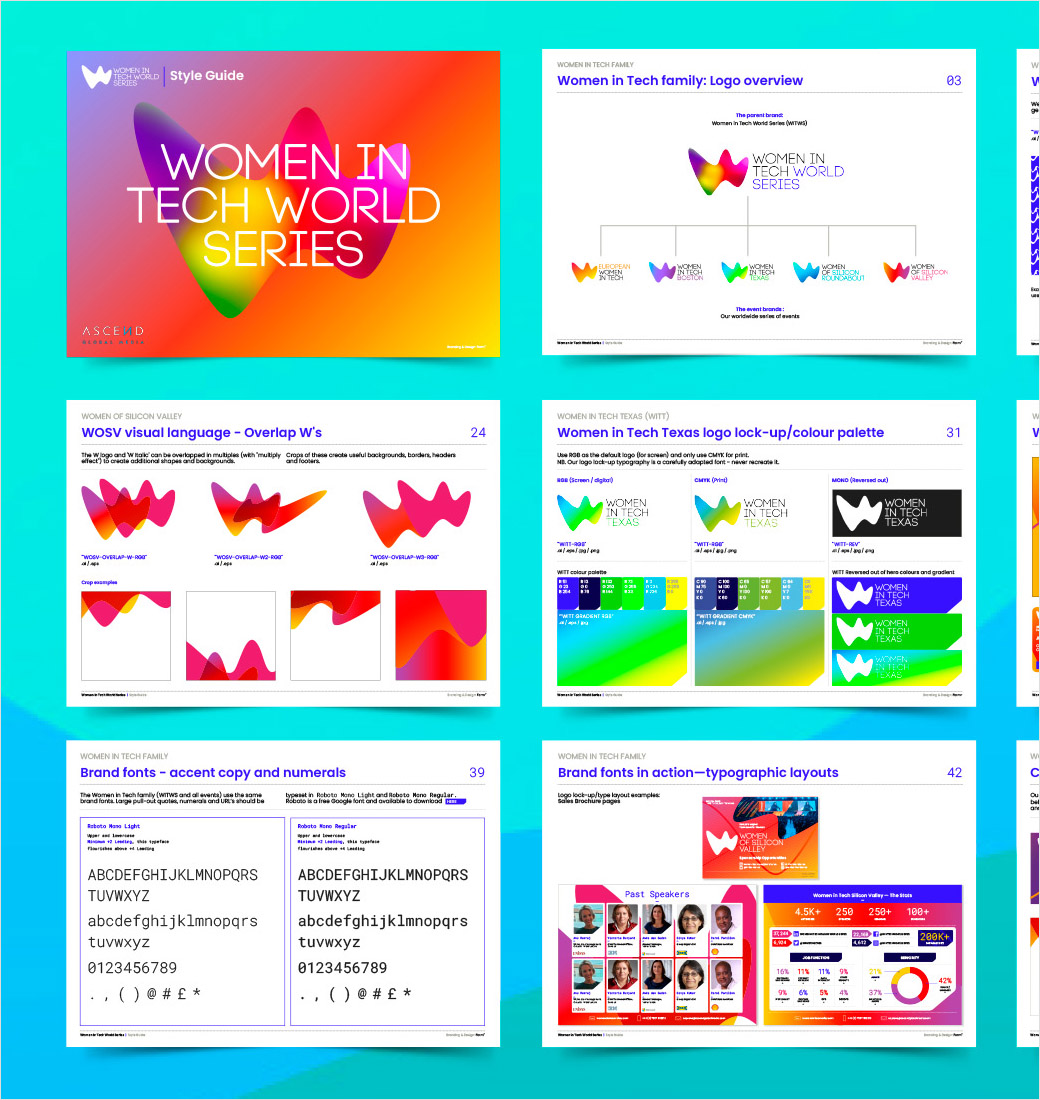
Form partners Paul West and Paula Benson devised the creative strategy along with all of the design work, which includes a new suite of logos as well as a comprehensive style guide, website homepage, and key touchpoints for both physical and digital usage.
Additional details include a series of repeat patterns based on the logo shape, while Poppins and Roboto Mono were selected as the two main fonts for the project.
“Poppins is a geometric sans serif and brings an international stance to a global identity. Roboto Mono beings a hint of tech to the table – both in its aesthetics and in its creation, originally developed by Google as the system font for its mobile operating system Android,” reckon the designers.

Form
www.form.uk.com


