Winkreative Brands ‘UP Express’ Rail Service
In the run-up to the July Pan Am and ParaPan Am Games, Toronto is launching a new infrastructure project by regional transportation authority Metrolinx.
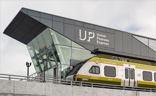
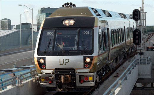
Winkreative, the international branding agency led by Tyler Brûlé, was retained to create the look for the Union Pearson (UP) Express, a dedicated rail service that links Canada’s two busiest transport hubs; Toronto Pearson International Airport and Union Station.
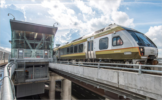
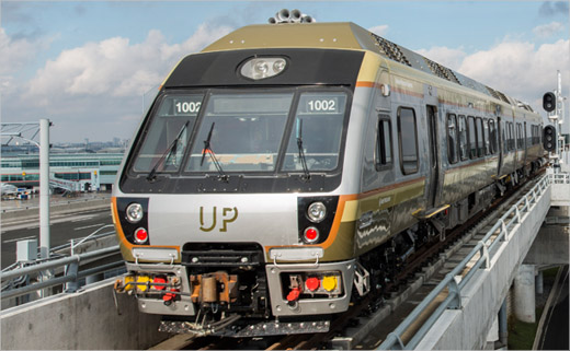
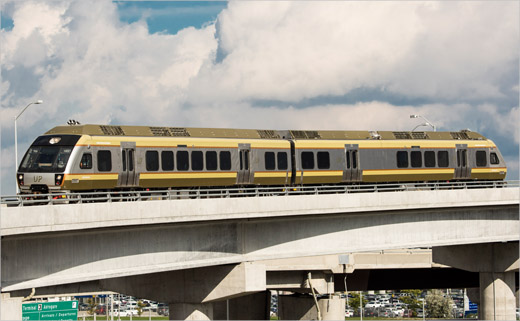
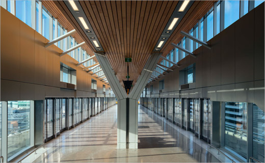
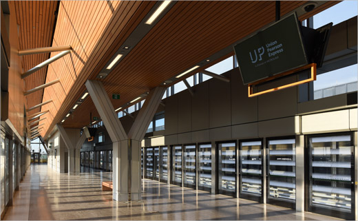
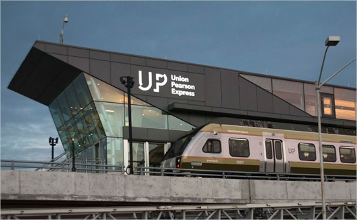
The agency was responsible for overseeing the entirety of the project’s identity design from train livery to uniforms to signage and station architecture.
“From the inception of UP Express, a considered approach to design has been at its core; through the materials, colour, texture and typography used throughout the trains and stations,” say the designers.
Green, orange and grey colours – said to have been inspired by the rolling Ontario landscape and Canadian Shield – have been applied graphically across the system, from the train’s headrests to station signage and ticket vending machines.
The lead typeface of the brand, Gibson, is a specially-commissioned, humanist sans serif by Canadian designer Rob McDonald. Winkreative says proceeds of the licensing of this font will go to the Graphic Designers of Canada.
A signage mapping study was also completed throughout the UP Express system in collaboration with signage and wayfinding consultancy, Entro Communications.
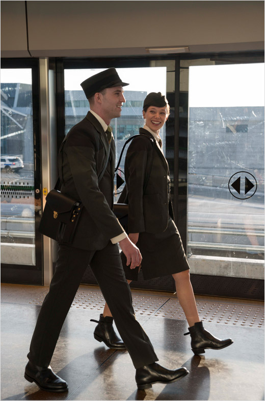
For the workers’ uniforms, Winkreative says it completed an audit of Canadian designers and selected Matt Robinson of the Toronto-based menswear brand Klaxon Howl.
“Robinson has remained true to the brand’s ambition to evoke the golden age of travel, and would frequently refer to pieces from his collection of early twentieth century rail uniforms in his designs for UP Express. Since each Canadian province has its own tartan, the Ontario Tartan was the inspiration to create the UP Express tartan in the brand colour palette, and is used in the ties. A scarf inspired by the old travel posters was developed for UP Express in the same colour palette as the tie and is an abstract, modern graphic representation of the train in motion. Robinson also designed a custom crest for the GSR’s uniforms and each panel has a specific story that ties back to the UP Express’ narrative; Ontario’s provincial flower, the iconic clock at Union Station, Ontario pine, the tracks at Union Station, and a key to represent the key to your destination,” explain the designers.
By 2031, Toronto Pearson International Airport and Union Station are expected to serve 190 million travellers a year, almost double the current volume of traffic.



Winkreative
www.winkreative.com


