WeTransfer Unveils New Logo and Branding
File sending website WeTransfer has rebranded, unveiling a new logo design and shortened name.
As well as ditching the word “Transfer” from its moniker, the facelift sees the “we” getting thicker to create a “friendlier effect”, according to WeTransfer creative boss Laszlito Kovacs.
The redesign has been carried out by the company’s in-house creative team, with further input coming from Paul van der Laan of Dutch type foundry Bold Monday.
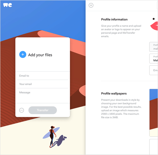
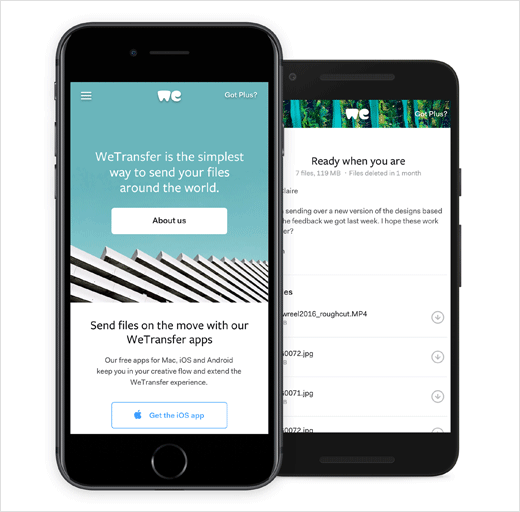
The new look also includes a refreshed website, which the company says offers a better overall user experience. Changes include a cleaner interface, with a navigation menu to access the help, information and account-related pages from a new sliding panel.
The new WeTransfer has been rolled out in 195 countries.


Source: WeTransfer


