Western United FC Reveal Logo and Kit
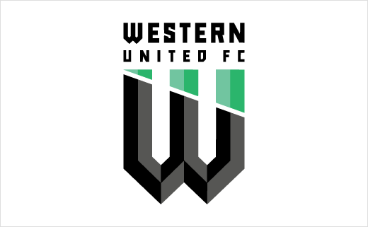
Western United FC have revealed their logo and kit design ahead of the club’s debut season in Australia’s premier football league, known as the Hyundai A-League.
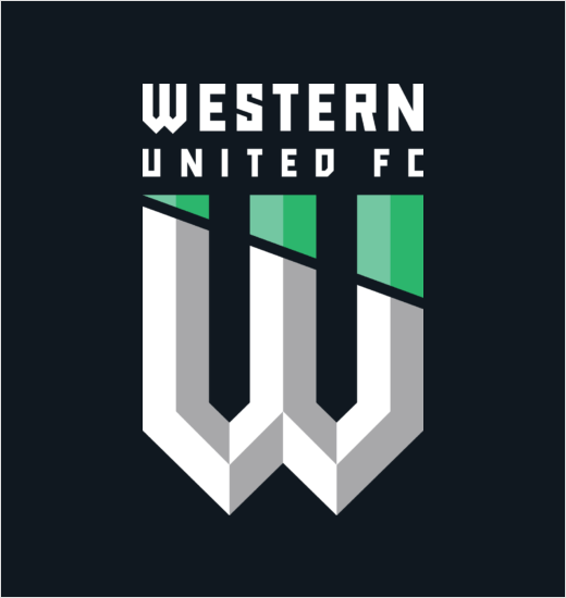
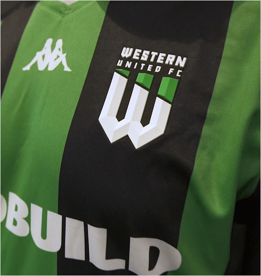
The club says it consulted with fans “for several months” before eventually selecting a design that adopts the letter ‘W’ as the central design element.
“We have listened to our fans and have created a brand identity which is contemporary and modern, and arguably non-traditional for a football club logo,” says club CEO, Maurice Bisetto.
The actual design of the logo is said to have been inspired by the rooftops of Victoria’s Western Corridor, as well as “borrowing architectural cues from the iconic West Gate Bridge”.
Its green colour is also described as symbolising “freshness and the evergreen community of cultures residing and growing in the West”.
“The result is a minimalist and refreshing design which reflects the club’s bold, innovative and aspirational ambitions, both on and off the field,” adds Bisetto.
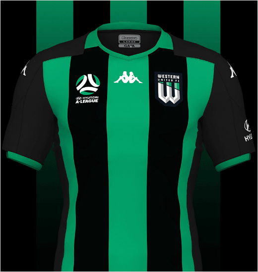
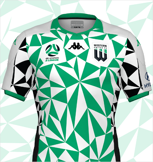
The club’s new kit, meanwhile, comprises a home strip with vertical green and black stripes, and an away strip with a predominantly geometric design inspired by on the one hand by the green wedge element from the club’s logo and on the other by the west pointer in a four-point compass rose to symbolise that “no matter where the team plays, they will always pay respect to the fans and the values of the west.”
The strips have been designed in collaboration with input from both fans and the team’s official apparel partner, namely, Kappa.
Source: Western United FC


