We Launch Rebrands Home Baking Kit Company – Baked In
London-based brand and digital agency We Launch has created the new logo and visual identity for subscription-based home baking kit company, Baked In.
Launched in 2013, and now sold both in shops and online retailers across the UK, Europe, and North America, Baked In wanted to expand its offering further and reach an even larger audience, with home baking becoming more popular than ever.
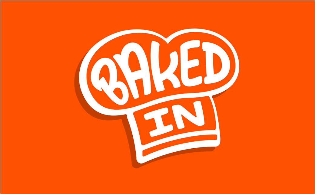
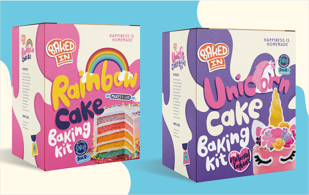
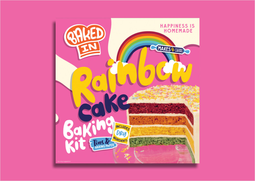
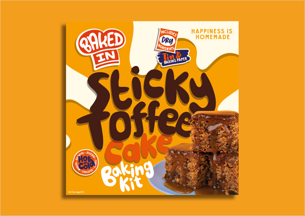
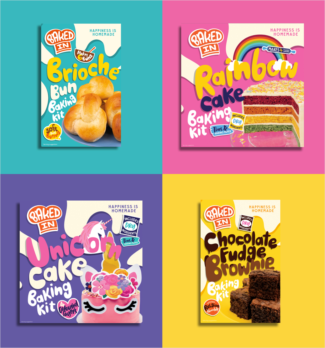
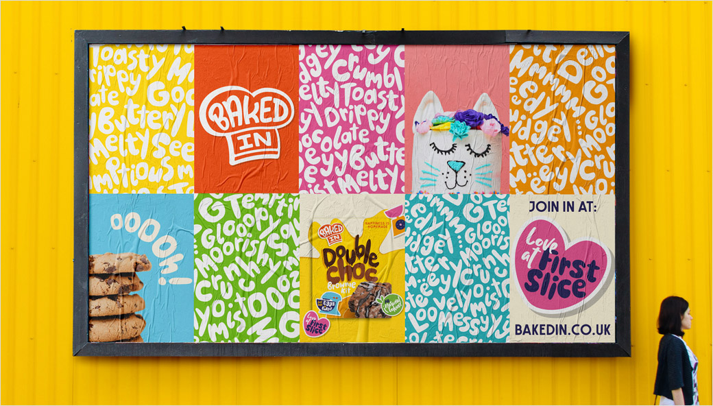
At the core of the new brand identity is a refreshed logo and hand-drawn typeface. An illustrated chef’s hat icon is accompanied by a bespoke typeface featuring soft, round letterforms that are claimed to recall “playfulness and warmth”.
“To further mirror the notion that every bake is unique, multiple characters were created for each letterform, allowing every new word, phrase or product developed to have a totally distinct look and feel,” explains the design team at We Launch.
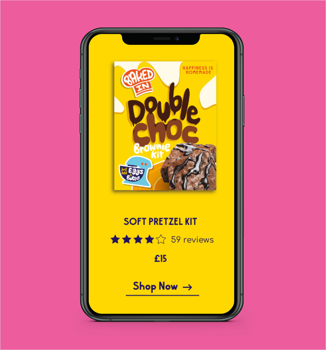
The agency also created a set of stickers featuring illustrations and more custom typography to further expand the ownable assets that Baked In could utilise across all its touchpoints.
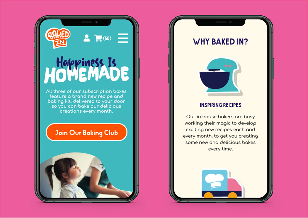
“These characterful stickers were created to make the brand as relevant as possible and, alongside the other assets, can be flexibly used across social, the updated website and within an easy-to-use instruction platform. The new brand identity hopes to appeal to bakers of all kinds, and pushes for as many as possible to get involved,” say the designers.
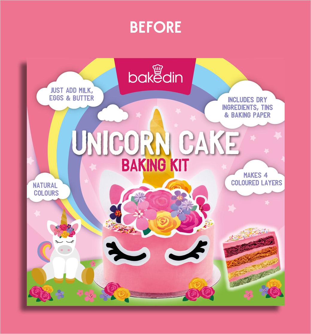
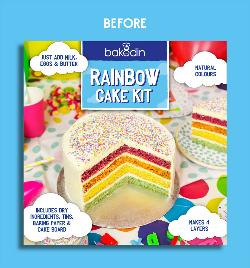
“We wanted to create something for Baked In that was more reflective of who the brand is and what it does. The products it sells create a sense of playfulness that really wasn’t brought through fully in the previous brand identity. By focusing on what makes home baking fun, and incorporating the handmade element into our work through illustration and a bespoke type, we sought to capture the essence of the Baked In brand experience across every channel,” adds Stuart Lang, founder and creative director of We Launch.

We Launch
www.welaunch.co.uk


