Warner Bros. Reveals New Logo Design by Pentagram
American film studio Warner Bros. has revealed a new logo with design by Pentagram.
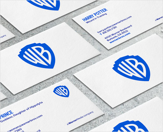
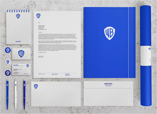
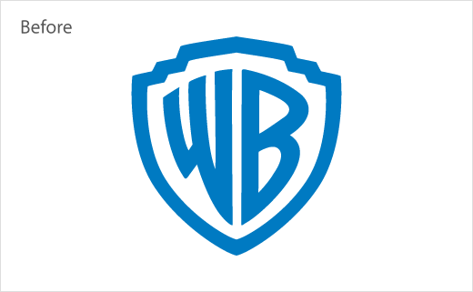
The redrawn logo is described as “a refinement and modernisation” of the famous “WB” shield that has been part of the company’s visual identity since its founding in 1923.
“As we approached our centennial, we thought it was the right time to take a good look at our brand, what it stands for and the values it represents,” says Warner Bros. chair and CEO, Ann Sarnoff.
“The Warner Bros. shield is one of the most iconic logos in the world, visual shorthand for entertainment recognised around the globe. The symbol has been used going back to the company’s roots and periodically updated over the decades,” add the designers. “The update streamlines the logo to its key elements, returning the shield and monogram to prominence and losing the sash. The redesign refines the shield with a form based on the classical proportions of the golden ratio.”
Although the logo retains the signature Warner Bros. blue, the colour has nevertheless been brightened, with the wordmark set off in a slightly darker shade to add contrast.
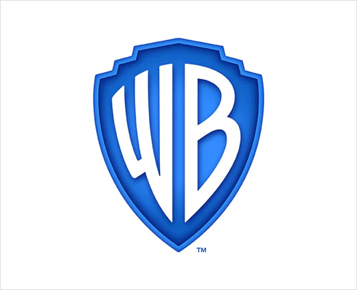
Pentagram’s design team has also created a semi-three-dimensional version of the logo, which will be used exclusively for on-screen content and “special cases”.
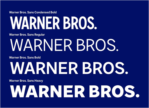
Additionally, the monogram has been expanded into a custom typeface, which has been designed by Pentagram in collaboration with Jeremy Mickel of Los Angeles-based type foundry, MCKL.
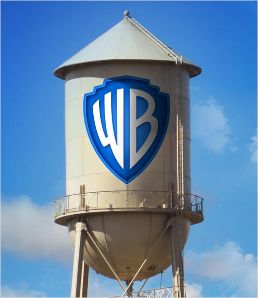
The new Warner Bros. logo is expected to begin appearing on screen in early 2020.
Pentagram
www.pentagram.com


