Vivo Reveals Updated Logo and Branding
Smartphone manufacturer Vivo has unveiled a new visual identity, which not only includes a new company logo but also a bespoke brand colour as well as custom Chinese Language and English Language fonts.
“Vivo has evolved from a follower to a leader in the tech and lifestyle industry,” claims Spark Ni, senior vice president of Vivo. “Through the new branding, we hope to redefine the brand’s positioning in technology and innovation and express our brand vision of ‘enjoying the extraordinary’ with young consumers around the world through Vivo’s unique visuals and creative spirit.”
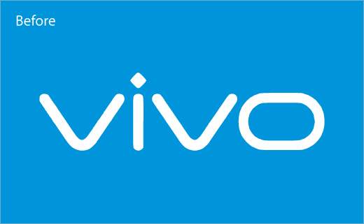
Vivo partnered with Danish design consultancy Kontrapunkt to develop the new logo, which features simplified lines and sharpened angles “to reflect the forward-looking spirit of Vivo”.
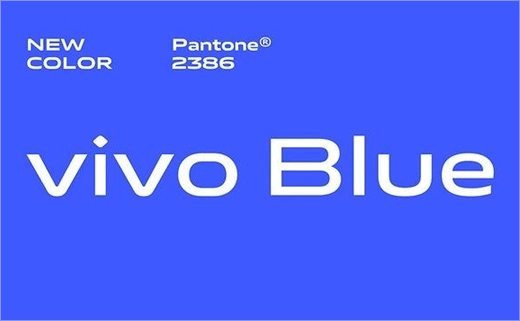
The company has also revamped its “Vivo Blue” colour by using a more saturated shade of blue, which is said to be the result of a study conducted by the Chinese brand to better understand consumer visual habits and their visual receptiveness to digital displays.
The new colour is deemed more soothing to the eye and is further described as “the ideal visual backdrop for the company’s creative and expressive character”.
Vivo has also revealed its English Language VivoType font, which comes in six weights and two widths, plus the Chinese Language VivoType font in two weights. While the former has been designed by Kontrapunkt, the latter is the work of Chinese calligrapher Qiu Yin.
“Vivo is not only an industry leader in the smartphone technology, but also a brand that is willing and genuine in its communications with consumers. Building on Vivo’s strong international visibility and influence, this new visual brand identity will better channel the brand’s character and attractiveness,” says Kontrapunkt’s co-founder and executive design director, Bo Linnemann.


Source: Vivo


