Virginia Tech Unveils New Logo Design
Virginia Polytechnic Institute and State University, popularly known as Virginia Tech, has revealed an all-new academic logo.
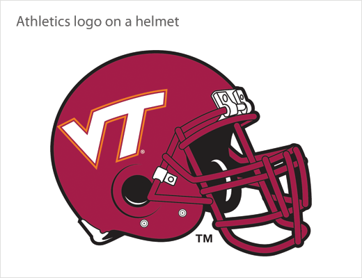
The new design adopts the familiar “flying VT” of the university’s athletic department logo, which remains unchanged.
“The lettering reflects the VT-shaped educational experience. The vertical bar of the T represents disciplinary depth, while the horizontal bar reflects the ability to work across disciplines. The arms of the V represent applying knowledge in real-world settings and the spirit of Ut Prosim [That I May Serve],” said a university spokesperson.
The institute’s old logo, which consisted of a maroon-coloured shield and the words “Virginia Tech”, will be retired, as will the tagline, “Invent the Future”. Depiction of the numerals “1872”, the founding year of the university, will also be discontinued.
Development of the new design cost about $25,000, according to a valuation from the university, which currently stands as the third-largest university in the U.S. state of Virginia.


Source: Virginia Tech


