VIDEO: Designing the New CUPRA Logo
A few weeks ago Spanish carmaker SEAT inaugurated its new CUPRA performance arm with the reveal of a specially created logo.
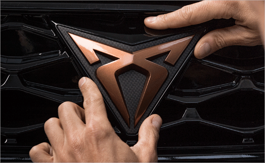
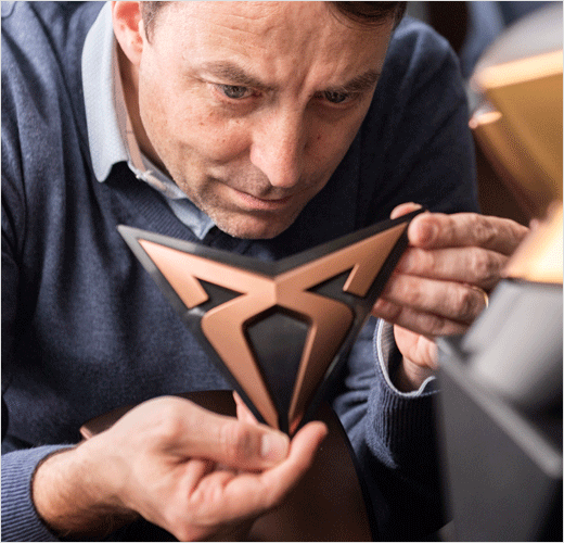
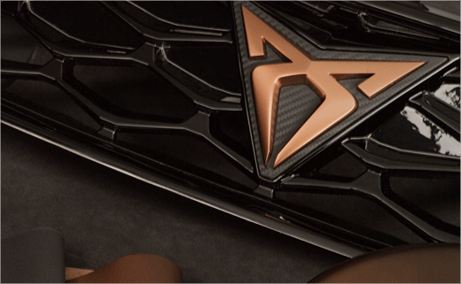
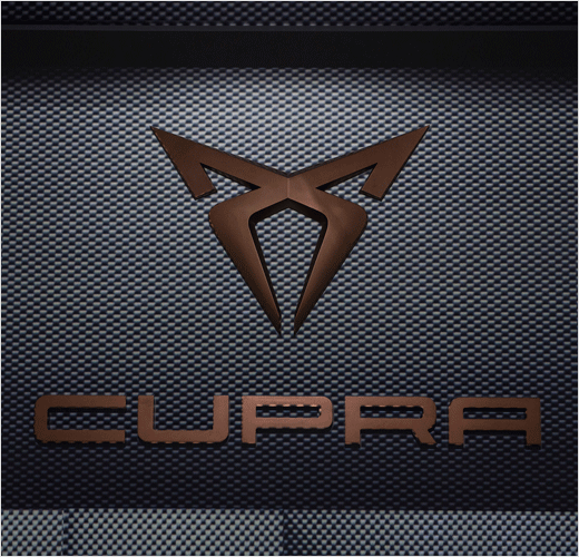
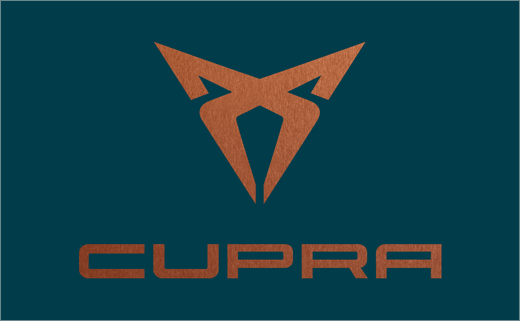
Replacing the regular SEAT ‘S’, the new symbol, which is made up of two overlapping, symmetrical ‘C’s, will henceforth be worn as a marque badge by all of the newly-launched sub-brand’s car models.
Designers at the company say the creation of a separate and “powerful” logo was critical in order to really help establish CUPRA as an independent brand of SEAT, which itself is currently owned by the Volkswagen Group.
“It goes far beyond a simple logo. It’s an emblem. It symbolises the sense of belonging to a clan, the CUPRA clan,” says Jordi Font, the head of Color & Trim at SEAT. “The design of the inverted triangle was modelled on the attitude of tribal civilisations, on their courage and daring,” he adds.
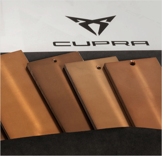
The logo’s “Cup Copper” colour is also said to have been developed following an in-depth study conducted by the SEAT design team. The other shade that defines the brand is “Petrol Blue”, a mixture of cyan and hints of black that Font says “emphasises its personality.”
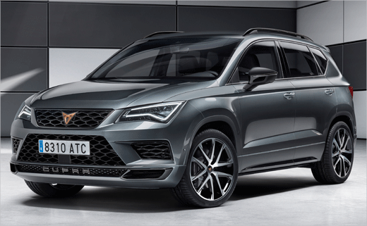
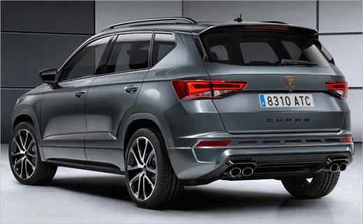
The first vehicle to officially wear the new mark will be the 296 bhp Ateca SUV (pictured below) that presents a “sporty, robust image,” according to Tony Gallardo, the head of design at SEAT.

Source: SEAT


