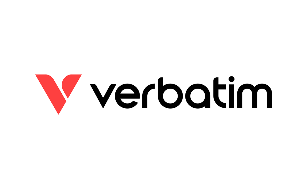
Verbatim Reveals New Logo Design at Computex 2024
Verbatim, a provider of storage and accessory products, has launched its new company logo.
The new design made its official public debut in Taipei last week at the annual Computex computer show.
Founded in 1969, Verbatim has gone from providing floppy discs during the PC revolution to becoming one of the world’s leading brand of blank optical media discs, CDs, DVDs, and Blu-rays.
It now manufactures a vast array of computer storage devices and accessories such as solid state drives (SSDs) and even 3D printing filaments.
As for the company’s refreshed logo, the design also incorporates a reinterpretation of the letter ‘V’, which is known as the brand’s ‘vision’ symbol.
“Inspired by the concept of ‘wings’, it combines sharp edges and soft curves to convey movement and energy,” says the Taiwanese firm.
The colour scheme, meanwhile, has shifted from the traditional red and blue of the previous logo to a more warmer ‘coral’ shade of red.
“Our objective in redesigning the logo was to modernise, simplify, and align with the digitally driven world,” states the firm’s global CEO, Clive Alberts.
Adding: “Through our new tagline ‘Anywhere. Everyday.’ we position Verbatim as an essential companion for everyday life, whether it’s for work or leisure, anywhere across the globe.”
The new logo will be rolled out across all of Verbatim’s platforms, including websites, packaging, and marketing collateral.


Source: Verbatim


