Webb deVlam Unveils New Look for VeeTee Rice Brand
Strategic brand design agency Webb deVlam has unveiled a fresh new brand identity for rice company VeeTee, to reposition the range, re-establish its relationship with its target audience of millennials and grow market share.
After ten years in the precooked sector and not to mention some 30 years as one of the UK’s leading independent rice brands, it was decided that VeeTee’s reheatable rice tray concept needed a makeover to make it stand out on shelf and establish itself as a “hero” product for millennial foodies.
Over a six-month period, Webb deVlam is said to have worked closely with VeeTee to help redefine and refresh the brand. At the early stages of the consultation, Webb deVlam also ran a so-called ‘co-creation workshop’ with both target consumers and the core VeeTee team.
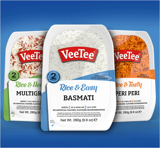
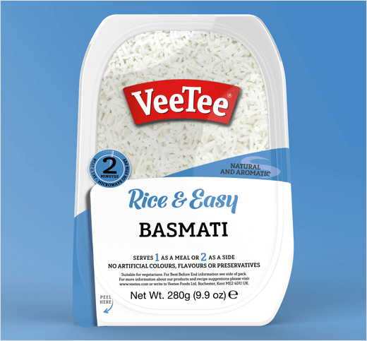
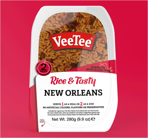
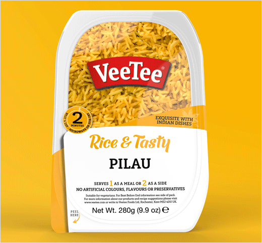
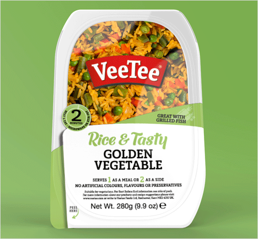
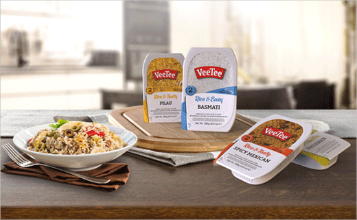
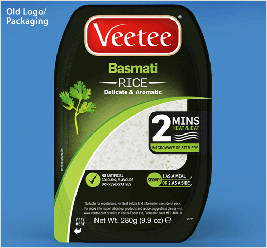
Based on its research findings, the agency has subsequently moved VeeTee away from the previous “recessive” black packaging, making it a stand-out white brand that displays its contents through an enlarged window. The use of white also ties in with the product’s natural white colour.
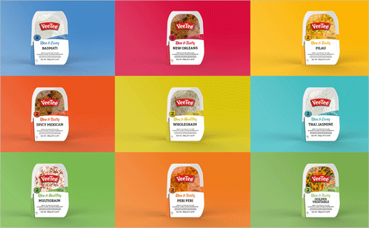
The designers further claim to have introduced a clearer message hierarchy, which they say enables consumers to read the pack and the product features “instantly”. A friendly tone of voice segments the range – Rice & Healthy, Rice & Tasty and Rice & Easy – and hits of colour add to the navigation cues.
The redrawn logo, meanwhile, incorporates new typography and is described as being both “strong” and “easy-to-read”.
“Using our proprietary ‘Moment of Sale’ methodology, we helped shine a light on the VeeTee brand, the competitive landscape and overall category to tease out key insights that formed the foundation towards defining the brand and overall refresh,” says JP Hunter, Webb deVlam’s head of design.
Webb deVlam
www.webbdevlam.com


