Vauxhall Unveils New Logo Design
British car brand Vauxhall has revealed an all-new logo design, presenting what it says is a “confidently British” reworking of its famous griffin emblem.
Specific changes to the logo include a move away from the 3D metallic texture that has been present since 2008, in favour of a flat minimalist design, optimised no doubt for the digital age.
It also features a streamlined new griffin that loses the mythical creature’s wing and the word ‘Vauxhall’ across the top while retaining the letter ‘V’. The logo also pairs the brand’s bright red colour with a deep blue, which aims to underline Vauxhall’s heritage as a British brand since 1903.
“The bold yet simple redesigns reinforce Vauxhall’s position as a confidently British brand. Constantly evolving and innovating, the brand continues to reinvent itself, with these most recent updates a reflection of Vauxhall’s commitment to ingenious design and modernisation,” says Vauxhall’s managing director, Stephen Norman. “While retaining its most iconic elements, the contemporary, minimal aesthetic had been created to seamlessly match our forthcoming models.”
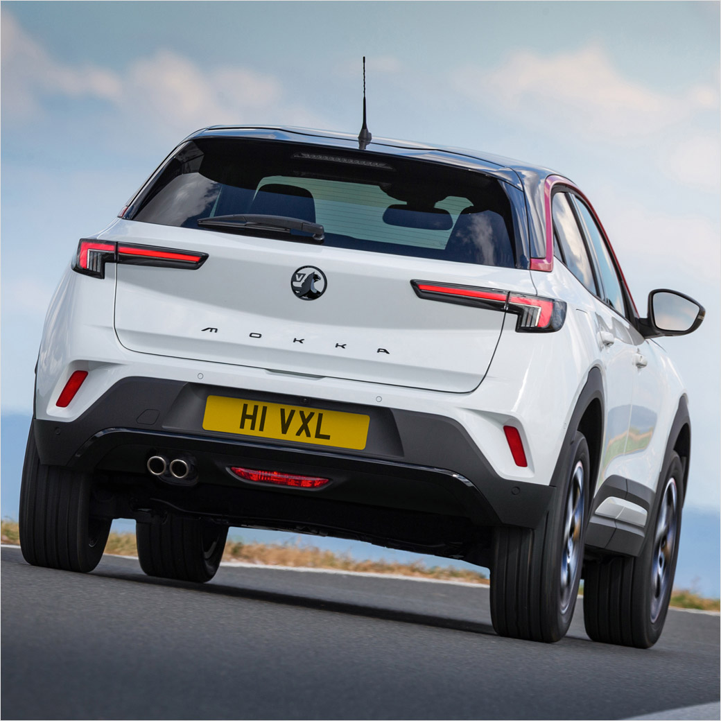
The first car to wear the refreshed badge will be the new Vauxhall Mokka (pictured below), where the logo forms part of a new front end that integrates the grille, headlights, and badge into a single module dubbed the “Vauxhall Vizor”.


Source: Vauxhall


