Urban Eat Reveals New Logo and Packaging by Robot Food
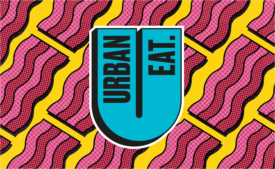
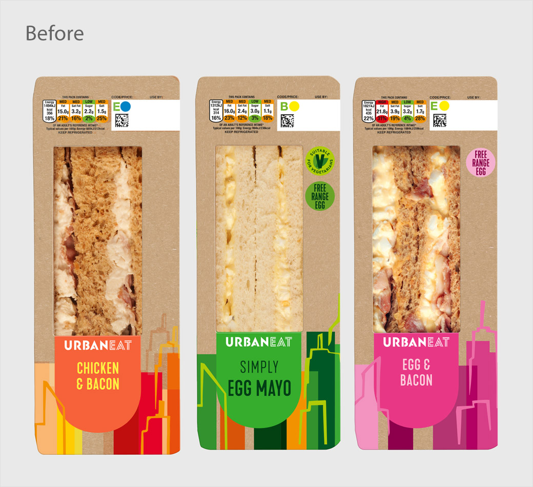
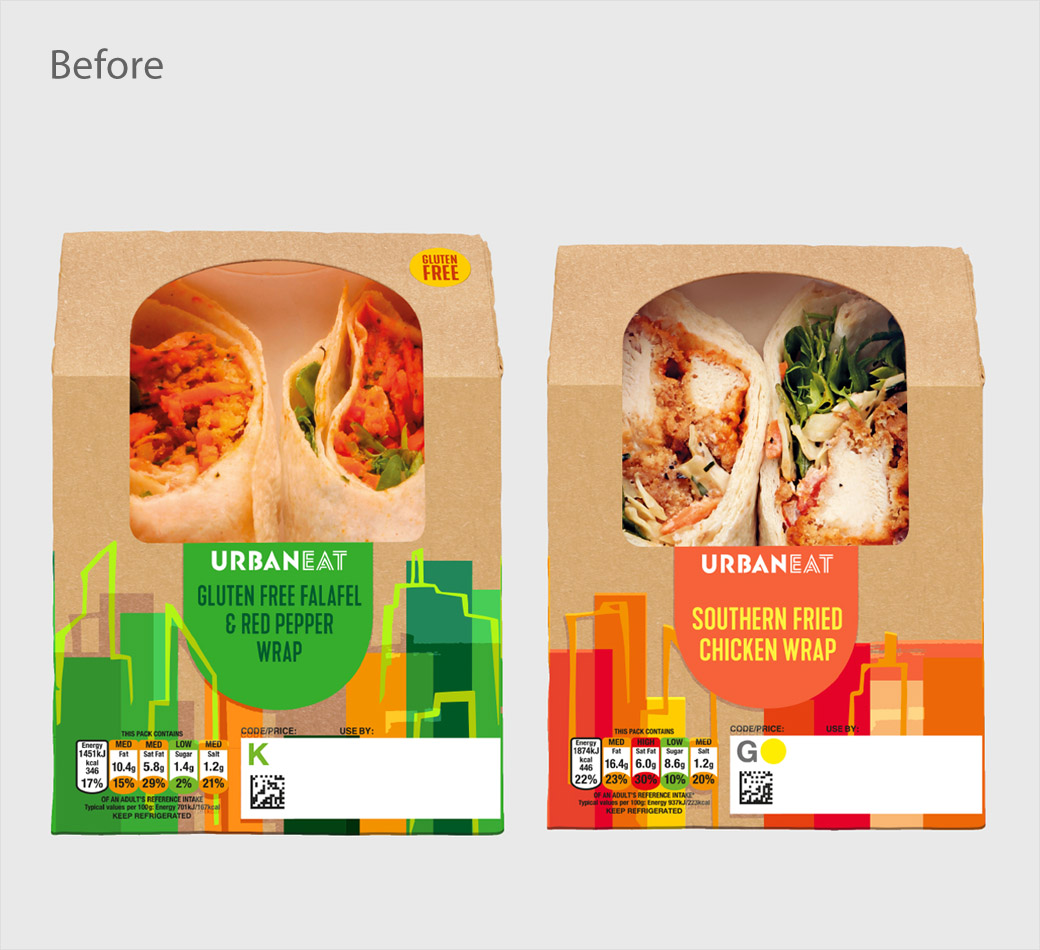
Robot Food has refreshed the logo and branding of food-to-go range Urban Eat, aiming to “implode” the sector with eye-catching new designs that “push the limits and shatter the preconceptions of what ‘grab and go’ can be”.
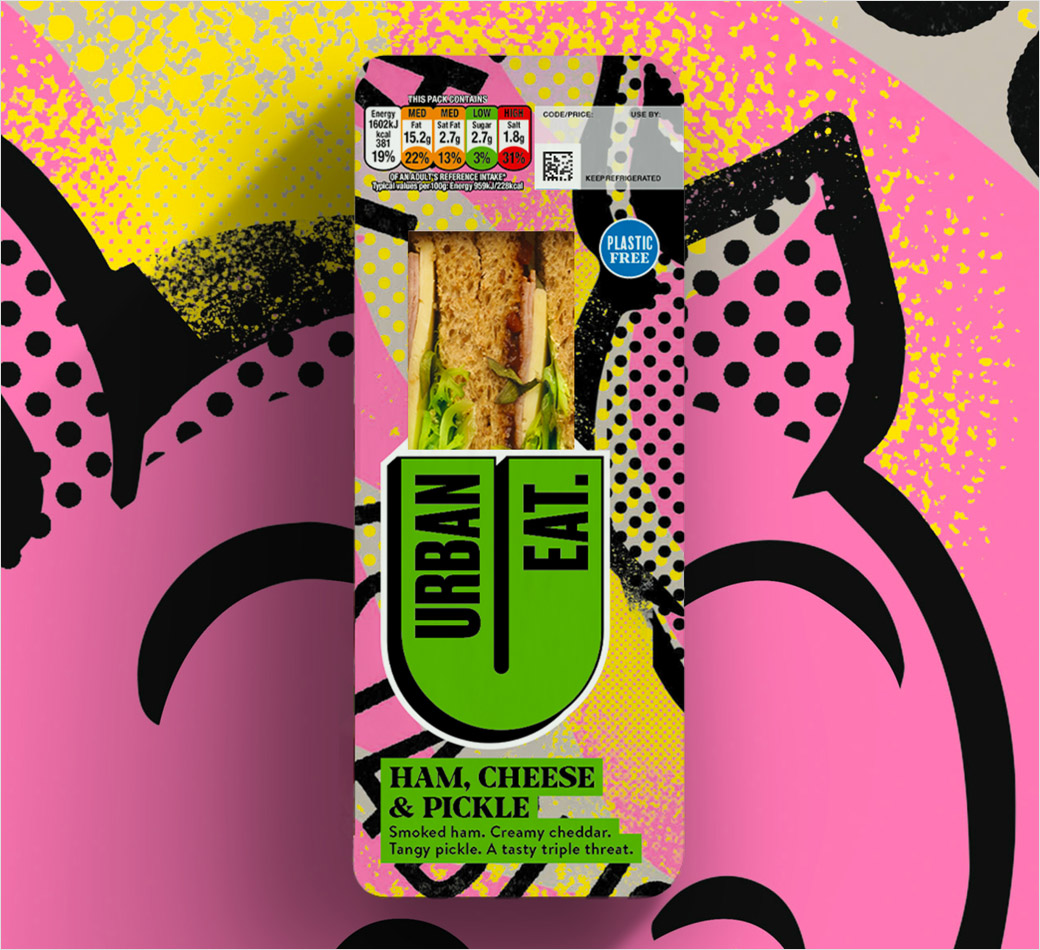
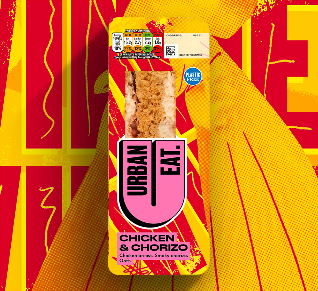
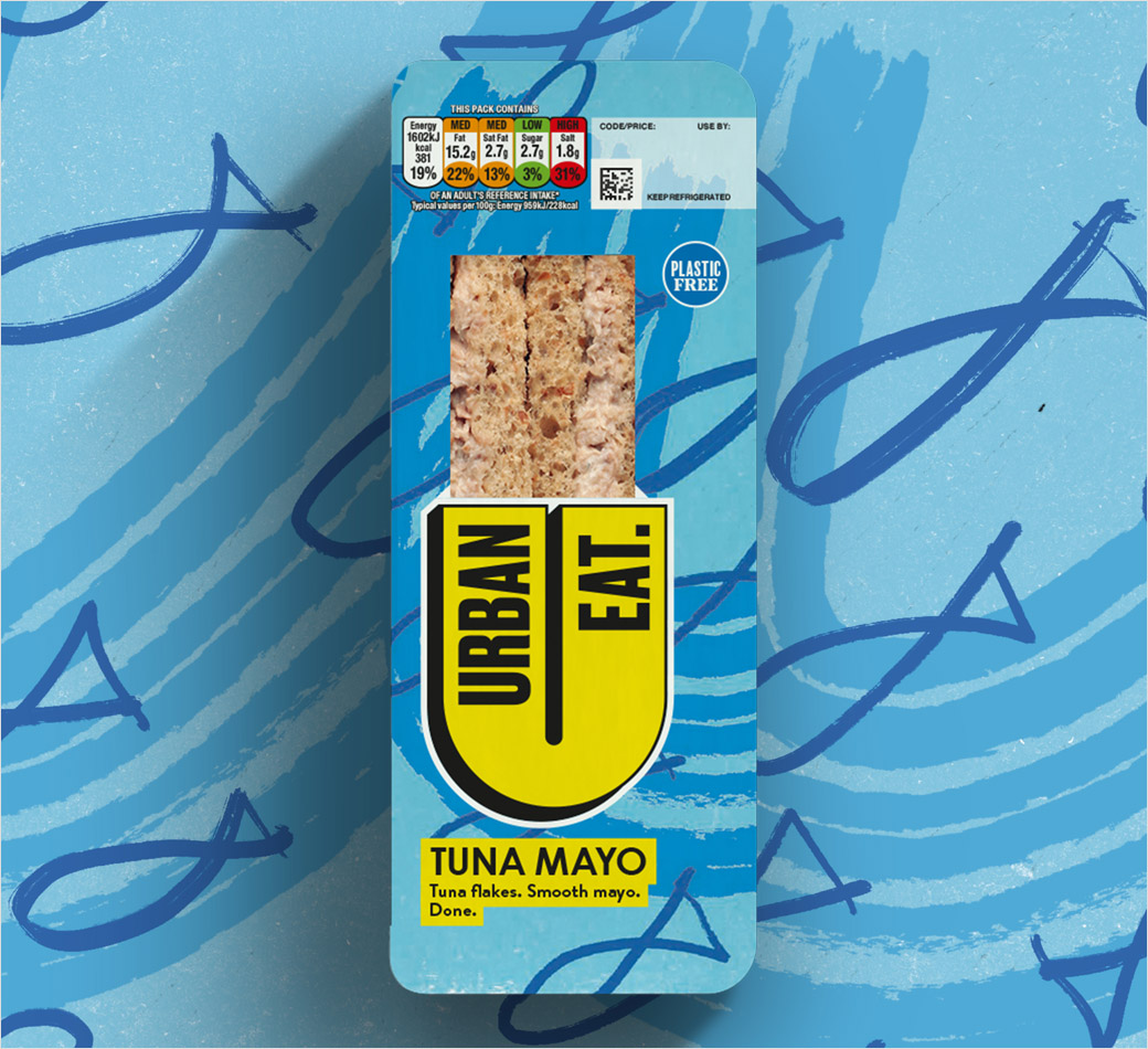
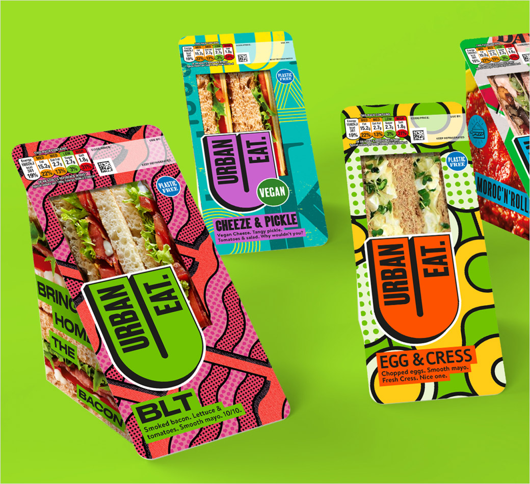
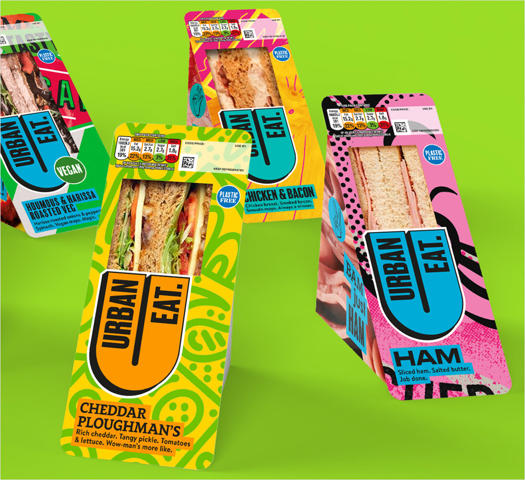
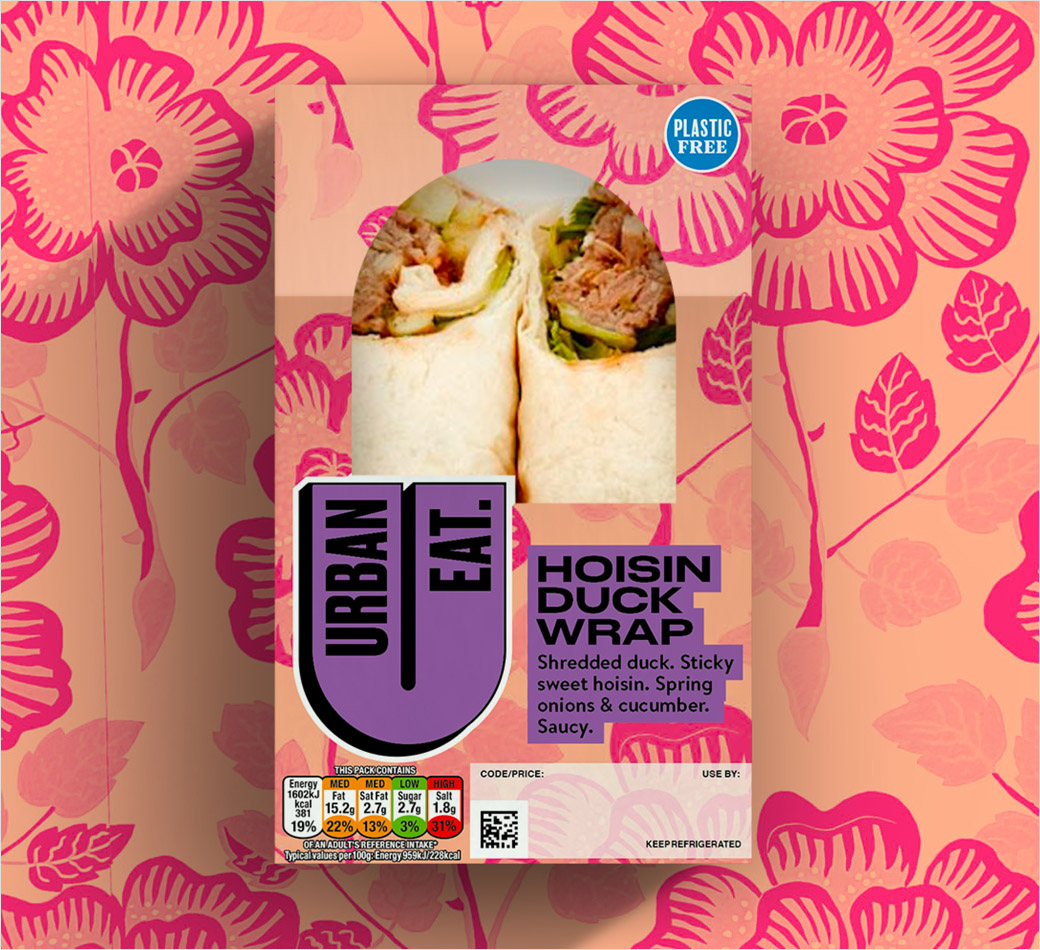
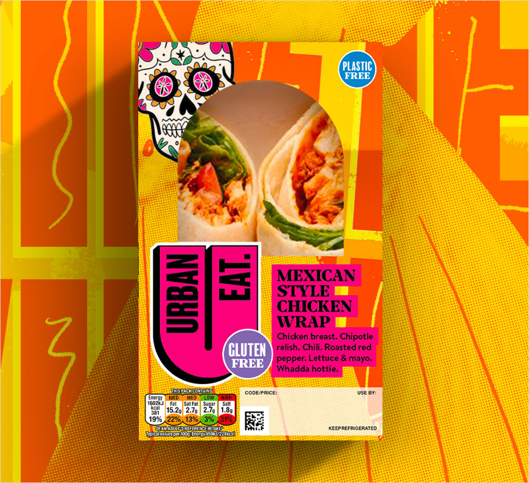
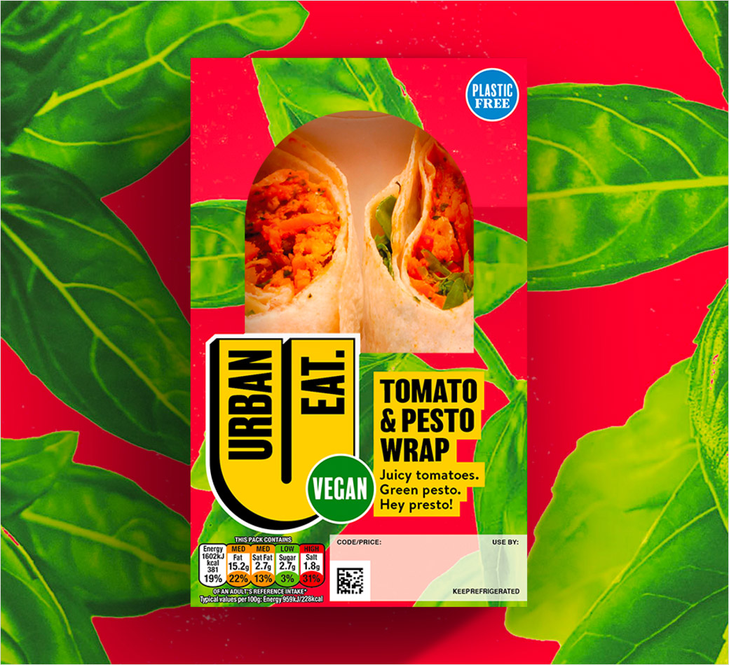
According to the agency, the main design challenge was to somehow mix together vibrant colours, intricate pattern designs, and illustrative elements, all in a way that would not alienate anyone – “colourful and crazy but tasty and approachable,” as senior designer Chris Shuttleworth, who was responsible for creating all of the illustrations in-house, puts it.
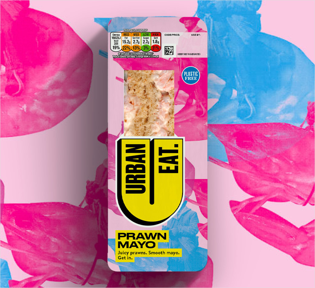
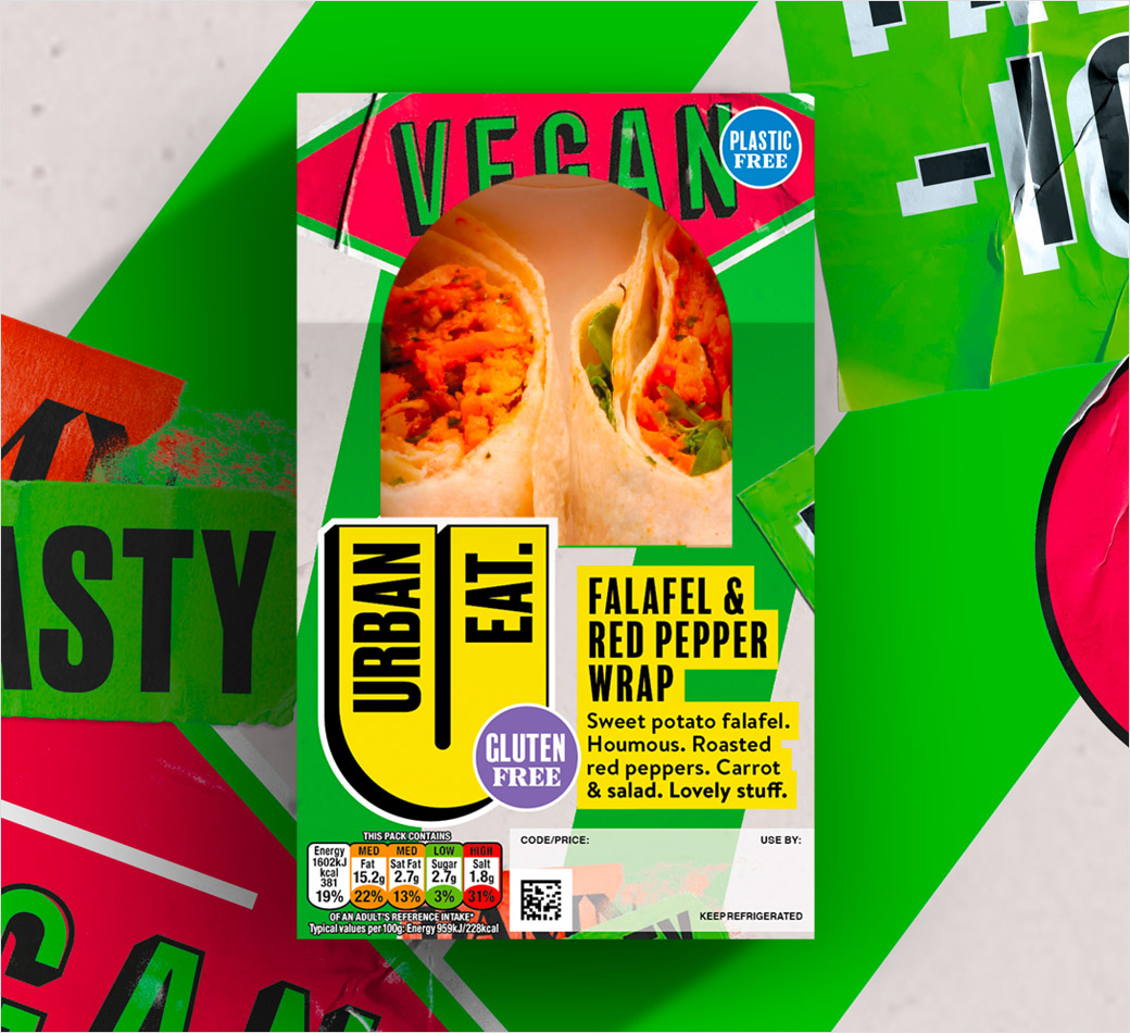
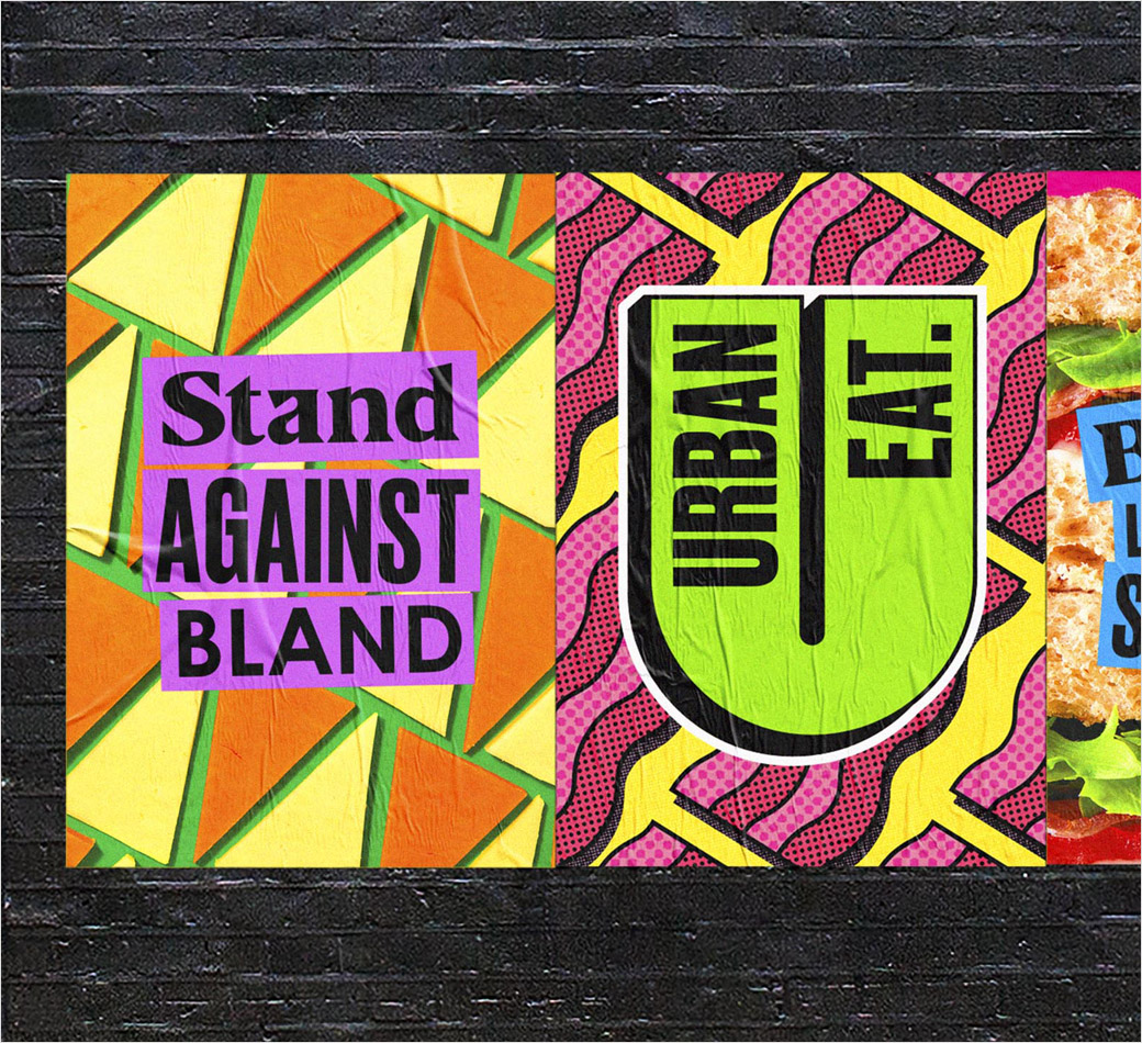
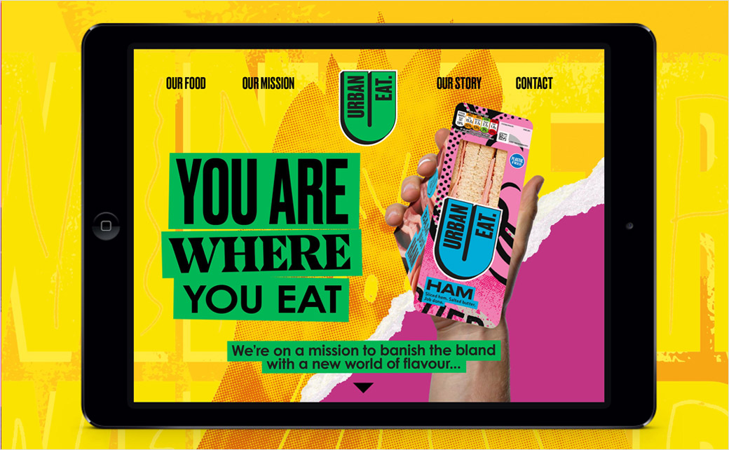
While the colours lean on traditional conventions such as pink for ham and yellow for chicken, the ‘art-inspired’ illustrative styles are more elaborate, ranging from textured patterns to Memphis-like repeating shapes to Keith Haring-style line drawings, Matisse-esque cutout effects, colour washed photomontage, type-led graphics, and more.
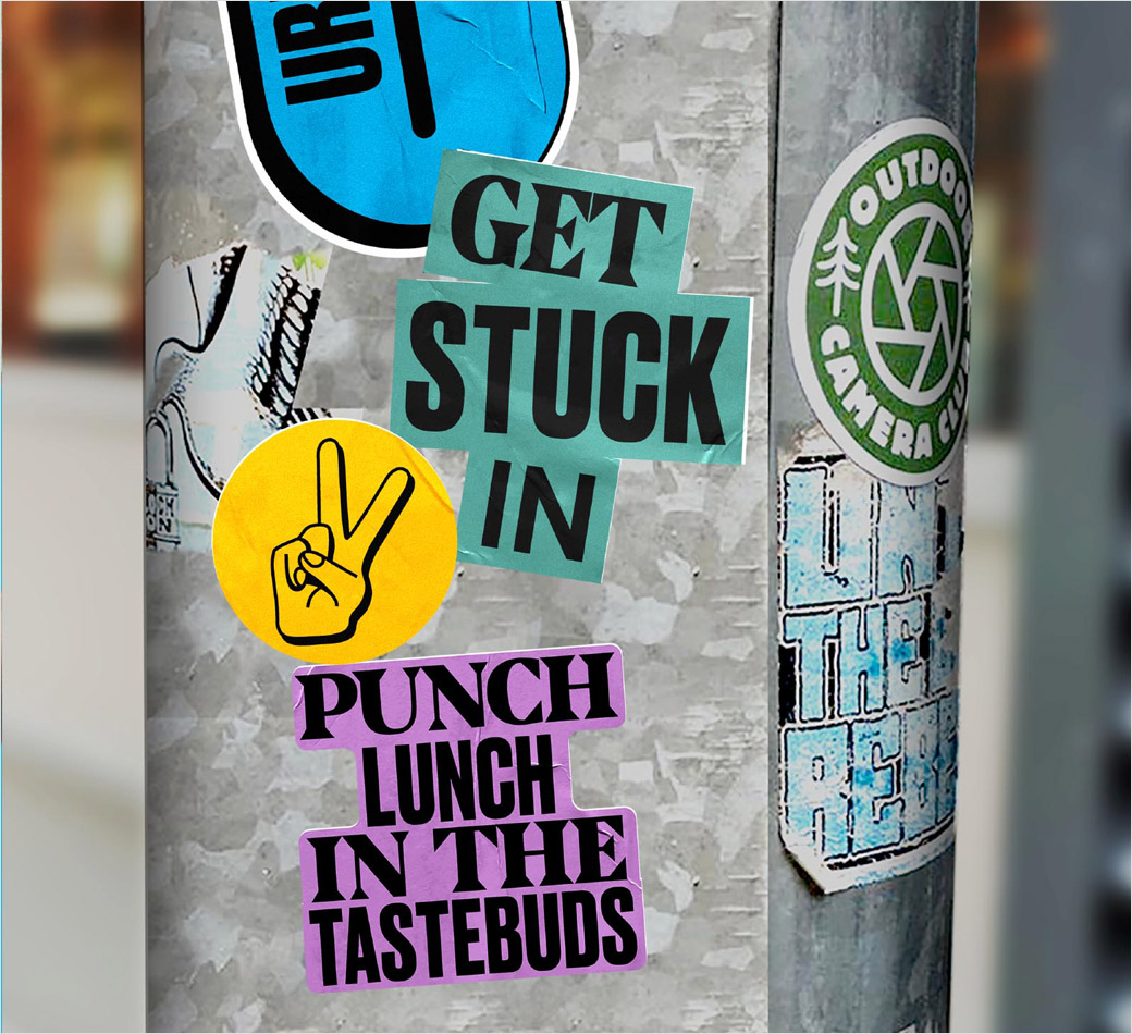
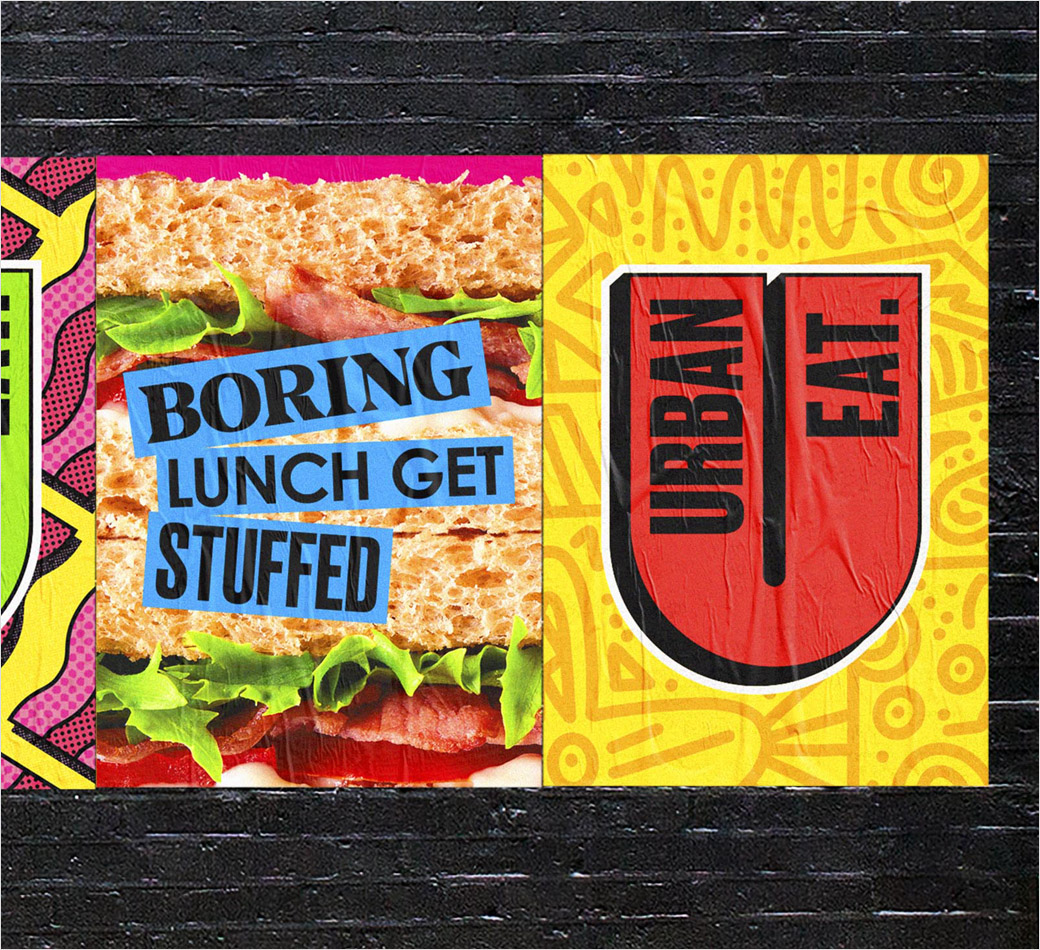
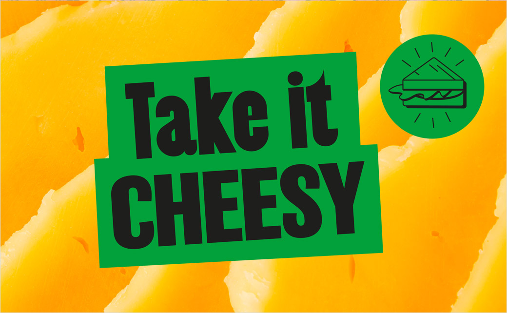
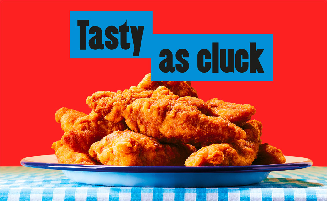
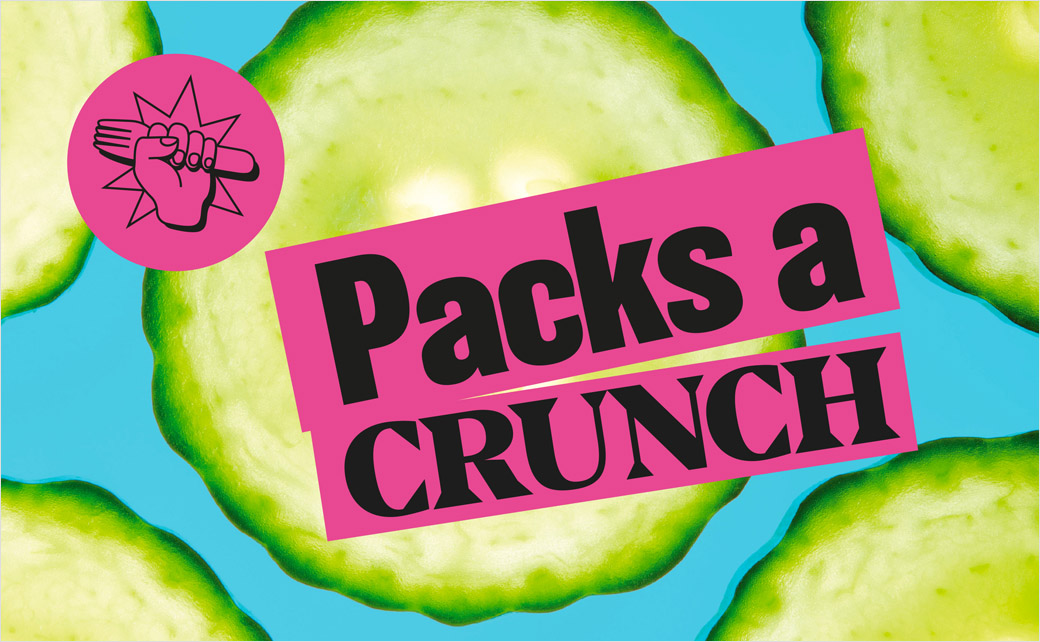
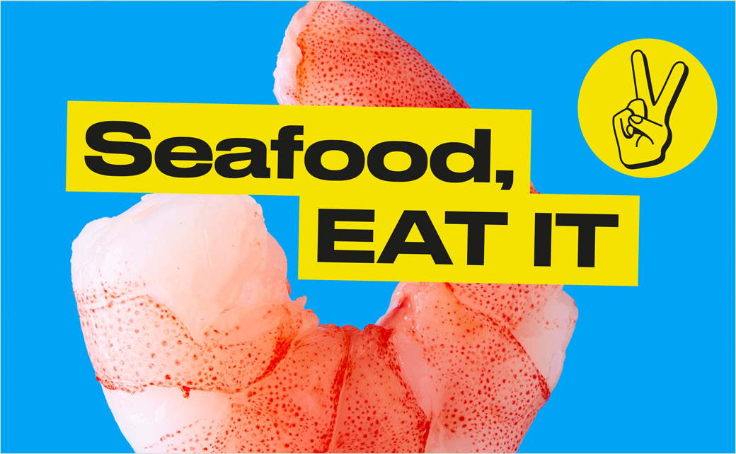
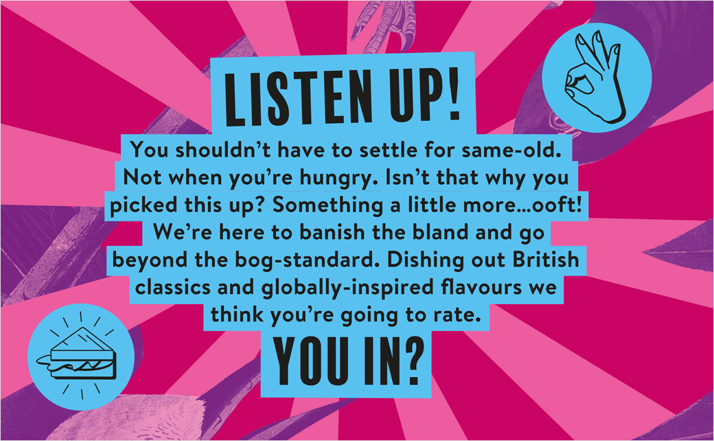
The side of the packs also use pop-art style photography of key ingredients with punchy slogans to “add a touch of the unexpected,” says Robot Food’s founder and executive creative director, Simon Forster.
“The new Urban Eat is all about shaking up your routine while keeping things uncomplicated. It questions the previously unquestioned by providing exciting, always delicious options – whether you’re looking for something familiar or something new,” he further comments.
“Everything we did from the visuals and tone of voice is about breaking people out of lunchtime zombie mode and their regular habits. The urban environment is about a rich mix of styles and colours, characters and cultures,” adds Robot Food creative strategist, Natalie Redford.
The new master logo, meanwhile, is set in a bright yellow tone with a noticeable drop shadow, while secondary logos are deployed in multiple colourways.
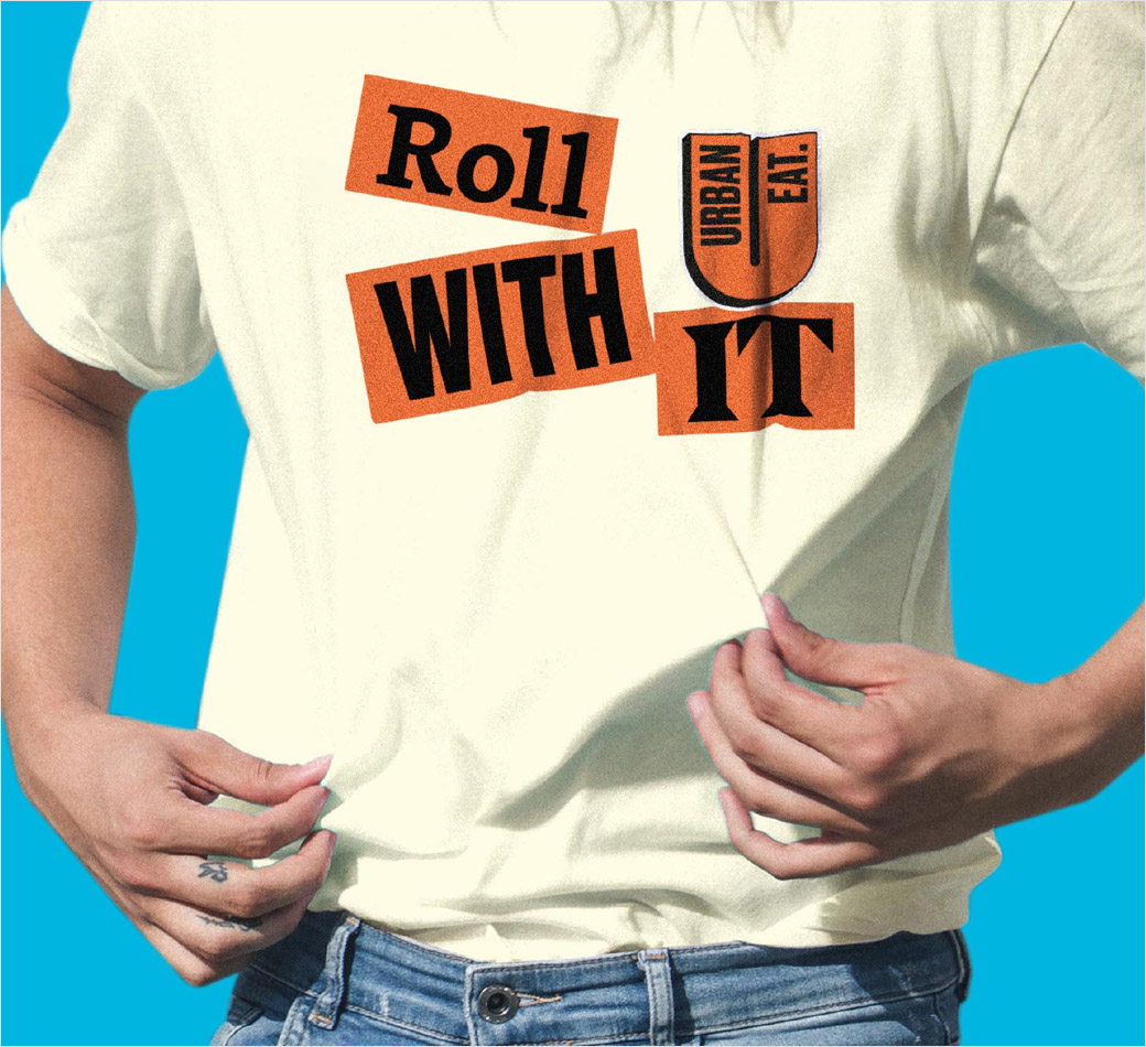
A suite of ten fonts is used to further amplify “the sense of eclecticism”, including a mix of Druk, Century Gothic, Balboa for title fonts, and Brandon for body copy.
Robot Food
www.robot-food.com


