Union Hand-Roasted Coffee Gets New Look from Studio Output
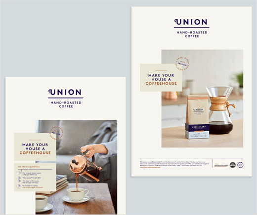
Studio Output has created a new brand identity for direct-trade coffee brand Union Hand-Roasted Coffee. The new look is aimed at repositioning the brand as a more premium offering.
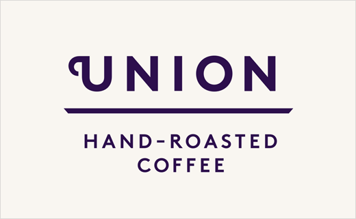
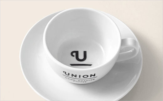
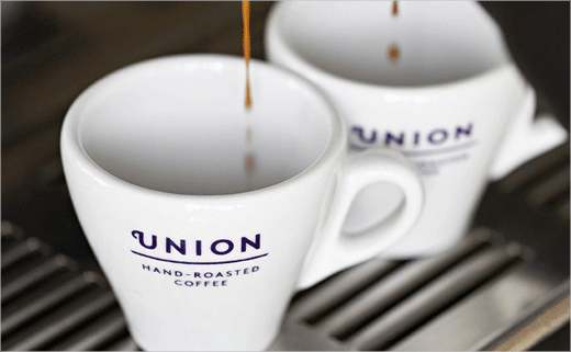
“There was a desire to simplify and reduce the visual elements, and ambition to communicate a sense of quality,” explain the designers. “To communicate quality and simplicity, we stripped the logo back to an elegant typographic device, with the ornamental ‘U’ representing the handle of an espresso cup. When contracted to a shorthand mark, this combines with the underline to create an iconic cup & saucer device.”
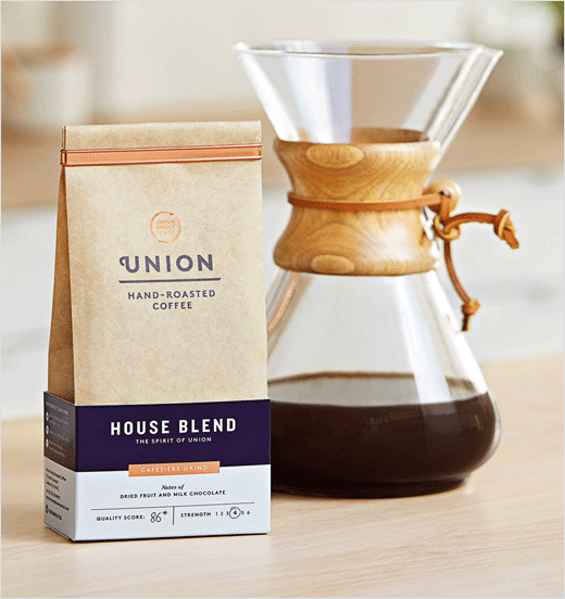
Though the refreshed visuals retain the indigo colour of the previous brand identity, it is used more sparingly. A copper colour adds further detailing to the natural kraft packaging, through foil-blocking and a reusable metal clip. Consumer and trade bags have also been redesigned, now becoming taller and featuring only the brand information and story.
The packaging further incorporates an outer band dubbed a “crash tray”, which identifies individual coffees through a colour system.
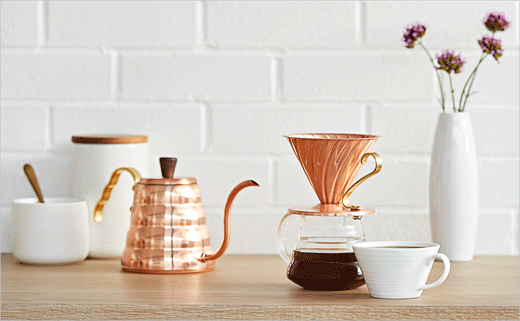
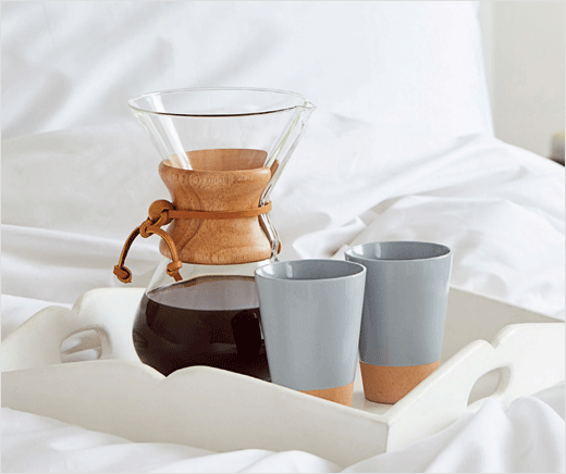
Studio Output also brought in specialist food photographer Steven Joyce to create a set of images that are intended for use across trade and consumer ads.
Studio Output
www.studio-output.com


