Ubisoft Unveils New Logo Design
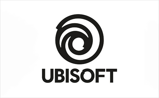
French video game creator Ubisoft has unveiled a new logo design. The refreshed mark represents the first change in the company’s logo since 2003, when it first introduced the ‘swirl’ design.
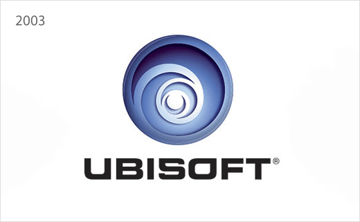
The update sees the previous three-dimensional version transition to a flat variant that is not altogether too different from its predecessor. However, the change to the accompanying wordmark is more notable, with the typography becoming more upright and condensed.
The latest design is the fourth in the brand’s history, and is markedly different from the original Ubi Soft logo from 1986, the year the company was founded.
In an official blog post announcing the new badge, Ubisoft provided a look back at its logos from the past, offering its own take on the evolution of the brand since the 1980s.
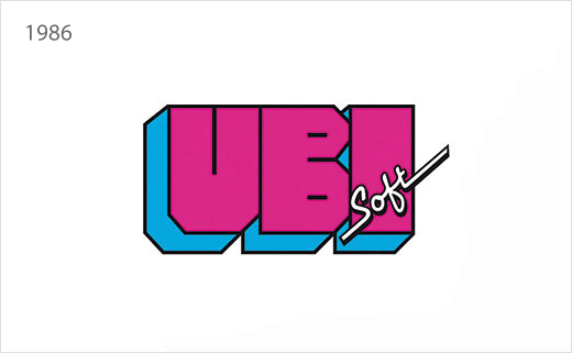
“It all started in 1986 with this rad design – a look inspired by the distinct visual style of the ’80s. At the time, Ubisoft was a local distributor of video games.
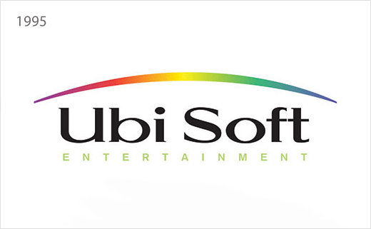
“Nine years later, Rayman was born and Ubisoft introduced the rainbow. This marked the company’s shift from distributor to creator, and highlighted the fact that Ubisoft was creating mainly family-oriented content.
“In 2003, the swirl appeared on the scene and once again signaled a shift. It followed the acquisition of Red Storm and the creation of new Tom Clancy titles, marking a more mature and diversified approach.
“Today, we create worlds – worlds that live as video games, comics, movies, TV shows, books, and amusement park rides. Our new logo is minimalist, modern and monochromatic. It’s a window into our worlds, giving a preview of what’s to come by highlighting the artistry that goes into creating them. The swirl and the letter O are both deliberately created to be reminiscent of hand-drawn shapes and represent our human qualities of enthusiasm, curiosity and the grain de folie that Ubisoft is known for.”
Source: Ubisoft


