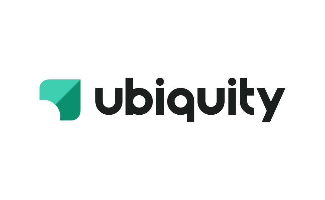
Ubiquity Retirement + Savings Reveals New Logo
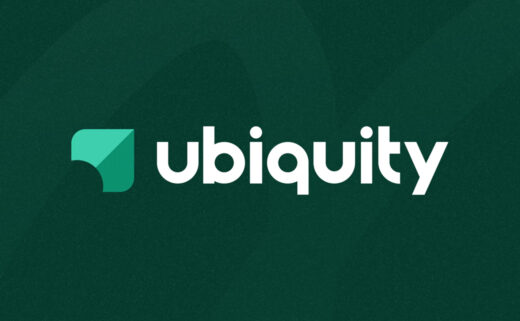
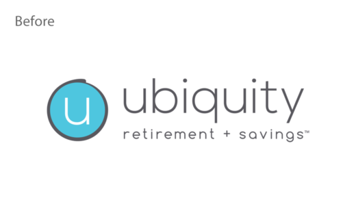
Ubiquity Retirement + Savings has unveiled a new logo and revamped website as part of a larger rebranding initiative.
Although the American firm has decided to keep the same brand name, it will be represented by new design components and upgraded tools and resources.
“Just like cars, phones, and fashion change and improve over time, so do we. The new look and feel and client experience reflects the maturity, stability, and commitment we have demonstrated as a provider to small businesses,” says Chad Parks, Ubiquity’s CEO and founder.
The rebrand consists of a refreshed colour palette and a modernised logo design that the fintech company claims not only conveys strength and perseverance but also symbolises its dedication to help clients “achieve upward growth”.
The new branding marks an important milestone as the online retirement platform is approaching its 25-year anniversary this August.
Its “Paradigm RKS” cloud-based software – which automates recordkeeping and plan management function – is reportedly used by over 10,000 American small businesses and hundreds of thousands of individual clients across 50 states.
The San Francisco-headquaretered business claims to hold over $3 billion in retirement assets.
Source: Ubiquity Retirement + Savings


