Tropicana Unveils New Logo and Packaging with Design by Sunhouse
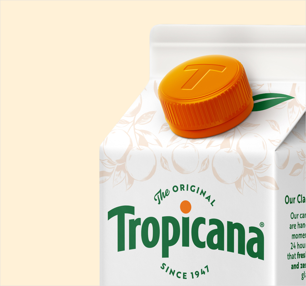
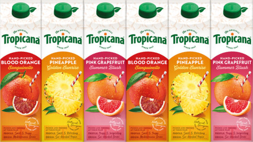
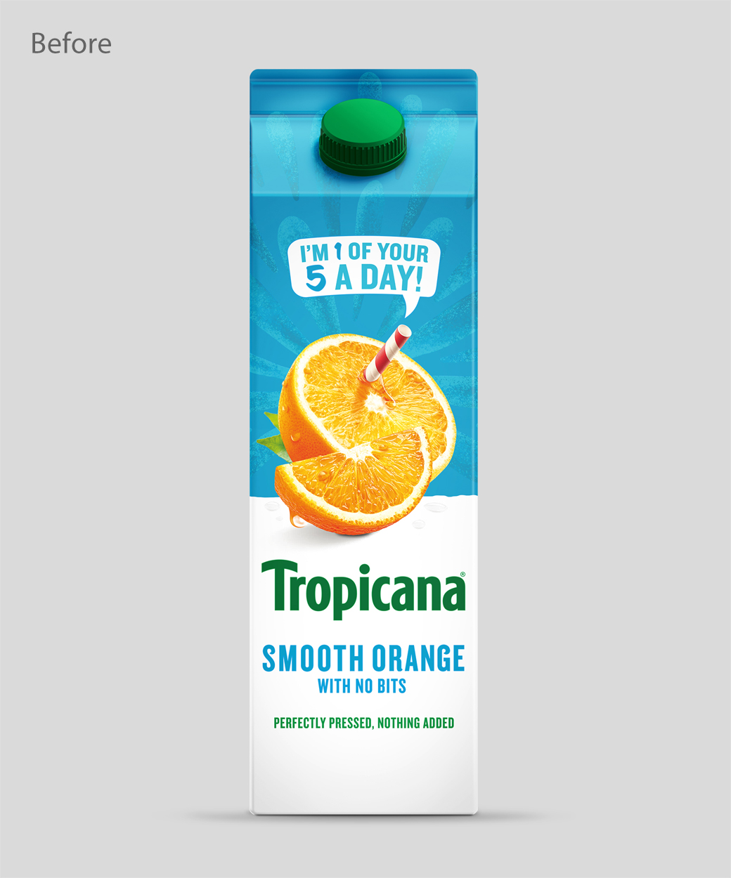
Independent design agency Sunhouse has updated the logo and packaging for prominent orange Juice brand, Tropicana.
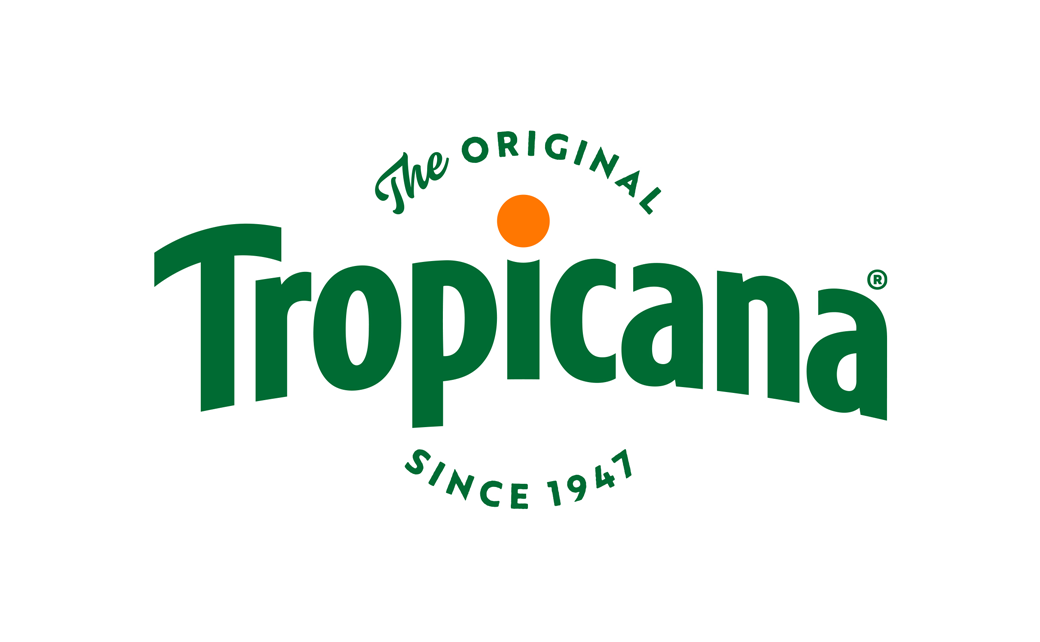
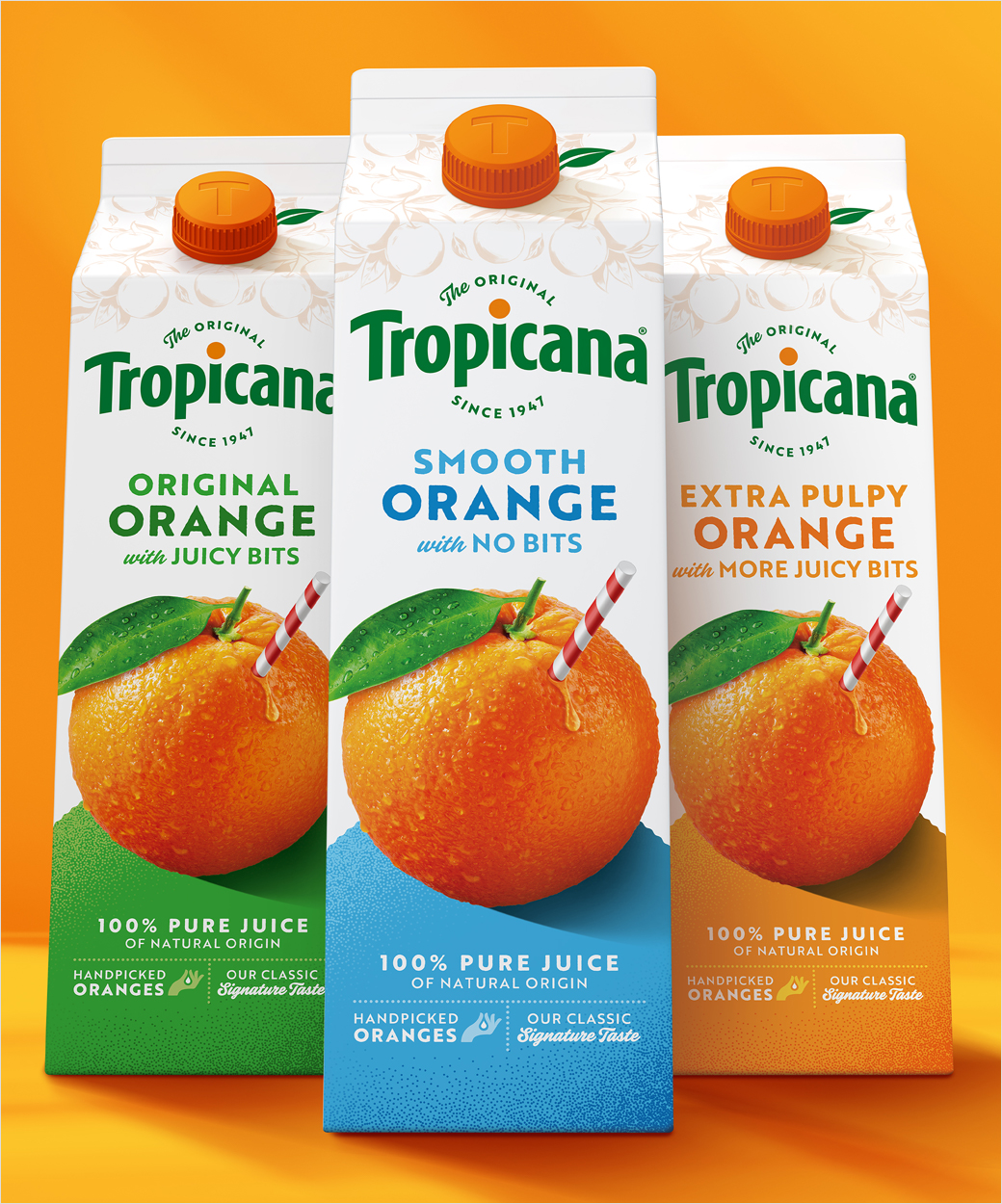
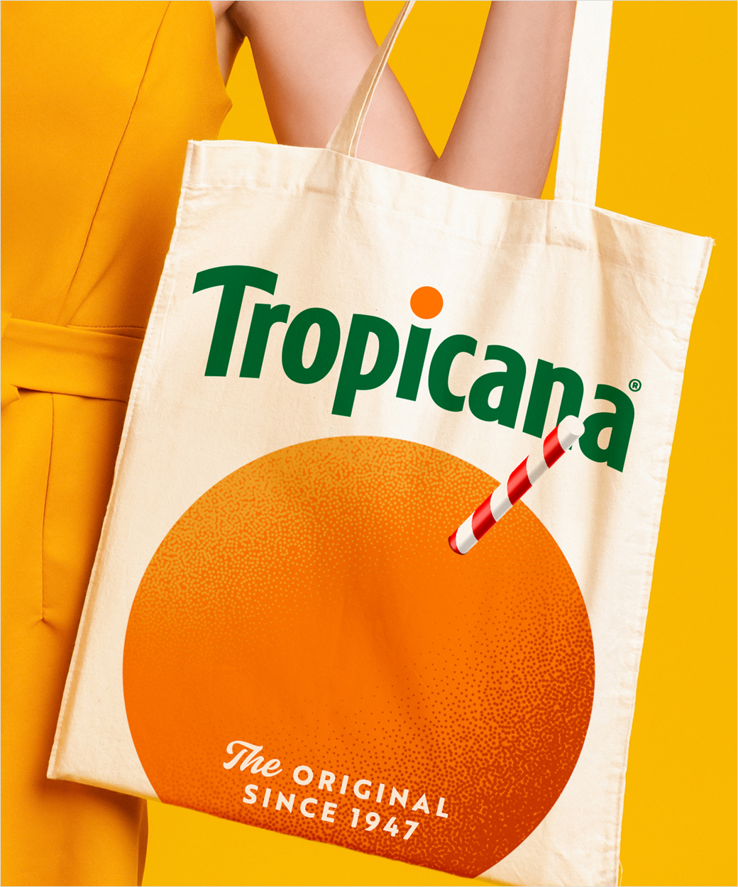
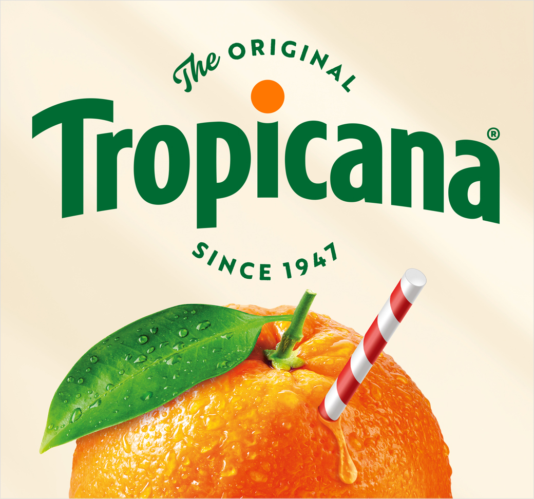
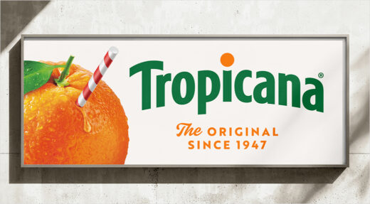
The new identity – which is claimed to put the orange back at the heart of the story – features an evolved brand mark that reintroduces the horizon arch with an orange punctuating the ‘i’.
This is then paired with the line ‘The Original since 1947’ that the designers says “locks in the heritage story”.
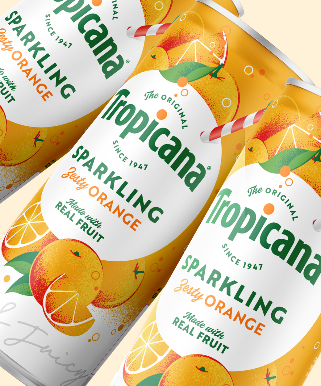
Tropicana’s well known symbol, a whole orange with a red-and-white straw, has also been enhanced “to intensify taste appeal”.
Additional details include founder Anthony T. Rossi’s signature, a hand-drawn illustration of oranges, and a photograph of the original grove.
“This redesign marks a pivotal moment for Tropicana. An opportunity to blend modern iconicity with decades of heritage and reinforce our leadership in the juice category,” says Mick van Ettinger, chief marketing officer at Tropicana Europe.
“From its founder, Anthony T. Rossi, who sparked a juice revolution 75 years ago by bottling fresh-pressed orange juice, to its signature blend crafted from only the highest quality oranges, handpicked and pressed within 24 hours – Tropicana possesses a legacy that no other brand can match,” further comments James Giles, executive creative director at Sunhouse.
Adding: “Our task was to breathe new life into the brand’s assets, showcasing these compelling stories with confidence and credibility to reinforce the message that ‘Not All Juices are Created Equal.'”

Sunhouse
www.sunhouse-creative.com


