Tripadvisor Updates Ollie the Owl Logo
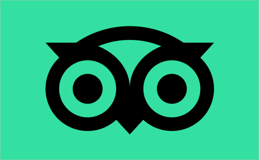
Online travel review giant Tripadvisor has revealed an updated logo as part of brand refresh in what is the American company’s 20th year.
Originally founded in 2000, the website currently reaches 460 million unique visitors each month, and features over 700 million reviews and opinions on everything from hotels to restaurants.
“Ollie is an icon. Given his global presence, online and off, we want him to stand out wherever you spot him,” says Tripadvisor. “We also made the decision to drop the capitalised A. After 20 years, people recognise and pronounce our name as a single word. So whether you’re reading about Tripadvisor in an article, using our app, or seeing the Tripadvisor logo as you travel, the brand now appears the same everywhere”.
“Appreciating the current love for and global recognition of the iconic logo, we retained its inherent personality but refined its geometry for better reproduction at all sizes. What was an exercise both in reduction of complexity and amplification of character resulted in a much simpler owl,” explains the design team at Mother Design, the agency tasked with carrying out the visual overhaul.
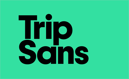
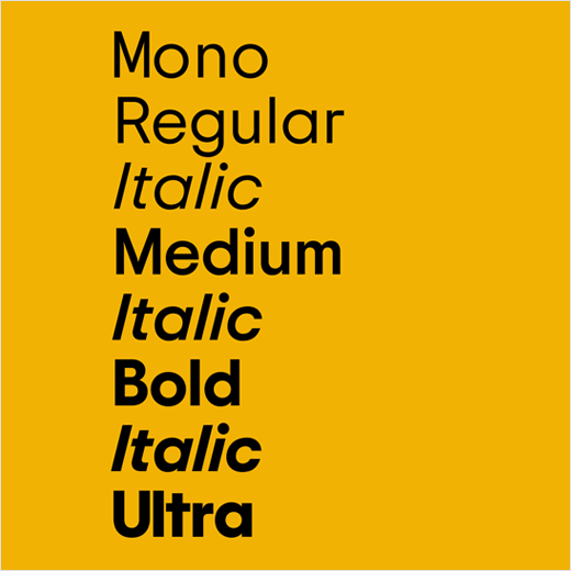
The revised logo is also accompanied by a bespoke typeface. Dubbed “Trip Sans”, and designed by Colophon Foundry, it is described as having “the weight of real, global, human connection that our brand believes in”.





Source: Tripadvisor


