Toyota Reveals New ‘Mobility-Friendly’ Logo Design
Toyota is introducing a new brand design in Europe with a reworked version of its brand logo and typography.
The refreshed look is claimed to signify a new era that will help the Japanese car giant transition from a car company to a mobility company.
“Developed for an increasingly diverse customer base that is coming to Toyota for an expanding range of mobility products and services, the new design language operates fluently across all digital and physical touchpoints,” says the company.
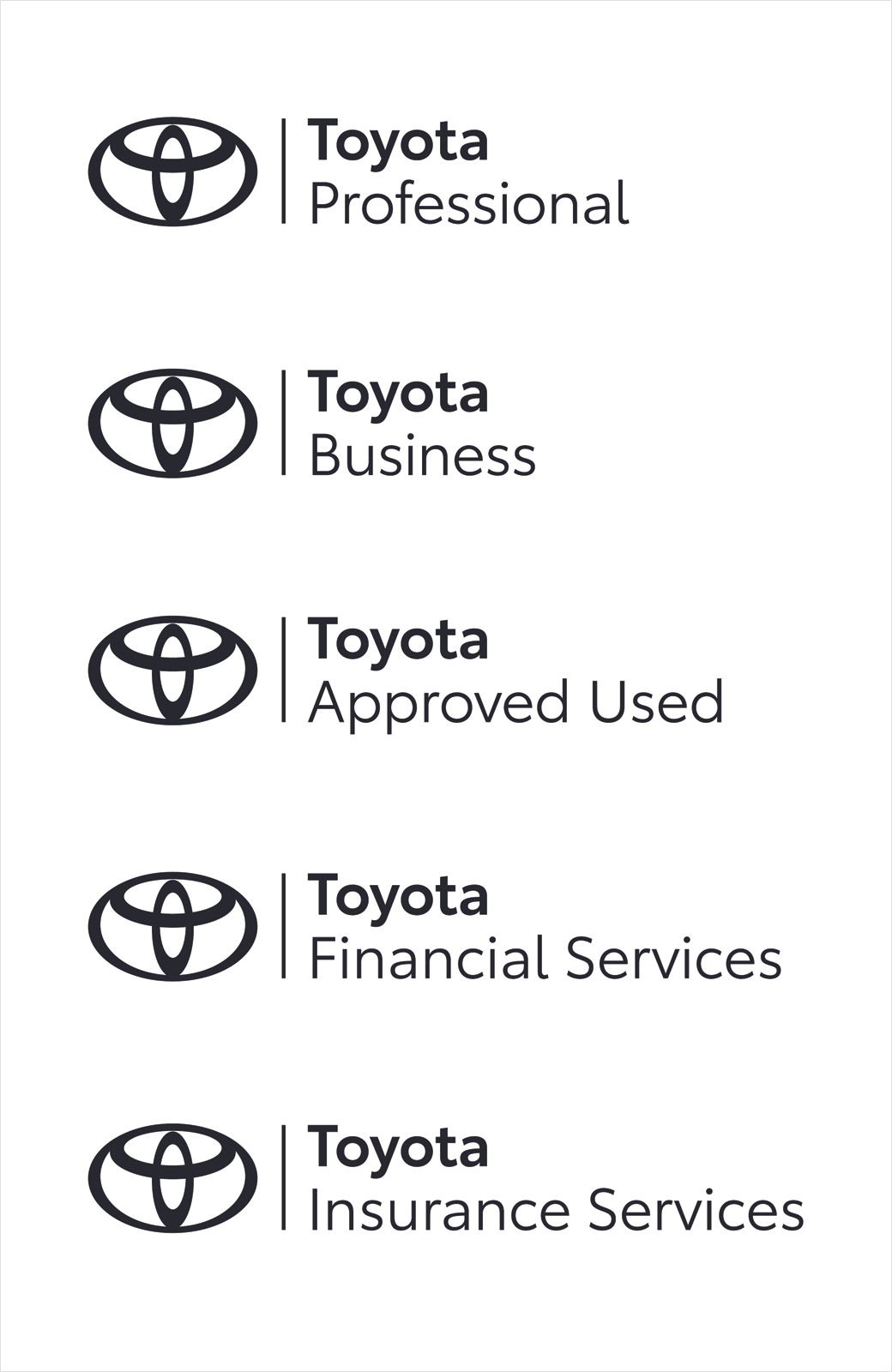
Adding: “The new visual identity is driven by simplification and has been shaped by four key principles: forward-thinking, mobile-ready, more premium feel and consistency across all business units and sub-brands.”
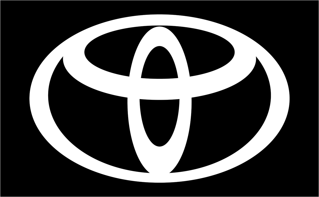
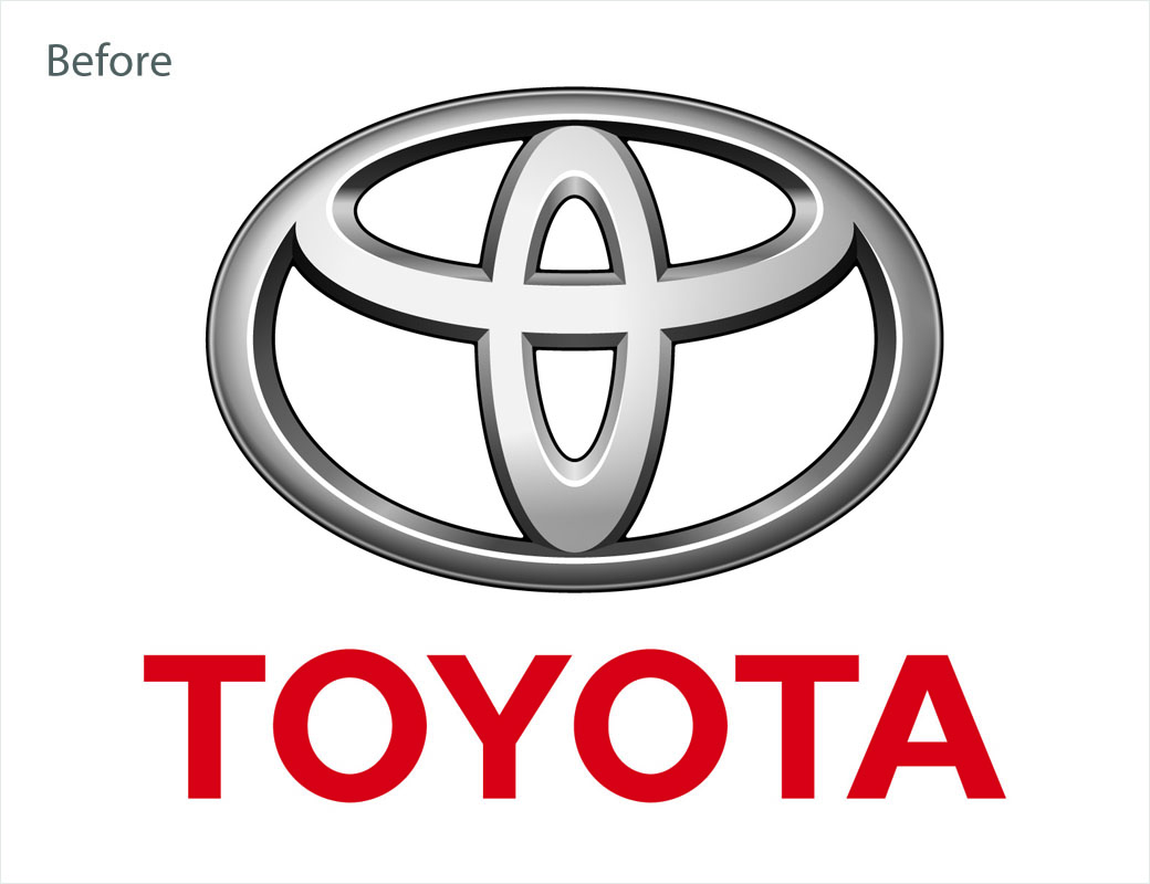
The new brand logo distils the company emblem to a more simple, two-dimensional design. The Toyota wordmark has also been deleted, as the company reckons the emblem itself is well-known across Europe.
The new mark will be applied across all communication touchpoints, while the current logo will continue to be used for Toyota vehicles. The current retailer signage will also remain in place and will be reviewed in the Toyota 2025 Network Strategy.
The new visual identity comes complete with a new, bespoke typography dubbed “Toyota Type”. This is reportedly multi-purposed for both on and off-line environments and marks a step-up in digital readiness as the company plans to expand its online retailing in Europe.
“We developed the new brand visual design with ‘tomorrow’ in mind. Our focus was on enabling ever-better customer connections, allowing them to keep pace with Toyota’s rapid expansion of electrified vehicles, mobility services and online retailing. The design was re-purposed to better connect with customers across diverse touchpoints,” explains Didier Gambert, Toyota’s vice president of sales, marketing and customer experience for Europe.

Source: Toyota


