Tordotcom Publishing Reveals New Logo
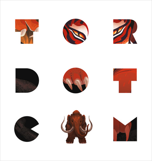
Science fiction and fantasy publisher Tordotcom Publishing has unveiled a new logo as the company approaches its fifth anniversary.
Launched originally as an online magazine in July 2008, the site would later in 2014 become a full-fledged imprint releasing its own range of printed books under the ownership of publishing giant Macmillan.
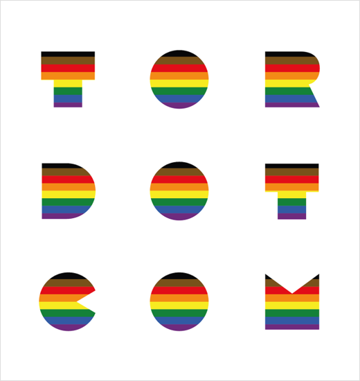
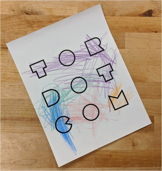
“We’re excited to celebrate by unveiling a new logo: a fresh, modern design that fully encompasses all the many different stories that we are proud to publish,” says the company. “This logo will serve as a reminder to keep pushing boundaries and continue publishing some of the most exciting work in the genre.”
However, the publisher’s previous logo, known as “Stubby the Rocket”, will continue to be used as the brand’s masthead, while the new design is meant to show “that Tordotcom Publishing doesn’t only publish science fiction”.
“The rocket – that we continue to love and adore – was not initially designed as an imprint logo. Switching to this logo-type gave us a chance to further solidify Tordotcom as an imprint, have our full name proudly displayed on our books, and help us represent the breadth of voices that we have the honour to publish,” explains Tordotcom’s creative director, Irene Gallo.
The new logo has been designed in collaboration with New York City-based agency, Drive Communications.


Source: Tordotcom Publishing


