Logo Designs for 2020 Olympic and Paralympic Games Unveiled

The Tokyo 2020 Organising Committee has this week unveiled the official emblems of the Tokyo 2020 Olympic and Paralympic Games.
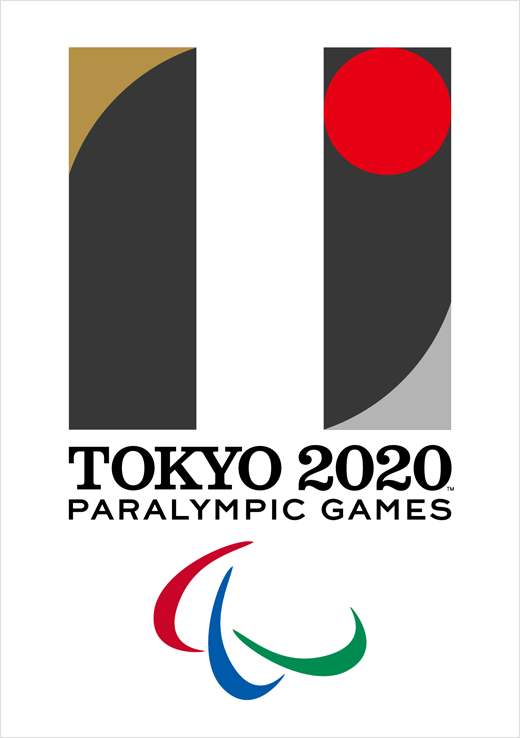
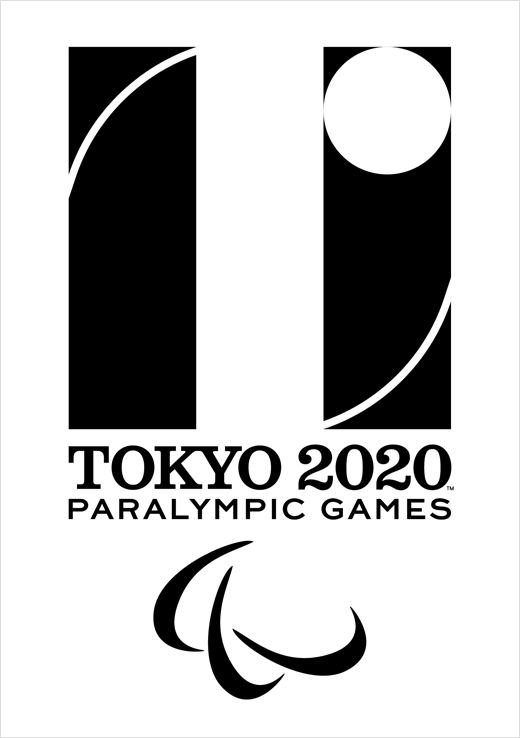
The Tokyo 2020 Olympic emblem is inspired by the "T" in: "Tokyo"; "Tomorrow"; and "Team". The Paralympic emblem, meanwhile, is inspired by "=", being described by the tournament organisers as the "universal sign of equality".
"The black colour of the central column represents diversity, the combination of all colours. The shape of the circle represents an inclusive world in which everyone accepts each other. The red of the circle represents the power of every beating heart. These elements combine to create the emblems of both the Olympic and Paralympic Games," said an official spokesman.
The logos have been designed by Kenjiro Sano. Born in Tokyo in 1972, Sano graduated from the Department of Graphic Design at Tama Art University. He is the founder of MR_DESIGN, and has previously won awards including the Yusaku Kamekura Design Award, the Mainichi Design Prize, the New York ADC Gold Award, the Cannes Lions Gold, and the London D&AD Black Pencil, among others.


Source: Tokyo 2020


