Toblerone Launches New Logo and Packaging Design by Bulletproof
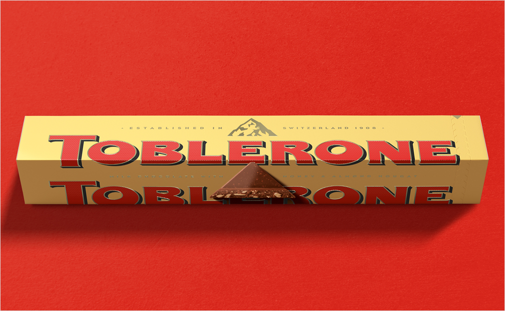
Branding agency Bulletproof has refreshed the logo and packaging design for Toblerone’s iconic triangle-shaped chocolate bar.
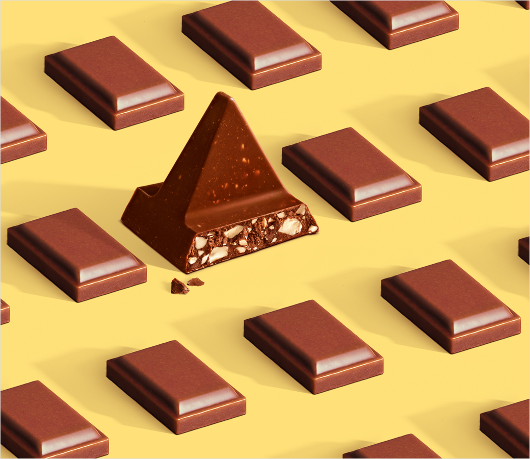
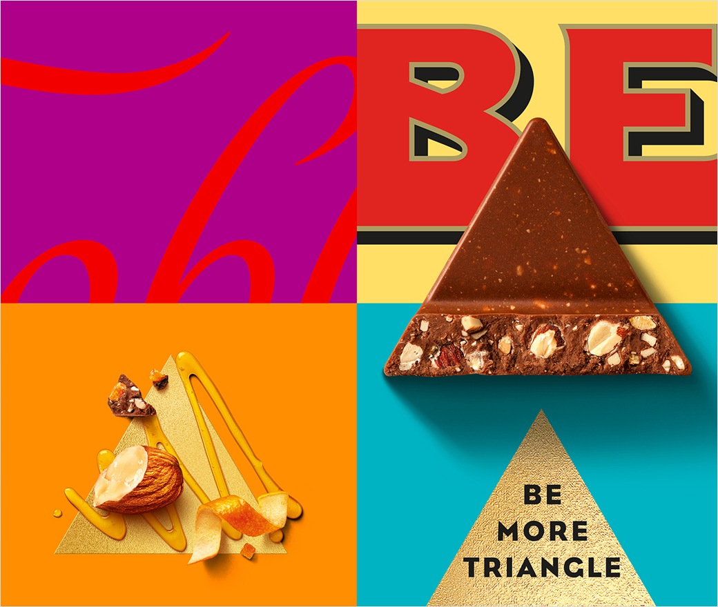
The confectionery brand’s new purpose features a distinctive call to action, ‘Be More Triangle’, which forms part of a design that is claimed to “pay tribute to the importance of being stubbornly triangle in a world of squares”.
“With a rich brand heritage over 110 years in the making, we saw an opportunity to return to our roots with a new brand story that pays homage to the core values embodied by our innovative founder,” says Mie-Leng Wong, senior vice president at Toblerone’s parent company, Mondelē. “The aim is to challenge stereotypical behaviours in the category and allow us to do things in a more progressive premium way, encouraging uniqueness and celebrating all things triangle.”
“Theodor Tobler broke the mould in his time – when others were creating squares, hemmed in by the refinement and rules of Swiss chocolate production, he went off on a tangent,” adds Nick Rees, chief creative officer and partner at Bulletproof.
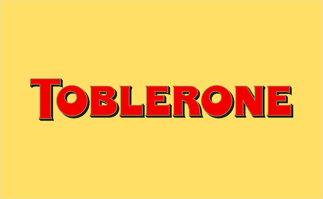
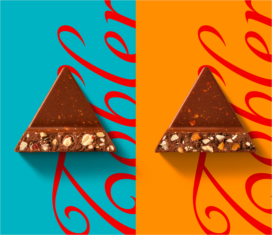
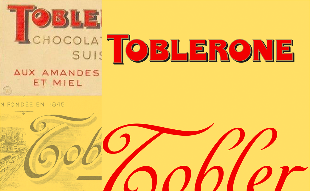
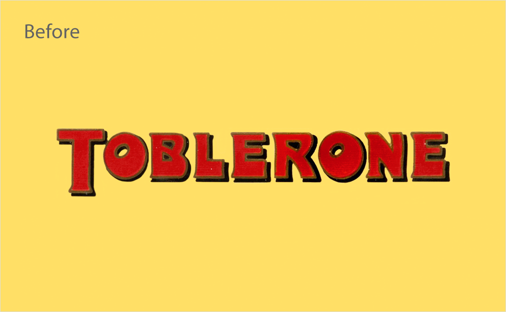
“The revitalisation of the Toblerone wordmark drew inspiration from the Toblerone archives, reintroducing the character of the original through bold quirks such as an off-centre counter in the ‘O’ and an unconventionally thickened base to the ‘E’,” further explains the design team at Bulletproof. “The creative elements also include a contemporary, yet quirky graphic style and a new ‘Tobler’ signature inspired by the founder’s sign-off on an archive poster. The redesign also modernised and streamlined the mountain logo, in line with the geometric and ‘be more triangle’ aesthetic, while retaining its famous hidden bear.”
The new look logo and packaging is also being accompanied by a new direct-to-consumer e-commerce ‘gifting’ feature, whereby customers can go to Toblerone.co.uk and buy personalised chocolate bars.
As well as being able to add a custom name and message to the chocolate bar’s front-of-pack label, they can also choose from a number of different graphic schemes for the ‘mountain-shaped’ triangular packaging.
Toblerone’s new brand has already started rolling out across core packaging, point of sale material, and other communications.
Bulletproof
www.wearebulletproof.com


