This Way Up Creates Branding and Packaging for New Plant-Based Cheese Range – ‘Nurishh’
This Way Up, a London-based design agency specialising in healthier food and drink, has created the branding and packaging for ‘flexitarian’-focused new plant-based cheese range, “Nurishh”.
In 2020, one of the world’s largest dairy companies, the Bel Group, acquired All in Foods, a French plant-based cheese startup, with the mission to launch a globally recognised plant-based cheese product that would appeal to both mainstream and flexitarian (‘casual vegetarian’) audiences.
Bel Group then reached out to This Way Up following the agency’s work for healthier food and drink brands such as Danone and Marmite.
Following global brand analysis into the category, This Way Up says it identified the Bel Group’s key target audience as being “agile home heroes”– essentially parents of teens or carers looking to feed the entire family with the one meal that everyone would enjoy.
The agency subsequently came up with the name Nurishh, which, it is claimed, has “implications of ‘goodness’, notions of family and the suggestion of the attributes of the product itself.”
Also important to the agency’s initial strategic work was said to have been “semiotic mapping” of how health and taste are communicated through design. This Way Up says it sees “health and taste as being not mutually exclusive,” and that approach helped to inform the design language used across all Nurishh touchpoints.
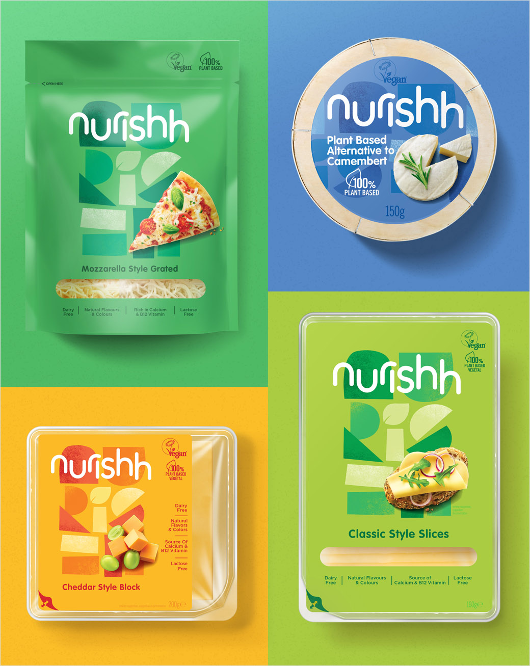
“The designs needed to strongly communicate taste, which was a massive barrier in the vegan cheese market,” comments This Way Up designer, Beth Kelsall. “Nothing in the plant based cheese category was shouting about taste or colour. This opened up a space to create a design which was full of colour, eye catching and appealing for everyone.”
Nurrishh, as both product and brand, therefore seeks to break with the conventions of vegan cheese, which the the design team at This Way Up says is either packaged no different to its dairy counterparts or often with neutral aesthetics that hint at restricted diets.
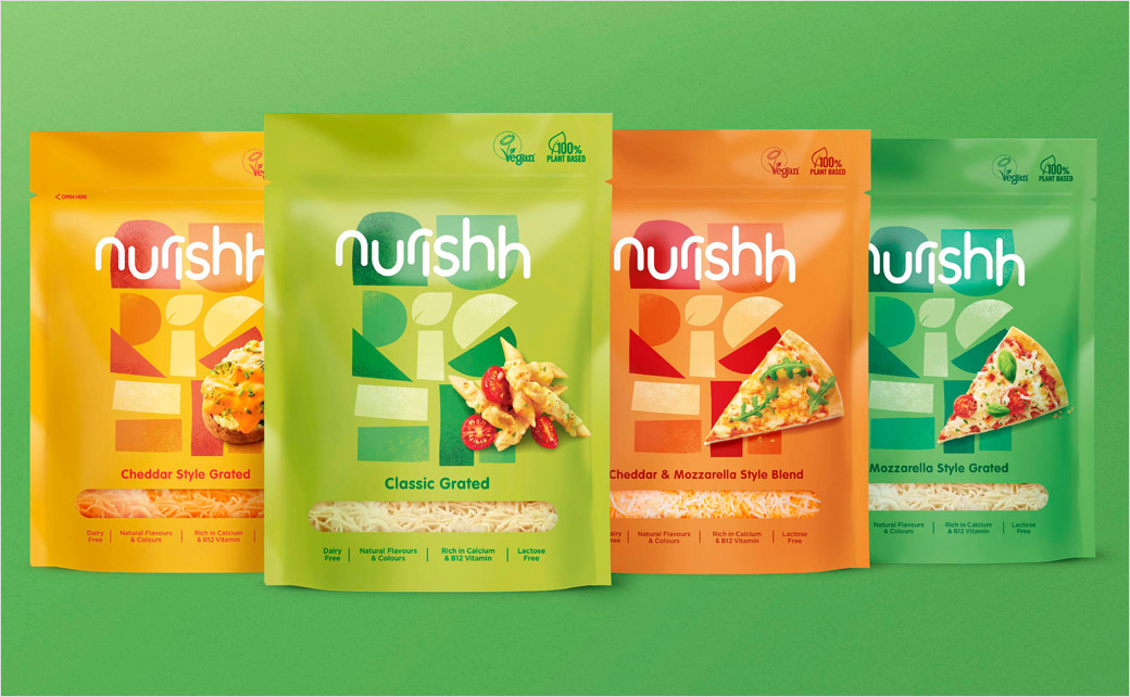
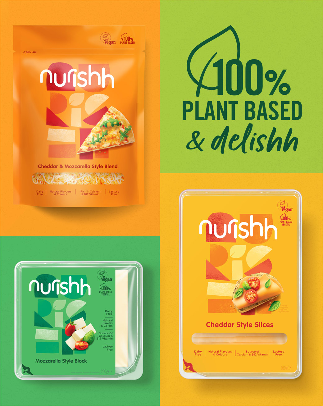
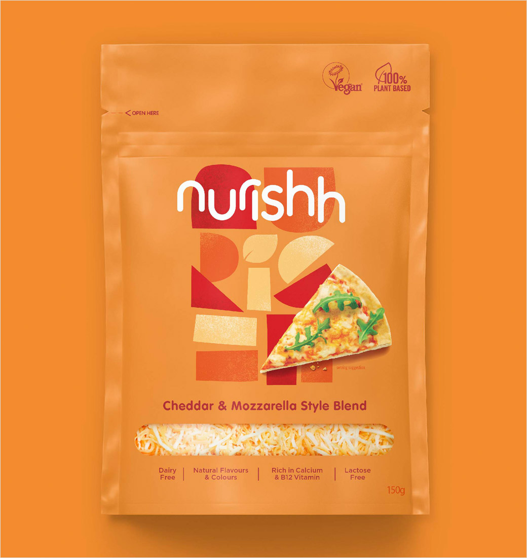
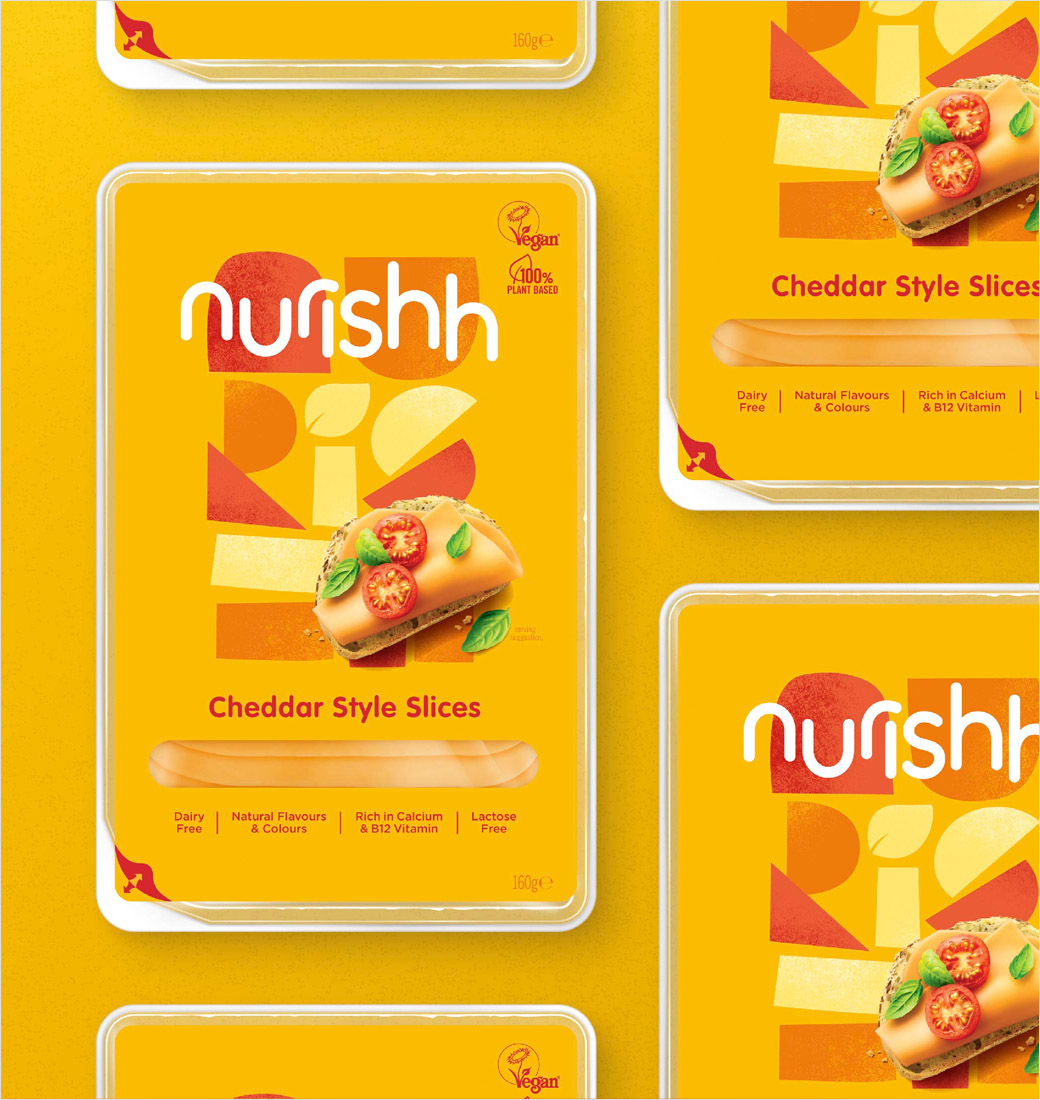
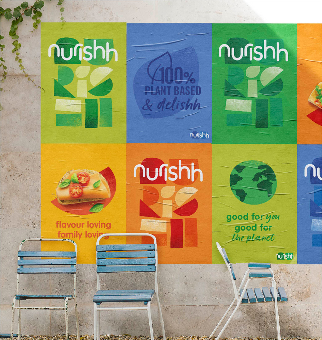
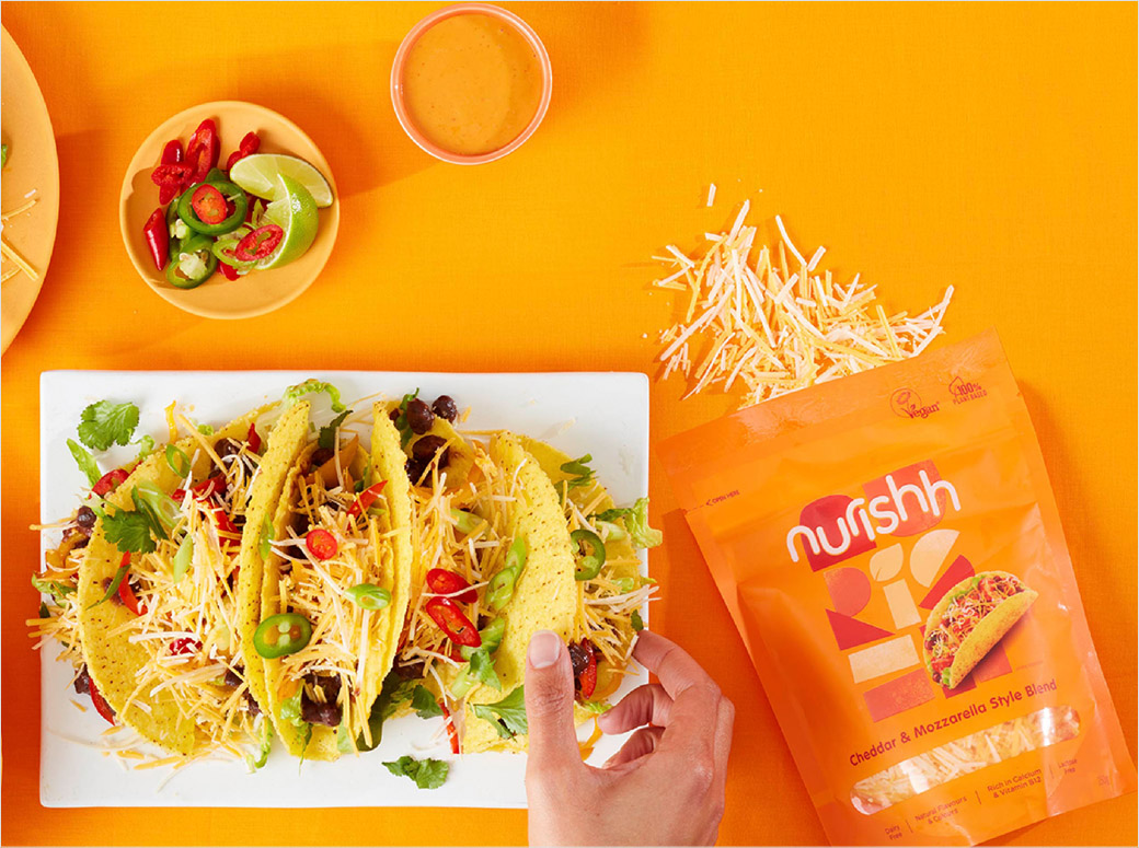
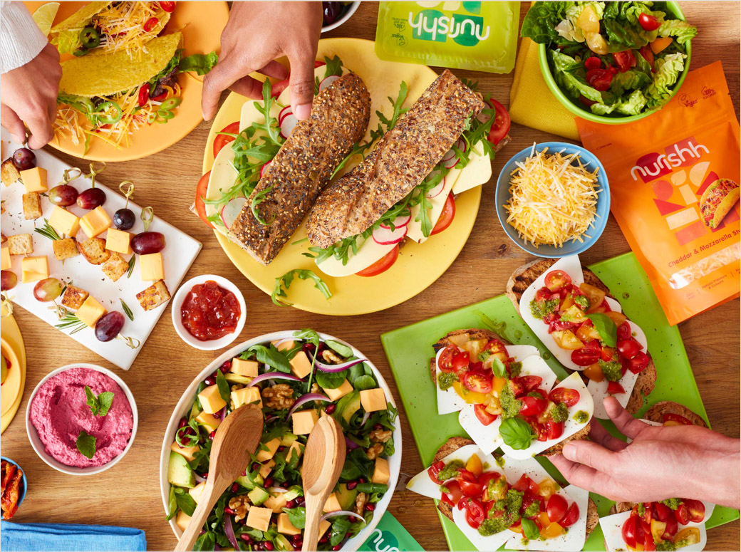
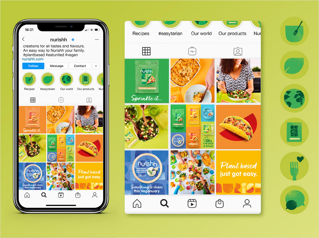
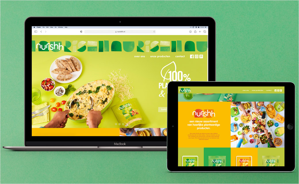
As an alternative, Nurishh’s packs use on-pack photography, bright colours, informal type, and even “Bauhaus-like” modular forms.
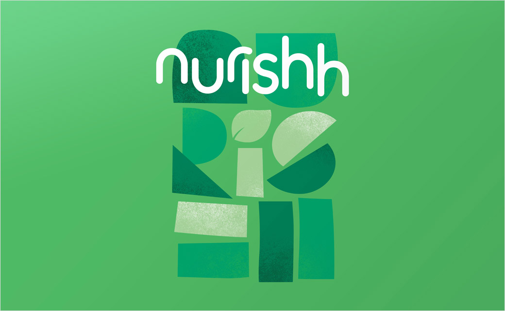
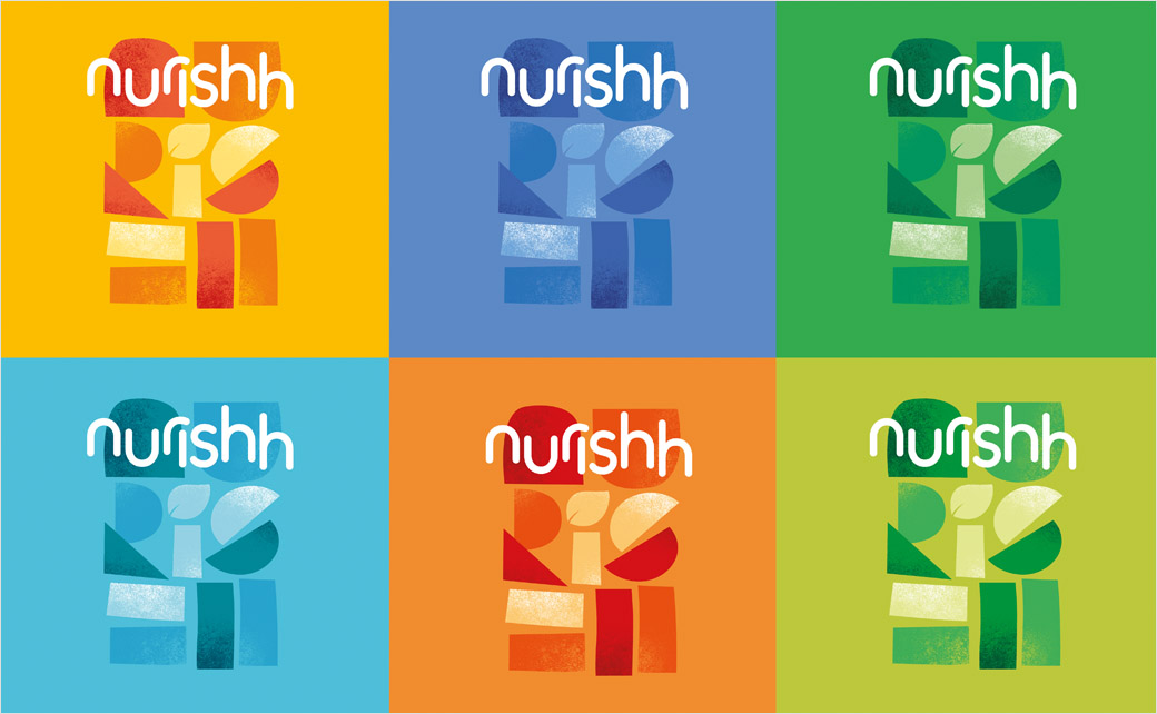
The Nurishh logotype, meanwhile, is set in all lowercase, and is used alongside more illustrative lettering formed of simple shapes.
“These abstract shapes represent Nurishh’s mission to bring everyone together. All food needs and cravings are fulfilled with Nurishh,” says Kelsall.
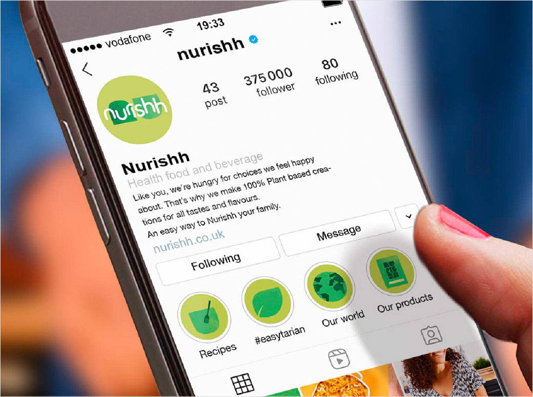
Stacked and condensed versions of the logo are further meant to illustrate how the brand overall was created to be flexible across varying touchpoints from digital to print.
“As a product, Nurishh makes plant-based cheese accessible and inclusive, and the brand reflects this,” asserts This Way Up’s founding partner and managing director, Chris White. “Accessibility and inclusivity have been the building blocks of creating a brand experience – both in real life and online – that welcomes our agile home heroes fully into the fold.”
Adding: “Nurishh ushers in a new era for plant-based cheese, breaking away from muted vegan cues to embrace a playful, inclusive future for anyone seeking out healthier – but still delicious – options. We’re proud to have been part of building the brand from day one.”
The designs have already rolled out in the US and Europe, and are currently stocked in Sainsburys and Asda in the UK.
This Way Up
www.thiswayupdesign.com


