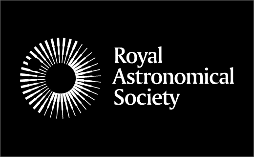
Royal Astronomical Society Marks Bicentenary with New Logo
Britain’s world-famous Royal Astronomical Society (RAS) has revealed a new logo design as part of its bicentenary celebrations.
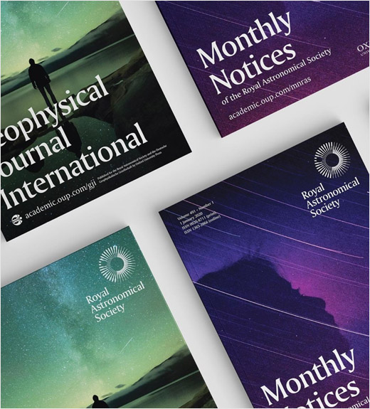
The new symbol, which also gets an animated variant, forms the centrepiece of a rebrand carried out by London-based design consultancy, Johnson Banks.
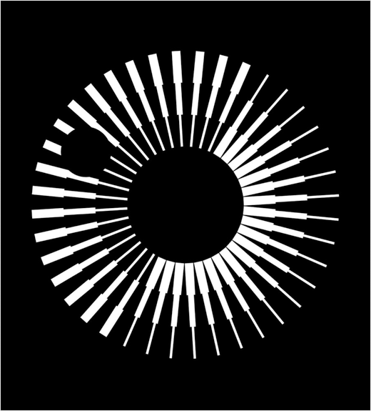
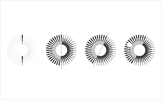
Inspired by, among other things, the Society’s motto ‘Let whatever shines be observed’, the logo features stepped spokes that are repeated and rotated to form a symbol that the designers say can be interpreted as “a stylised eye or planet with an orbiting moon”.
It is also turned 23.5 degrees to mirror the Earth’s axis, which is tilted 23.5 degrees from the plane of its orbit around the sun.
The refreshed logo is accompanied by a primary colour palette of black, white and grey, and a secondary palette of colours that are claimed to allude to the land and sky.
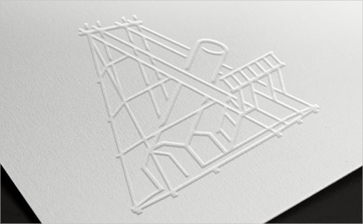
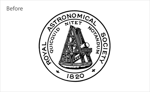
A “simplified” version of the Society’s 200-year old original logo, which featured an engraving of the telescope designed by their first ever president, Sir William Herschel, has also been retained for use on certificates and medals.





Johnson Banks
www.johnsonbanks.co.uk


