The Guardian Newspaper Reveals New Logo Design
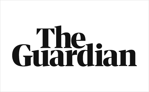
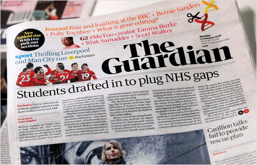
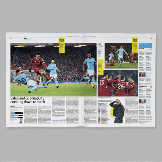
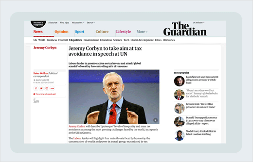
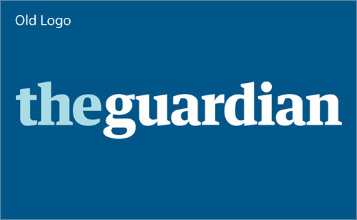
The Guardian newspaper has unveiled a new look that includes a redesigned wordmark.
The refreshed identity also includes an updated colour palette for both in print and online, as well as a new font, called ‘Guardian Headline’, that is described by Alex Breuer, the Guardian’s executive creative director, as “simple, confident and impactful”.
Both the new logo and font have been created in collaboration with design agency Commercial Type, who created the original ‘Guardian Egyptian’ font.
The aesthetic revision is a result of the paper’s plan to switch to a tabloid format; the Guardian was formerly known as a “Berliner” – a style unique to the UK and one that represented a mix between a broadsheet and a tabloid.
Being a tabloid means the paper will now be cheaper to print, which in turn is expected to save the company millions of pounds. Last year the newspaper reportedly made a loss of around £40m.
“Since we announced our plans to change format seven months ago, it’s been an exhilarating period of creativity, imagination and focus, and I’m thrilled with the result: a new paper that feels bold, striking and beautiful, and still unmistakably The Guardian,” says Katharine Viner, the paper’s current editor-in-chief. “Our move to tabloid format is a big step towards making The Guardian financially sustainable and ensuring we can continue to invest in agenda-setting journalism for generations to come.”
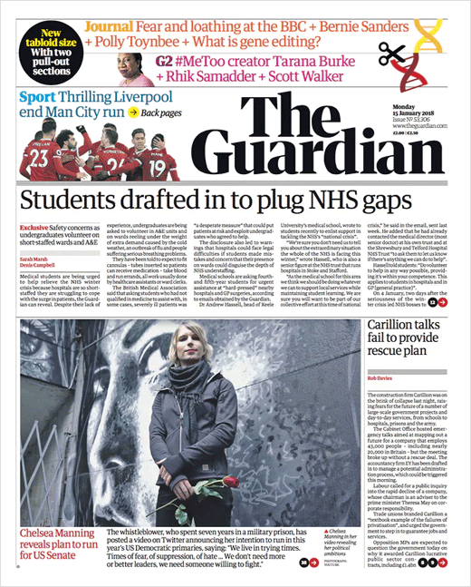
Source: The Guardian


