The Atlantic Magazine Unveils New Logo Design
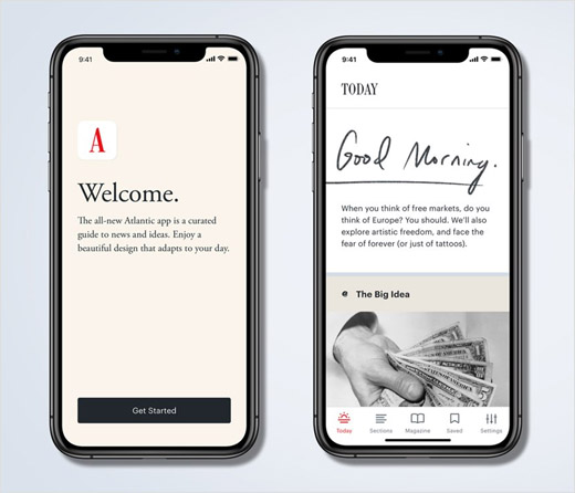
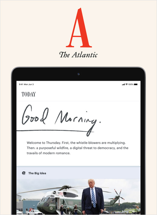
Politically-centred magazine and website The Atlantic has unveiled a refreshed look that includes a new logo, custom typeface, and redesigned iOS app.
The new visual identity is claimed to be the most significant in the U.S. publisher’s 162-year history.
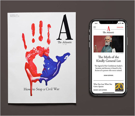
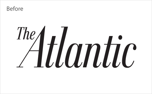
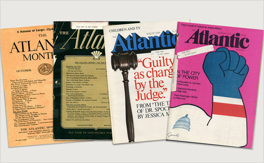
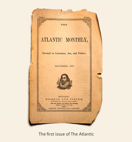
The Atlantic wordmark that has consistently topped the magazine in different forms for a century and a half has been updated to a large letter “A”, while a bespoke typeface, dubbed “Atlantic Condensed”, is claimed to have been inspired by the original type chosen by the magazine’s founders in 1857.
“It seemed obvious to us that what we needed was an emblem—a logo. A ‘swoosh,’ if you will. But what could that logo possibly be? At some point, we noticed that we had already been clicking on that very logo, every time we went to The Atlantic online, or on the app, or on Twitter—that is, a giant A. There it was, staring us in the face. And the more we explored The Atlantic’s long history, the more we saw that A, Zelig-like, showing up. Which is to say that, although the A seems radical, it is in fact historically grounded,” explains The Atlantic’s creative director, and former book designer, Peter Mendelsund.
“The design is bold but classical, beautiful but spare, and respectful of the reader most of all. We’ve rethought everything about the way we present The Atlantic to the world, helping readers better understand our words through clarity in design,” adds editor-in-chief, Jeffrey Goldberg. “The resulting work makes The Atlantic visually arresting, classically informed, and radically modern, all at the same time.”
Source: The Atlantic


