SYFY WIRE Reveals New Identity Inspired by Comic Books
American cable television channel SYFY has refreshed the branding of its online news and content hub SYFY WIRE.
Led by network executives including svp-head of creative Jeff Blackman, vp-design Calvin Chu and design director Ariel Frost, the redesign is the result of a collaboration with creative studio BLOCK & TACKLE (B&T).
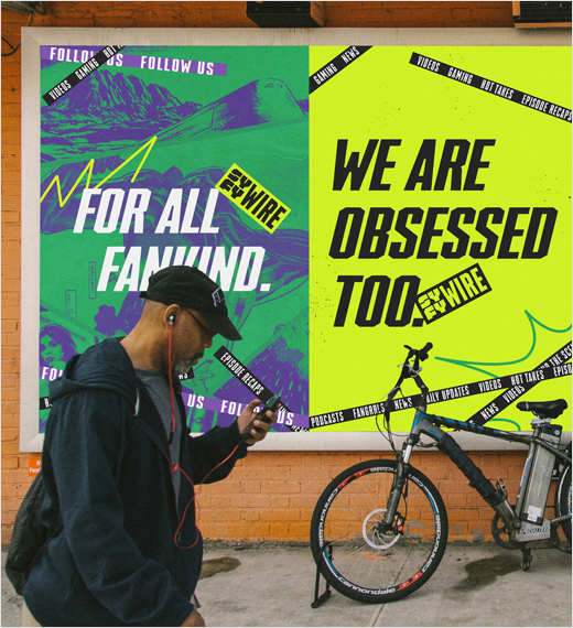
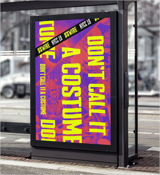
The New York-based agency was tasked with reinterpreting the SYFY master brand into a distinctive visual identity for SYFY WIRE, and the result is a design described as having “classic comic aesthetics” with “a fan-made feel” that tries to “capture the excitement and obsessiveness of geek culture”.
“Vintage comics provided the inspiration for both the punchy-yet-slightly-desaturated colour palettes and the functional comic POWs used throughout the identity,” explains B&T creative director, Adam Gault. “We were really inspired by the not-too-perfect, homemade feel of cosplay costumes… there’s energy, excitement, and love in those costumes, and we tried to capture all of that in our designs.”
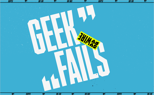
“The system of playfully placed SYFY WIRE logo stickers we developed was originally inspired by the ‘mark of authenticity’ stickers placed on collectable comic books,” adds fellow B&T creative director, Ted Kotsaftis.
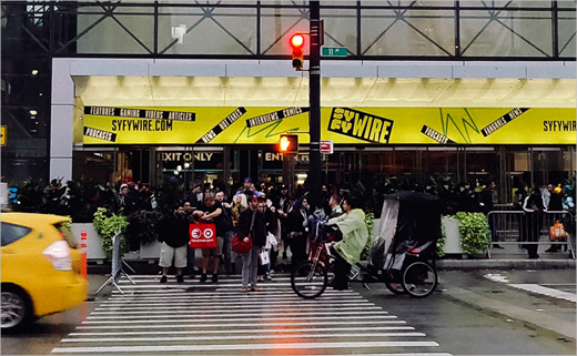
The new identity system encompasses on-air packaging, website, social, and podcast designs, event signage, and merchandising. Additionally, B&T’s deliverables included six animated packages for SYFY WIRE’s franchise shows and a generic toolkit for future properties.
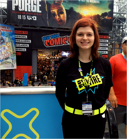
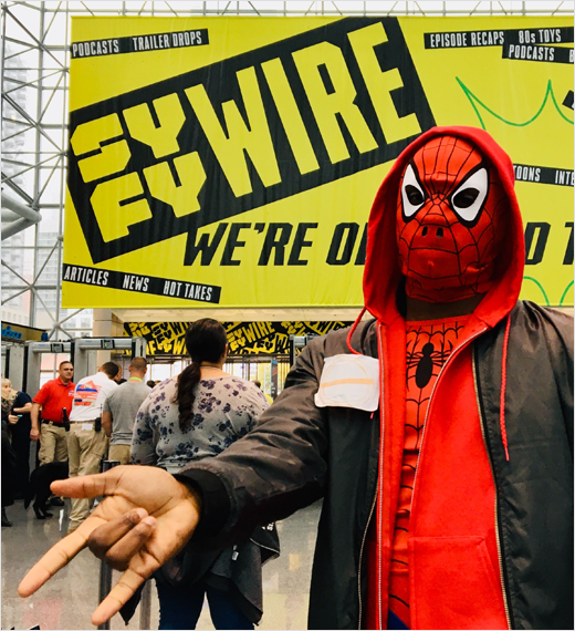
While the rebrand is now appearing on social media, franchise content, advertising, merchandising, and experiential content, it was first revealed to fans at New York Comic Con (NYCC) back in October of last year.





BLOCK & TACKLE
www.blockandtackle.tv


