Supple Studio Creates Identity for TWINE
Supple Studio has created the name and identity for TWINE – a new web platform and app created to help local businesses measure their economic, social and community impact more easily.
Funded and created by not-for-profit trust Power to Change, the software aims to be simpler and more user friendly than anything else on the market.
“We were briefed back in September by Power to Change to devise a name and brand identity for them to launch the BETA version of the platform in 2017. This is the first platform to offer a joined up approach to capturing not just financial data, but also social impact; this key difference lead us to the name TWINE,” says Supple director, Jamie Ellul. “Evoking two elements joining together. Once the name was agreed we started thinking about a visual language around ‘joined up thinking for local businesses’.”
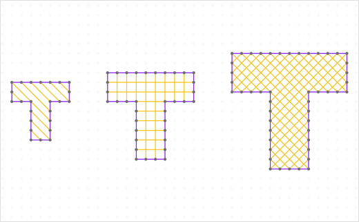
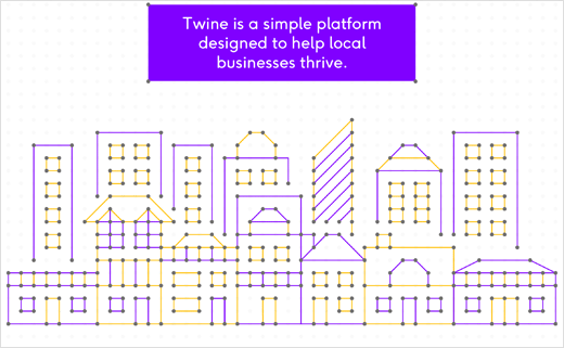
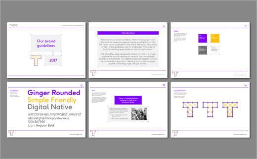
The brand identity therefore centres around a ‘graphic pegboard’ of dots and an adaptive T monogram. “The T can flex and grow to suit the size of canvas. And we’ve created a suite of patterns and sizes that echo the diversity of the businesses TWINE is aimed at,”explains Ellul.
The brand uses Face37’s typeface Ginger Rounded and further illustrations and icons are created using the pegboard style and coloured threads.
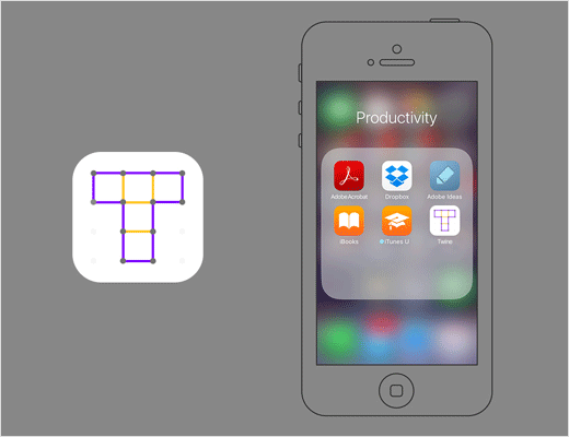
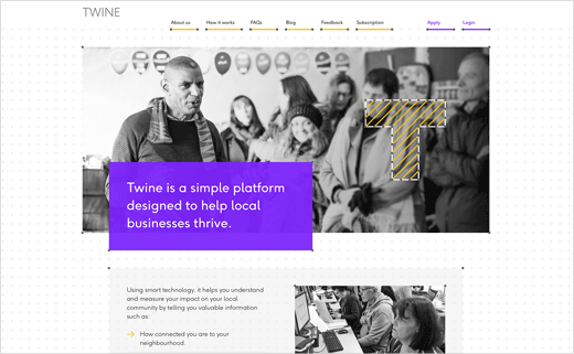
Digital design has been rolled out by Mud who have designed a ‘shop window’ website for TWINE and a look and feel for the app which has been built by Reason Digital. The digital pegboard underpins the design of the site, with all elements sitting on the grid and adapting to browser size.
Tone of voice and copy, meanwhile, has been devised by Kendra Futcher to be “simple, factual and can-do” in nature.
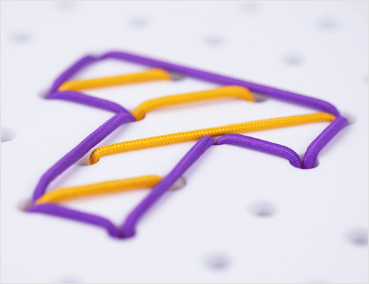
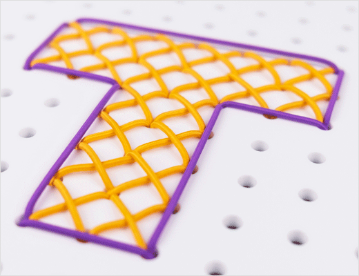
The identity further employs a suite of photography created by making physical versions of the T from laser cut perspex and coloured elastic. These will be used in training materials and marketing going forward.



Supple Studio
www.supplestudio.com


