Studio Tilt Unveils New IHOP Identity and Branding
Kansas-based design agency Studio Tilt has unveiled a new branding system for U.S. restaurant chain IHOP.
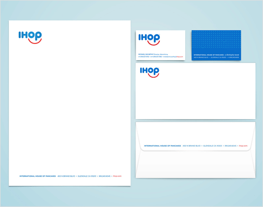
As well as a new logo, supporting visuals include a set of symbols that reference the International House of Pancakes and a smile dot pattern. A new corporate identity system, carry-out packaging, seven sub-brand logos and other print materials were designed as well.
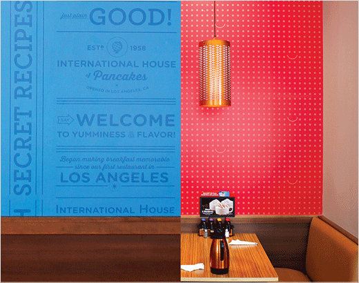
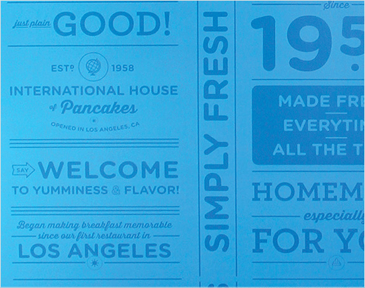
As part of the brand and restaurant refresh, IHOP’s brand was also incorporated into the interior design. Details include typographic messaging related to IHOP’s brand values and wall covering featuring a dot pattern with smile embellishments.
“The best way to start your day is with a smile. The IHOP dining experience is fun, fresh and upbeat,” say the designers.
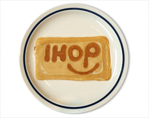
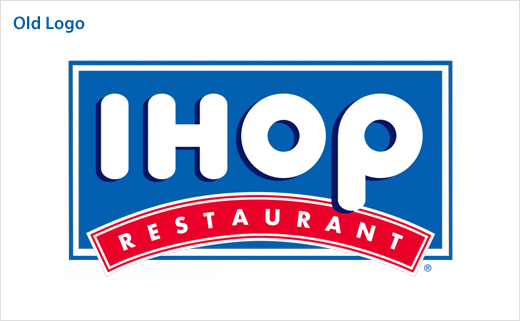
“We wanted to reflect this in IHOP’s new brand design. The primary logo is an evolution of IHOP’s iconic identity. It is no longer limited to residing in a box, which gives it more flexibility. The bold, geometric letterforms have been updated but still retain their friendly charm. They are complimented by a red smile, the international symbol for happiness.”
The design team further developed a brand standards manual that outlines all things related to IHOP’s new brand.






Studio Tilt
www.studiotiltkc.com


