Studio Blackburn Creates New Brand for Siglion
Studio Blackburn has created the new brand for Siglion, a development company made up of a partnership between Sunderland City Council, Igloo regeneration and Carillion.
Over the next few years Siglion aims to redevelop and revive three areas of Sunderland with housing, recreation and community projects as part of a new £100 million-plus plan.
Studio Blackburn was invited to take part in a five-way pitch to name and develop the brand.
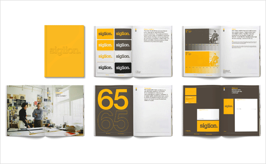
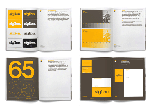
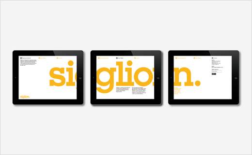
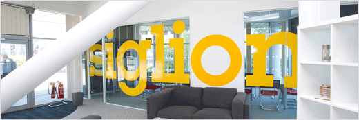
The design team chose a slab serif font for the logotype, while the colour palette adopts a warm grey and a bright yellow combination. Said to have been inspired by an airport signage system, the aesthetic is described as being “utilitarian” and deliberately understated.
“Studio Blackburn’s design work focussed on making a brand that didn’t overclaim, try too hard to be sexy or cool, or shout too hard about itself, the outcome was a look and feel that is workmanlike,” explained the designers.
Studio Blackburn
www.studioblackburn.com


