Straight Forward Design Creates Identity and Packaging for New Girl Femcare Brand ‘betty’
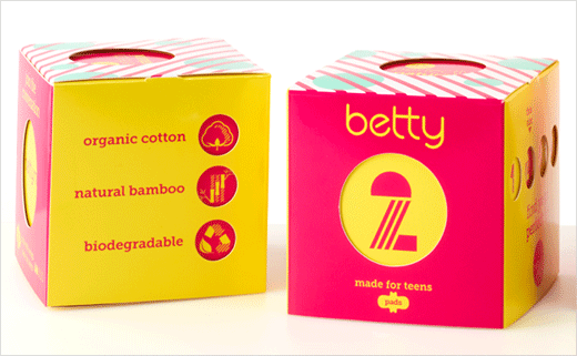
Straight Forward Design has created the branding and packaging for betty, a new femcare company launched to specifically target eight- to 16-year-old girls.
betty’s parent company, It’s a Monthly Thing (an adult femcare supplier), says it wants to “dismantle the taboo surrounding puberty” with dedicated products and a subscription service.
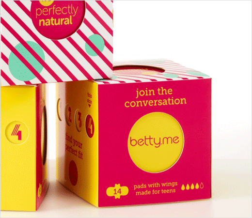
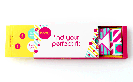
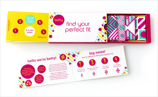
While freshening up and reworking a pre-existing logo, Straight Forward Design adopted a two-tier approach to the packaging and on-pack communications.
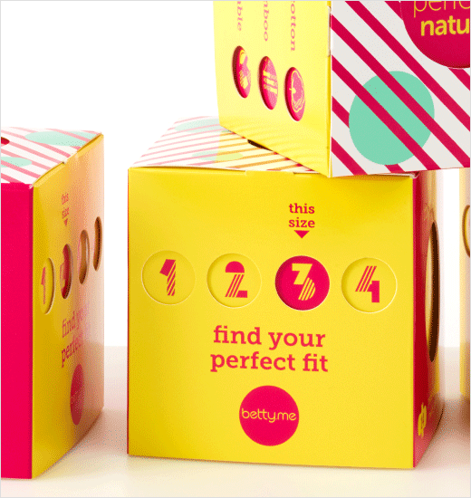
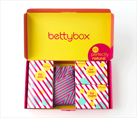
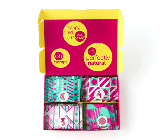
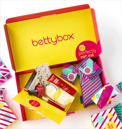
For example, the outside speaks to mums at point of purchase, with information about size, fit and the natural materials and packaging, while the inside, with its bright and colourful messaging, is aimed to appeal directly to girls.
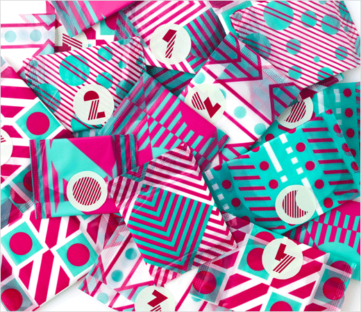
“The aim was to create a positive packaging and communications strategy that reassures girls about the practicalities of periods, the social and personal implications and the physical and emotional developments,” explain the designers. “Every product has its own instantly recognisable geometric pattern and vibrant colourway to help girls navigate the range, and the tone of voice is cheeky and irreverent. The message is clear: it’s natural, it happens, be nice to yourself and enjoy life!”
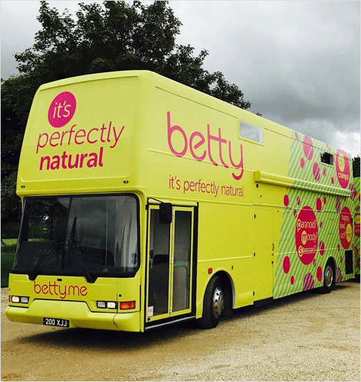
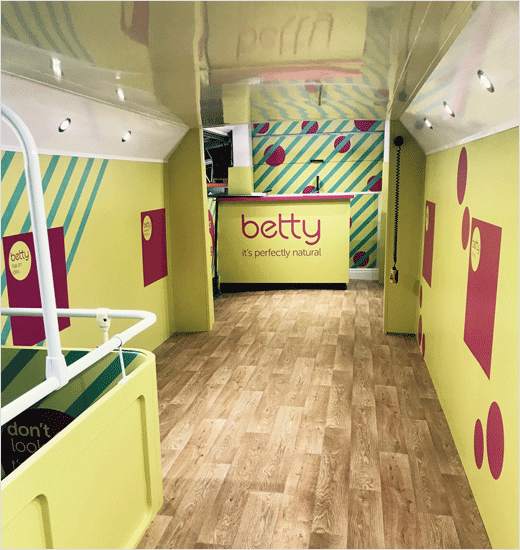
Straight Forward Design was also tasked with bringing betty’s on-the-road educational campaign to life with distinctly designed buses that visit schools and festivals, emoji mood stickers, sample packs and additional ‘fun’ merchandise to support the messaging.
Having already launched an online subscription service supplying ‘Pick & Mix’ pad packs and ‘bettyboxes’, betty now plans to launch into retail from autumn 2018.
Straight Forward Design
www.straightforward.design


