State of Oklahoma Reveals New Logo and Identity
Governor Kevin Stitt and Lieutenant Governor Matt Pinnell have revealed the new logo and branding for the State of Oklahoma.
The new look is said to be the result of nine months of work by a volunteer committee consisting of more than 140 creatives, dubbed “OklaX”.
“Last summer I invited more than 200 of Oklahoma’s brightest and most creative designers, marketing experts, communications professionals, videographers and photographers to join me in creating a new brand for Oklahoma,” explains Pinnell, “Their task was to develop a cohesive, new brand for Oklahoma that best represents our heritage and history, our booming industry, our beautiful one of a kind vistas, and most importantly, our greatest asset – our people. The vision behind this effort is to position Oklahoma as a top-tier destination for visitors, businesses, talent and citizens.”
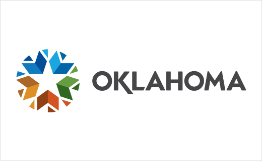
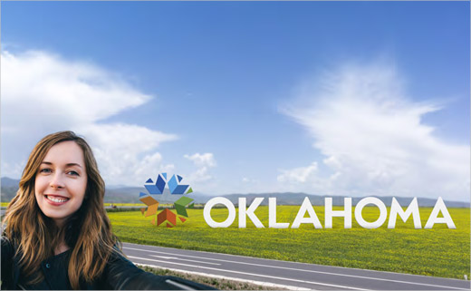
The new logo’s shapes and colours are claimed to reflect the earth, sky, water, agriculture and forest. A white star in the middle evokes the state’s original flag of 1911, while the chevrons outlining the star serve as a nod to Oklahoma’s military.
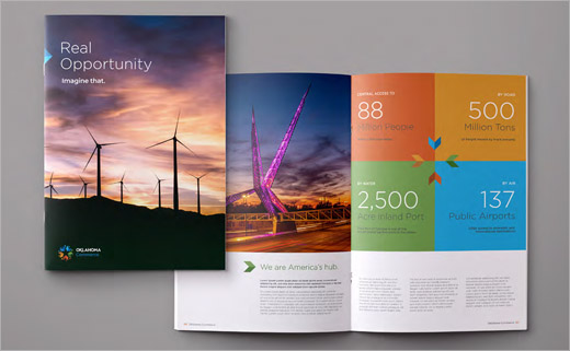
Together, all of the elements form a circle that directs “energy inward, highlighting Oklahoma as a hub at the centre of America”. Accompanying the logo is the tagline “Imagine that”.
“Based on key attributes uncovered and through a competitive audit, the OklaX team staked out an authentic emotional positioning of Oklahoma as a remarkably friendly place of people who embrace and support each other and newcomers, so everyone can thrive,” comments Pinnell.
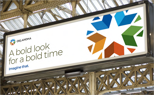
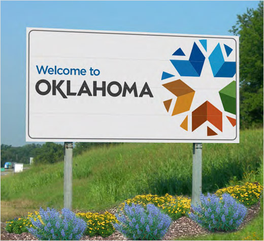
Over the next few months, the brand rollout will continue as motorway signs, tourism efforts, agency websites, and communications begin to implement the new identity.
Source: OK.gov


