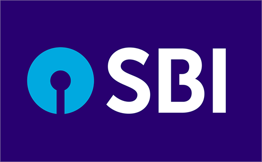
State Bank of India Reveals New Logo Design
State Bank of India, said to be India’s largest banking and financial services provider, has unveiled its new brand identity, designed to position SBI as a “modern, progressive bank, ready to meet the financial needs of all Indians.”
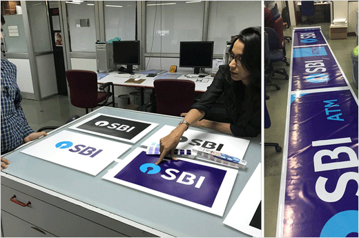
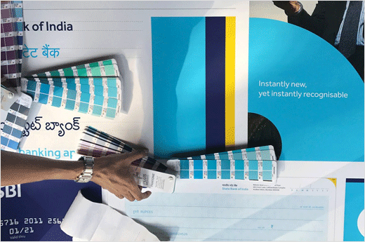
SBI’s senior management and the SBI brand marketing team, led by Dinesh Menon, collaborated with the founding partners of Design Stack (a Mumbai-based branding and design agency), Priyanka Bhasin and Anoop Patnaik, to develop the new identity.
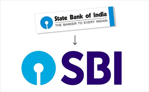
Set in a refreshed palette of blue colours, the new logo does away with ‘State Bank of India’, as well as the tagline that formerly accompanied it, namely, ‘The banker to every Indian’.
However, the blue keyhole symbol, which was originally designed back in 1971 by Shekhar Kamath from India’s National Institute of Design (NID), has been retained.
The symbol is accompanied by the wordmark ‘SBI’, which is set in a modern sans serif typeface that has been further adapted to create a sense of “weight and heighten the institutional feel”, according to the designers.
“It is a sturdy, geometric and highly legible typeface. To connect to the monogram, a gap was introduced in the letterform B in the word mark, just as the monogram itself. This creates a visual hook and also sets it apart,” explains Bhasin.
“Considering the stature of SBI, the idea was to create an identity that was concise and modern, but also retained the established and immediate recall that the logo enjoys. The SBI logo was created in 1971 at the National Institute of Design. As NID alumni, this project is close to us,” adds Patnaik.
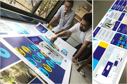
Design Stack
www.designstack.com


