South China Morning Post Introduces New Logo Design
The South China Morning Post (SCMP) has introduced a new corporate identity, which the Hong Kong-headquartered business says signifies its “evolution from a storied newspaper into a global media company”.
The launch includes a redesign of the English-language SCMP broadsheet and its digital products as well as a new corporate logo that is said to have been inspired by Hong Kong’s maritime heritage.
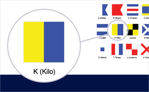
With its proportions based on the golden ratio, the yellow-and-blue marque is an iteration of the international signal flag Kilo, which means “I want to communicate with you”.
“The new look’s two-pane design also highlights the importance of understanding the world from both sides of the story, which is key to truth and fairness. In addition, the new identity, which graphically resembles a broadsheet newspaper, pays tribute to SCMP’s legacy as Hong Kong’s paper of record for 114 years,” added a spokesperson for the Alibaba Group-owned newspaper.
“As we grow into new marketplaces across multiple platforms, we need to have an identity that is simple, recognisable, and iconic – one that tells the story of who we are, where we have come from, and what we hope to achieve,” says the paper’s current CEO, Gary Liu.


Source: South China Morning Post


