SomeOne Rebrands Norwegian Telecoms Giant Ice.net
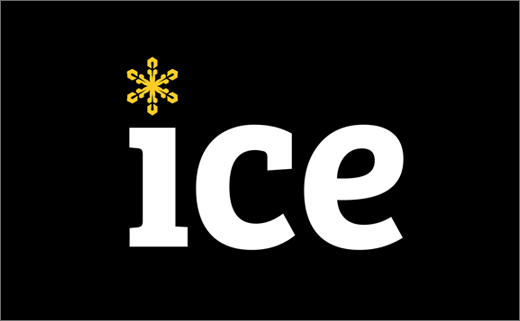
SomeOne has unveiled an all-new logo and identity design for Norwegian telecommunications company, Ice.net.
Launched in 2003, the business initially started off providing wireless broadband services, particularly in Norway’s more rural and remote regions.
More recently, as of June of 2015, Ice.net moved into mobile telephony thereby becoming a fully-fledged mobile operator, covering both private and corporate markets. It is now claimed to be Norway’s third biggest mobile network.
SomeOne says it has been working with Ice.net to help build the company into “an even more customer focused, customer experience brand”.
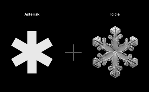
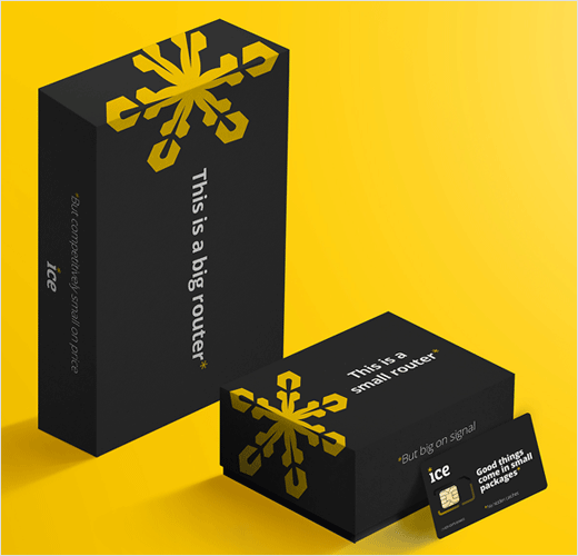
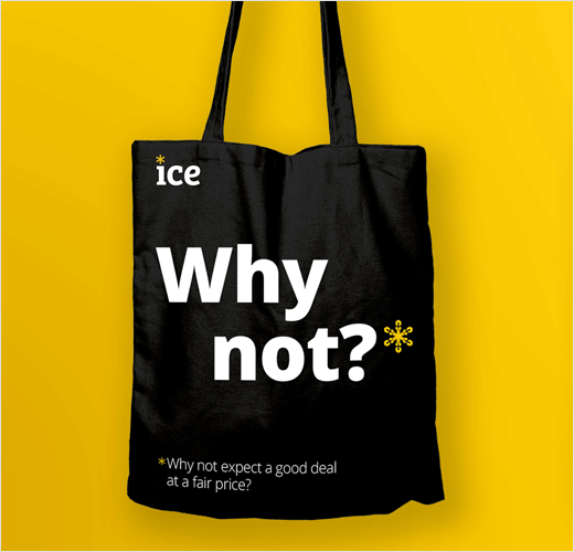
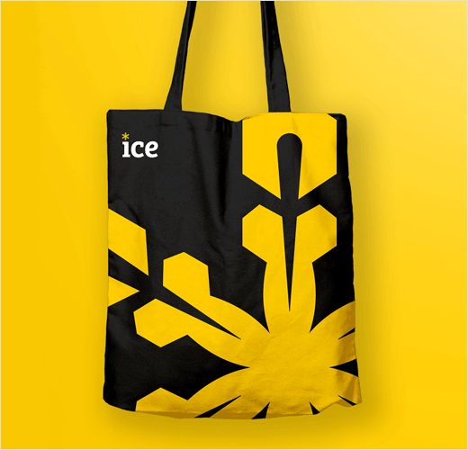
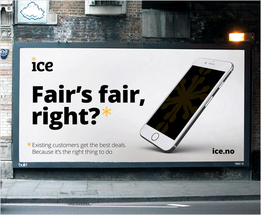
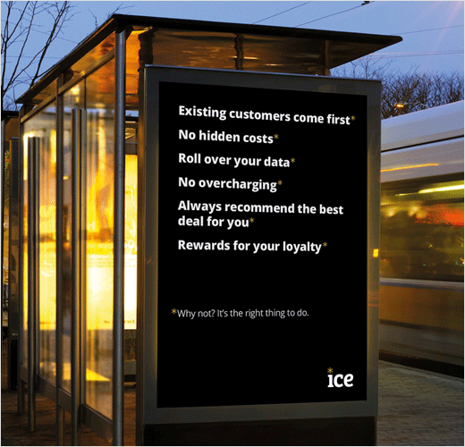
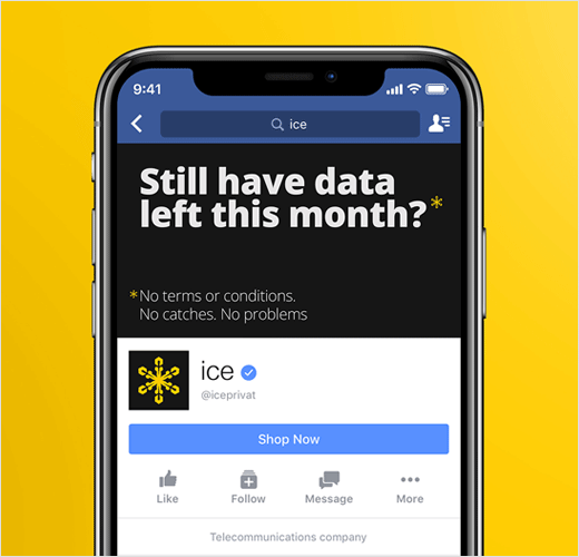
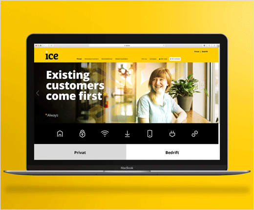
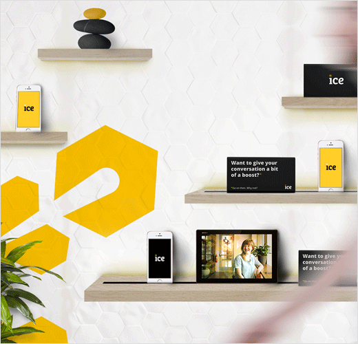
Central to the refreshed visual identity is an ice crystal symbol that is used both as a literal representation of an ice crystal and as a more lateral application as an asterisk, designed to highlight the benefits of the Ice brand.
“Traditionally an asterisk symbolises small-print, a catch, or something that needs qualifying – here it means good news. A good deal, and something genuinely of benefit to the customer,” says SomeOne.
“The ice crystal is used in a positive way throughout the brand and communications, to highlight the positives,” adds Gary Holt, founder and CEO of SomeOne.
“In a sector that is seen as struggling with trust and benefits, the Ice brand identity takes a more conversational approach. It creates simple and transparent communications that come from a brand that truly listens and reacts to what customers want,” further explains Helen Altoungarian, design director at SomeOne.
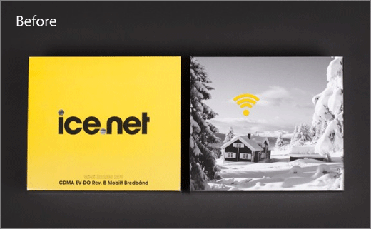
The new logo and identity replaces the previous design that was created by famed Norwegian architectural practice, Snøhetta.

SomeOne
www.someoneinlondon.com


