SomeOne Rebrands American Restaurant Chain – TGI Fridays
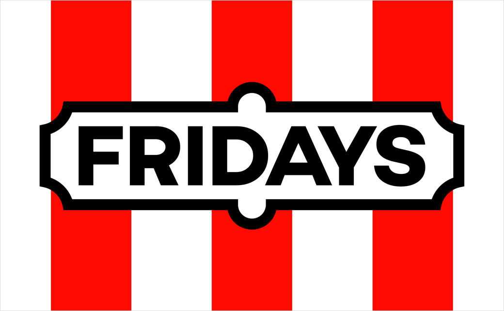
SomeOne has created the new branding and identity for well-known American restaurant chain, TGI Fridays.
Aesthetically, the rebrand, which also includes a name change to Fridays, harks back to the 1960s, with the business having launched in 1965 on the corner of New York’s 63rd Street and First Avenue.
“We began with a full strategic overhaul, drilling down to and establishing the key essence of the brand – The Fridays Feeling, that original idea of fun and entertainment from back in New York. It was essential that this strategic driver was something that could touch every corner of the brand, from the design, to customer service to physical interiors,” explains SomeOne’s design team, which has been working on the new identity for the past six months.
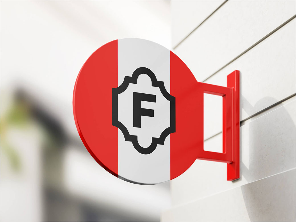
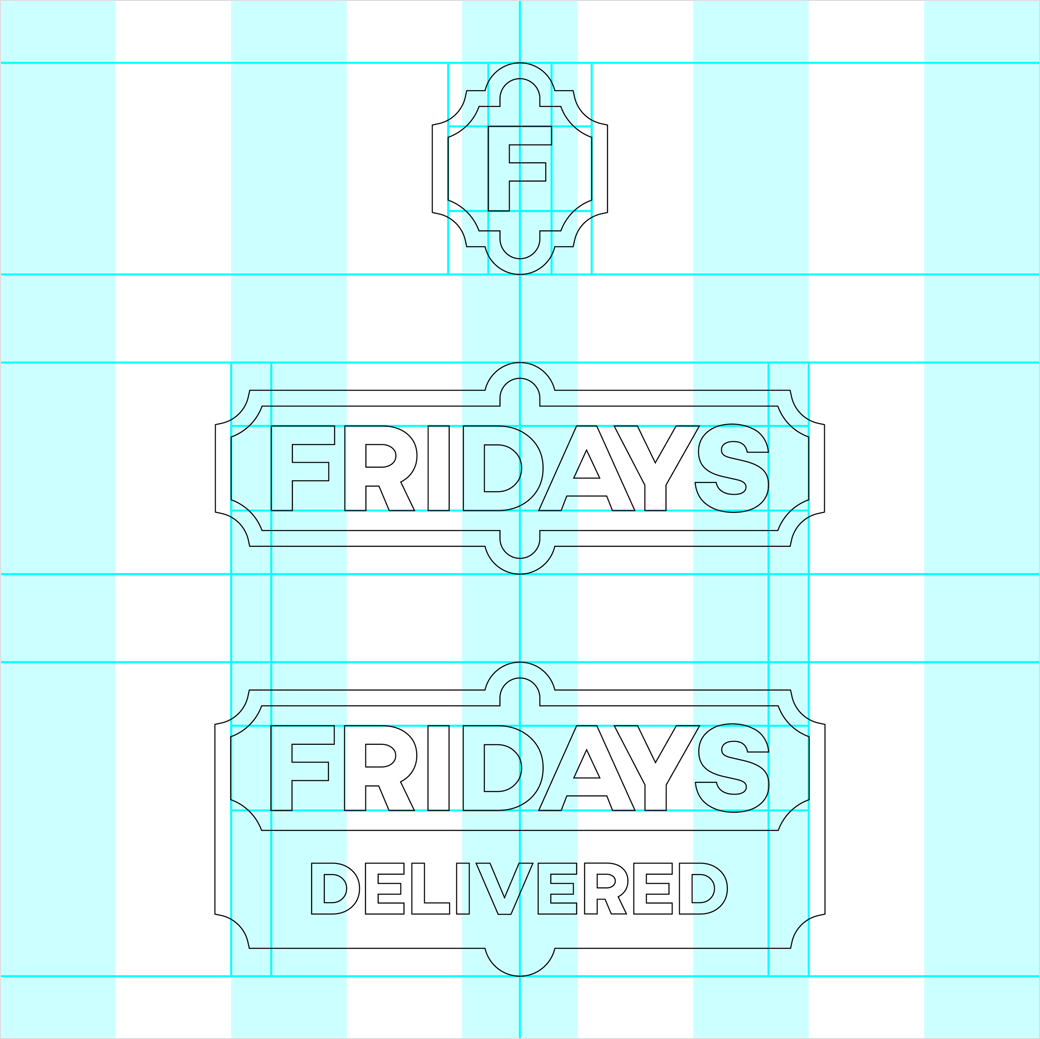
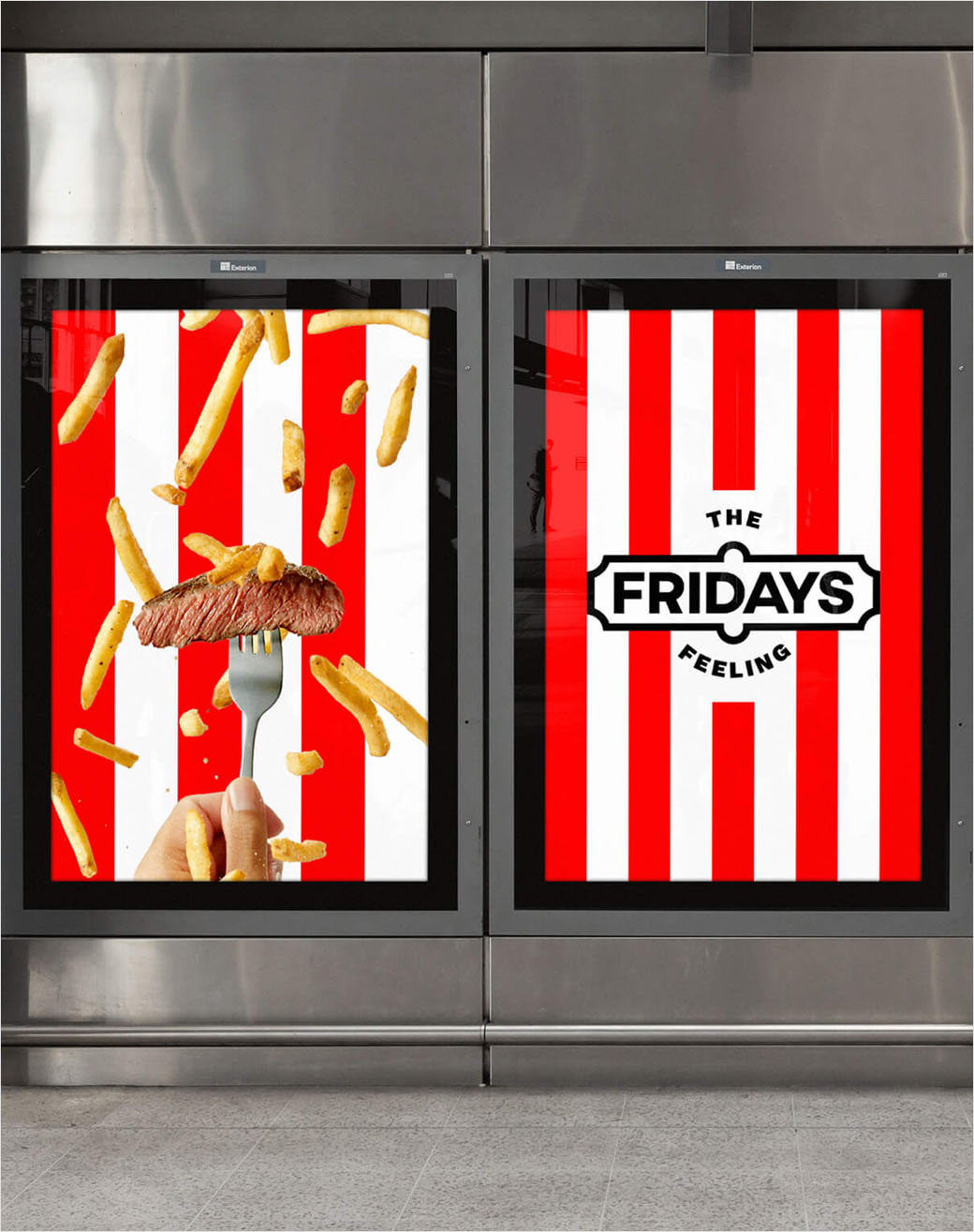
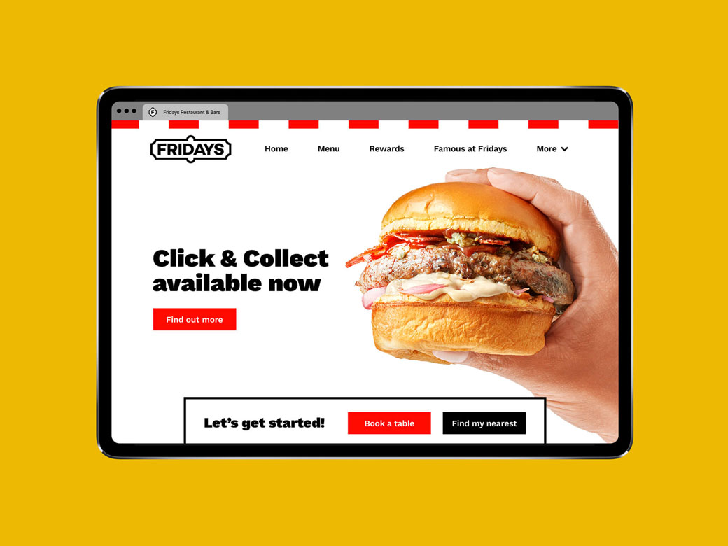
The new logo is also said to have been inspired by the company’s original signage. After testing a range of logos from the past, the designers determined the holding shape to be the most recognisable part and therefore reintroduced it in what is claimed to be “a bold, simple and sophisticated way”.
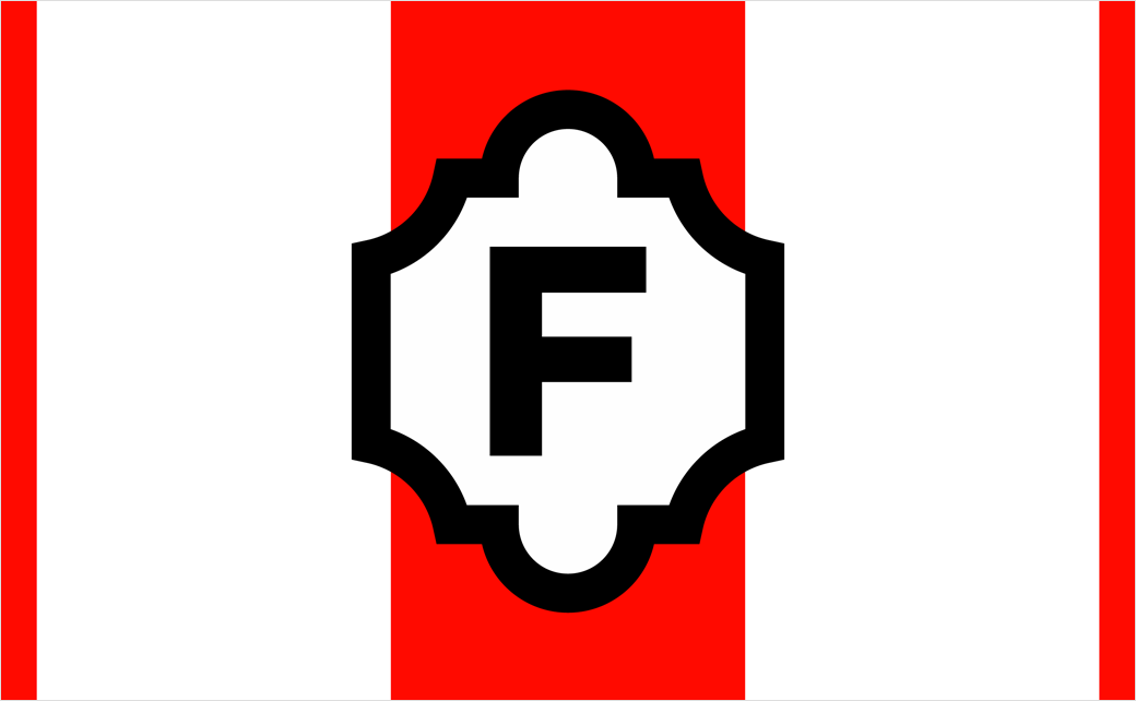
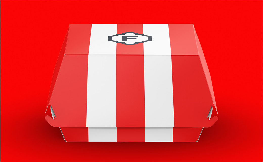
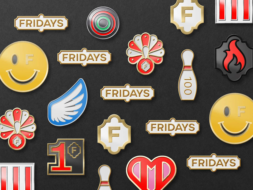
The logo also collapses down to a compact “F” symbol, particularly when it is seen close up, onsite or online.
“Steeped in heritage, with a modern twist, the logo is a reflection of the new approach and attitude,” says SomeOne’s creative director, Rich Rhodes.
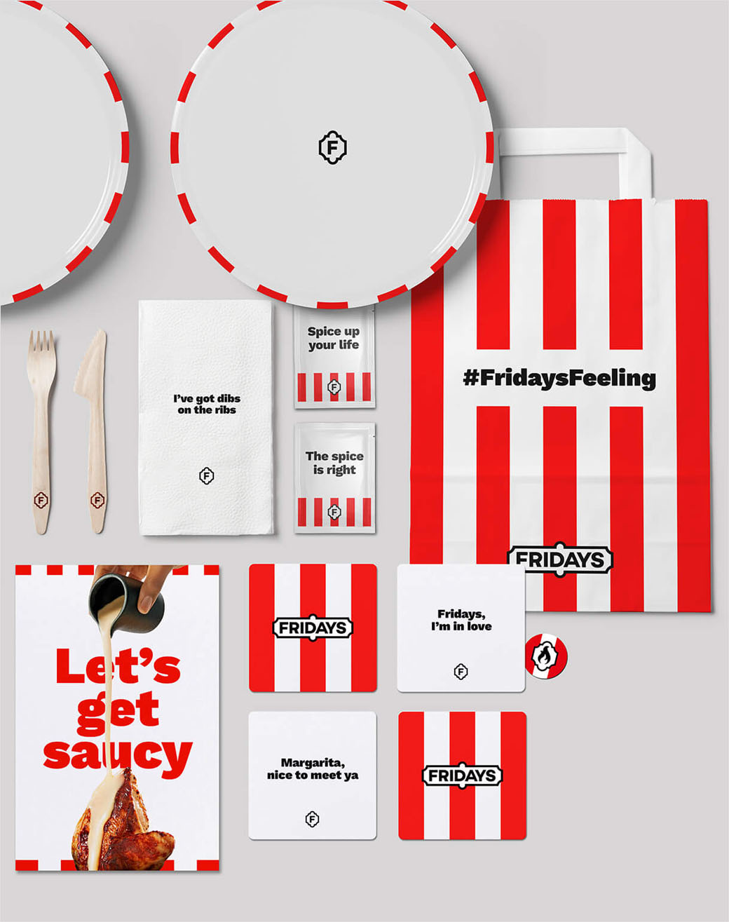
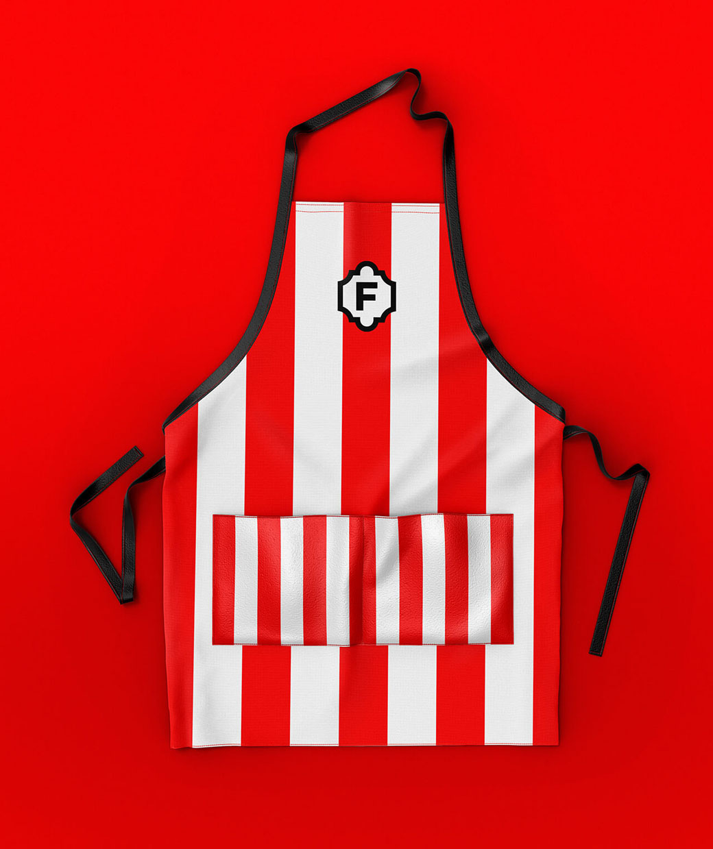
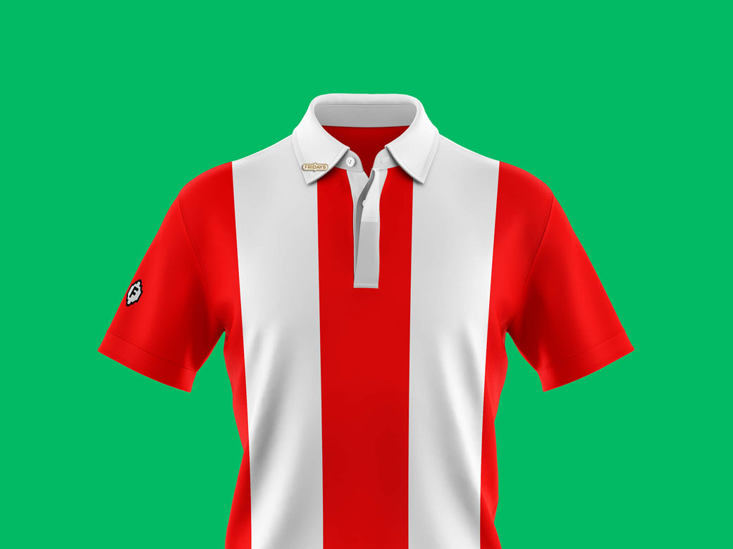
In addition to the logo, the designers have also gone back to the brand’s roots with the use of vertical stripes, which were reportedly inspired by the famous Barnum and Bailey travelling circus. Described as the “backbone” of the identity, the stripes can be adapted “to play either a significant visual role or more of a subtle detail”.
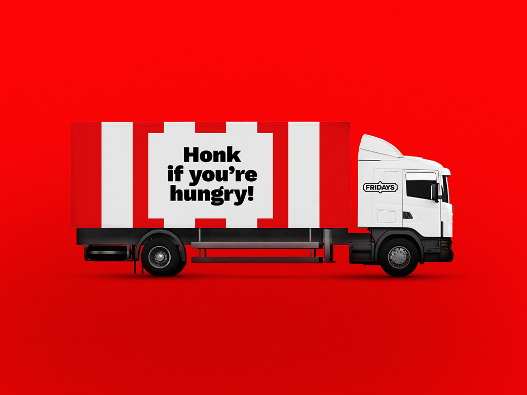
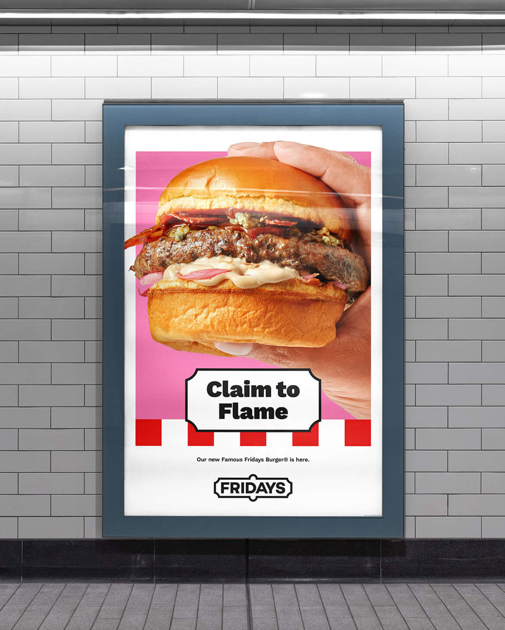
The new tone of voice, meanwhile, adopts a deliberate humorous approach, in an effort to give the refreshed identity an added ‘fun’ factor.
“While we focused on developing a watertight operating system, it was important that we didn’t lose sight of the character synonymous to Fridays. So we have made sure to deliver a touch of frivolity on all design materials and instil that as part of the brand’s DNA. Whether it be playful copy, cheeky icons or illustration,” explains Cosmo Jameson, design director at SomeOne.
SomeOne
www.someoneinlondon.com


