Soccer Team D.C. United Unveils New Logo Design
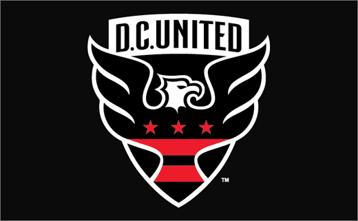
American soccer team D.C. United has unveiled a new logo design for only the second time in the club's history.
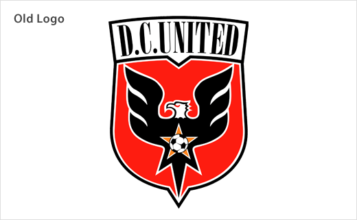
The Washington-based team's updated crest is being described as an "evolution" of the original design that was unveiled after the 1997 season.
United says it conducted "thorough" market research two years ago on the current state of the brand.
"The research pointed to the need for modernisation to reflect the growth of the sport and the league in the United States. The current brand did not adequately represent the United community. Maintaining a strong tie to the tradition of the club was a priority, because that same research also spoke to the strong sense of nostalgia and tradition of the community, a tradition that the club is supremely proud of," said a club spokesperson.
United subsequently hired New York agency Red Peak Group to develop the new brand positioning strategy, which ultimately steered the logo design process as well.
After working with Element Advertising on the initial logo design, Red Peak Group brought in graphic designer Peter Horridge to create the final version of the crest.
Horridge is based in the UK and also redesigned badges for Liverpool FC and the England Football Association, as well as the Royal Coat of Arms for the Queen of England's Royal Household among other well-known marks.
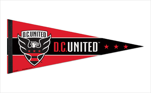
The logo features a new shield shape, an updated wordmark, an enlarged eagle and the stars and stripes of the Washington D.C. flag, "is more of a modern evolution than a revolution," Tom Hunt, United chief operating officer, said.
At the top of the crest, the wordmark is written in a new, handlettered font, which the club says delivers better readability, while also showcasing the "confidence" of the evolved brand.
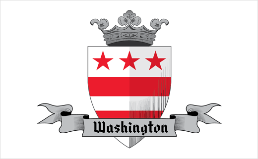
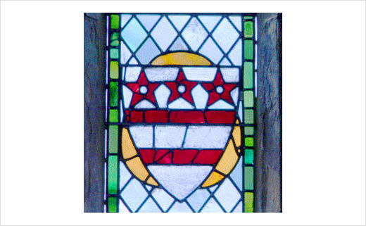
The shape of the shield is based on the George Washington family crest as well, which dates back to 1559, and aims to provide a connection between the club and the nation’s capital. This version of the crest still hangs as a stained glass window at Selby Abbey in Yorkshire, England.
The "Stars and Bars" are taken from the D.C. flag, but originate with the Washington family crest, and create a further link with the District.
The shape of the eagle’s head has not changed since the team’s inception in 1996, but is now turned to the right. The wings of the eagle have also been enlarged and are seen "escaping out" of the shield.

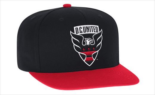
Source: D.C. United


