Snapple Unveils New Logo and Packaging Design
New York-headquartered brand agency and retail design consultancy CBX has unveiled new graphics for tea and juice drinks brand, Snapple.
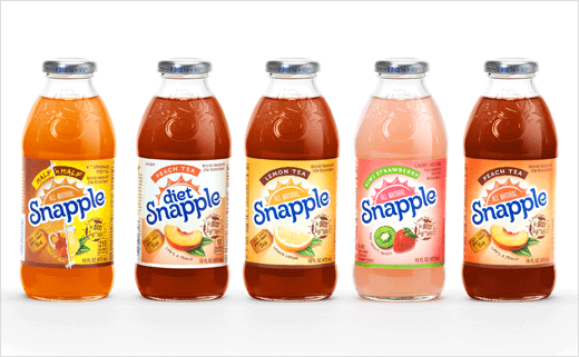
Coming at a time when the company is trying to to ramp up growth in markets across the United States and globally, the refresh touches all Snapple products, which includes more than 20 different flavours of regular and diet teas and juice drinks.
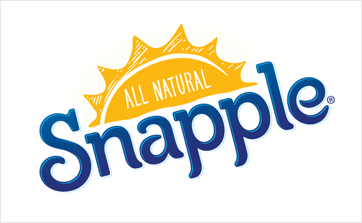
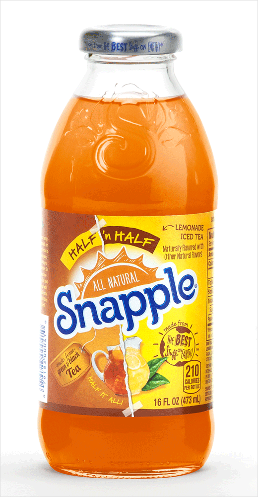
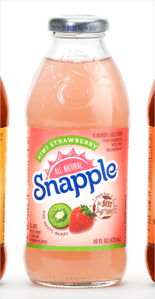
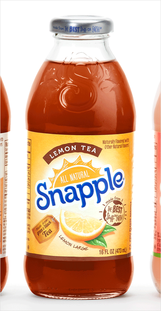
The new Snapple logo includes a sun graphic in a hand-drawn style to provide the “playful, natural character” of the brand, according to the designers. The evolved logo also uses letterforms with a bit more movement, yet maintains the curl of the well-known Snapple ‘S’.
The new design further includes a hand-drawn New York skyline, which aims to emphasise Snapple’s New York roots.
Additionally, CBX has created an Earth icon to embody “Made from the Best Stuff on Earth,” one of the brand’s trademarked statements, which dates back to its Brooklyn storefront origins. “We wanted to make that statement more ownable,” says Rick Barrack, chief creative officer for CBX. “And we carried this element through to the top of the Snapple cap.”
The refresh includes the use of flavour captions such as “Life’s a Peach”, “Lemon Large”, “Takes 2 to Mango” and “Kiwi Meets Berry”.
“The captions help establish a sense of delight in Snapple’s great flavors,” says Satoru Wakeshima, CBX general manager, “and unlike its competitors, Snapple doesn’t take itself too seriously. These visual and verbal elements of the refresh work together for a uniquely engaging experience and add to the brand’s approachability.”
Snapple was originally founded in 1972 in Greenwich Village, New York. The brand is now available throughout the United States and forms part of the Dr Pepper Snapple Group.
CBX
www.cbx.com


