New Smoothie Brand ‘Mockingbird Raw Press’ Launches with Identity by B&B studio
B&B studio has created the logo and identity for Mockingbird Raw Press, a new smoothie and juice brand from food products company, Life Health Foods UK.
Encompassing brand positioning, creative strategy, naming, brand design and packaging, the look and style for the nascent drinks label aims to “reintroduce emotion into a now purely functional category”.
“It has been well over 20 years since Innocent set the bar high for smoothie and juice brands, and in recent years we’ve seen the whole category become increasingly conventional and conformist. Mockingbird was a fantastic opportunity to offer consumers something new and encourage them to reappraise a tired supermarket shelf,” explains Lisa Desforges, strategy director at B&B studio.
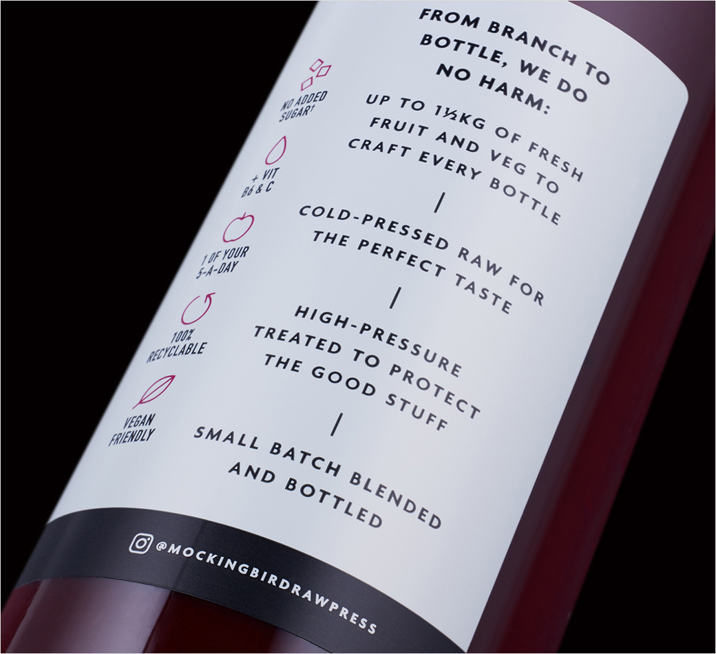
Highlighting Mockingbird’s ‘premium’ cold-press technology and so-called “Do No Harm” philosophy was paramount for the agency’s design team.
“The strategic solution was two-fold: first, introduce the codes of craft into the smoothie and juice category, borrowing from the worlds of spirits and cold brew coffee for a more premium look and feel; and secondly, retell the cold-press story in an emotional rather than literal way,” explain the designers.
Adding: “Do No Harm is the philosophy at the heart of Mockingbird Raw Press, reflecting the ability of cold-press to transform fruit and vegetables into smoothies and juices without damaging its nutritional integrity or clean authentic taste. As a brand manifesto, it speaks to kindness and care, setting the foundations for a brand in tune with an audience of young, purpose-driven consumers. The philosophy and brand name work hand in hand, inspired by the moral at the heart of the novel To Kill A Mockingbird – that it’s a sin to hurt something that does no harm.”
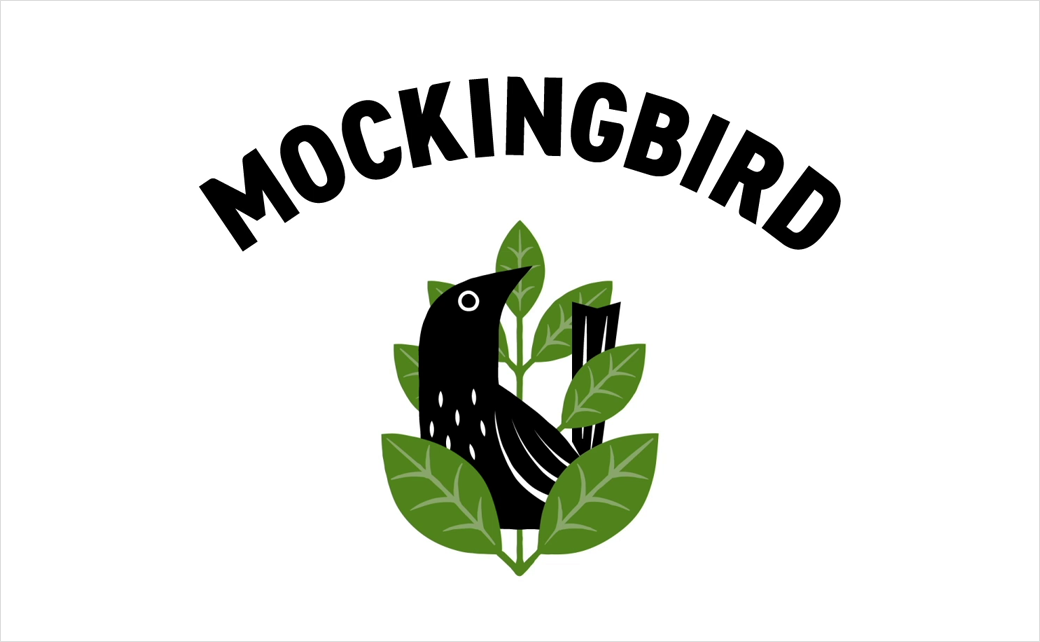
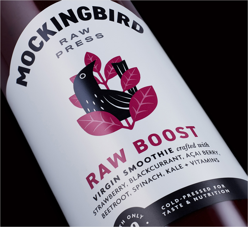
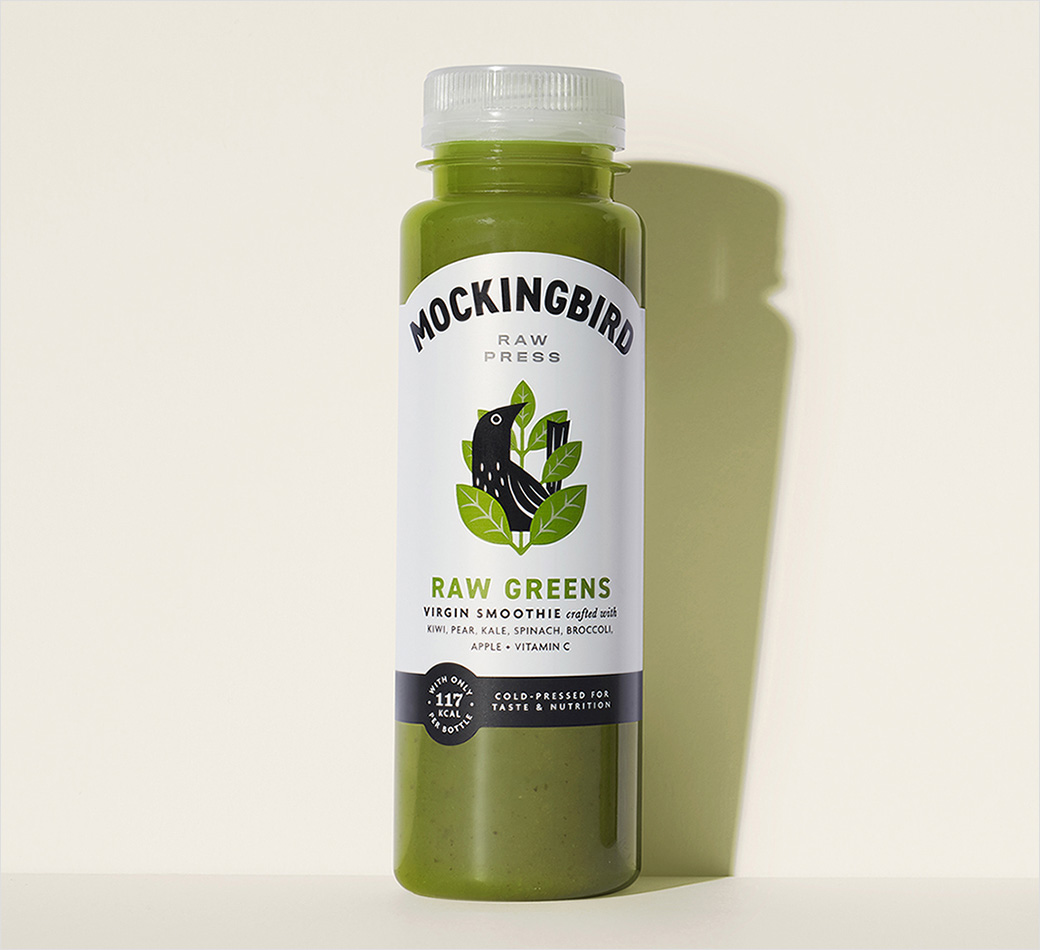
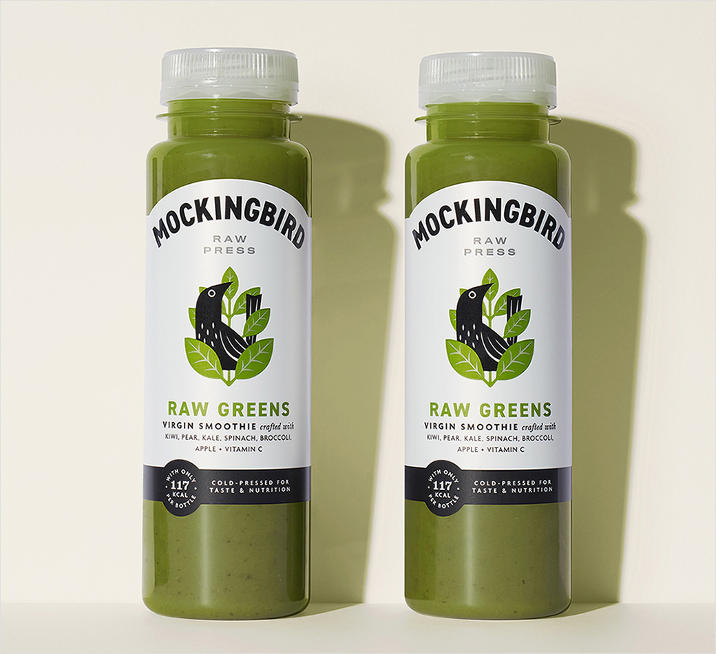
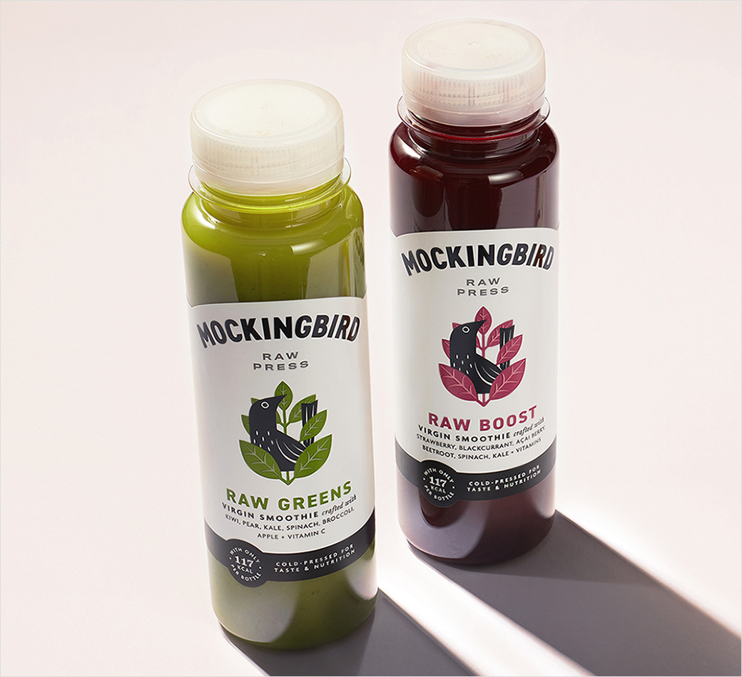
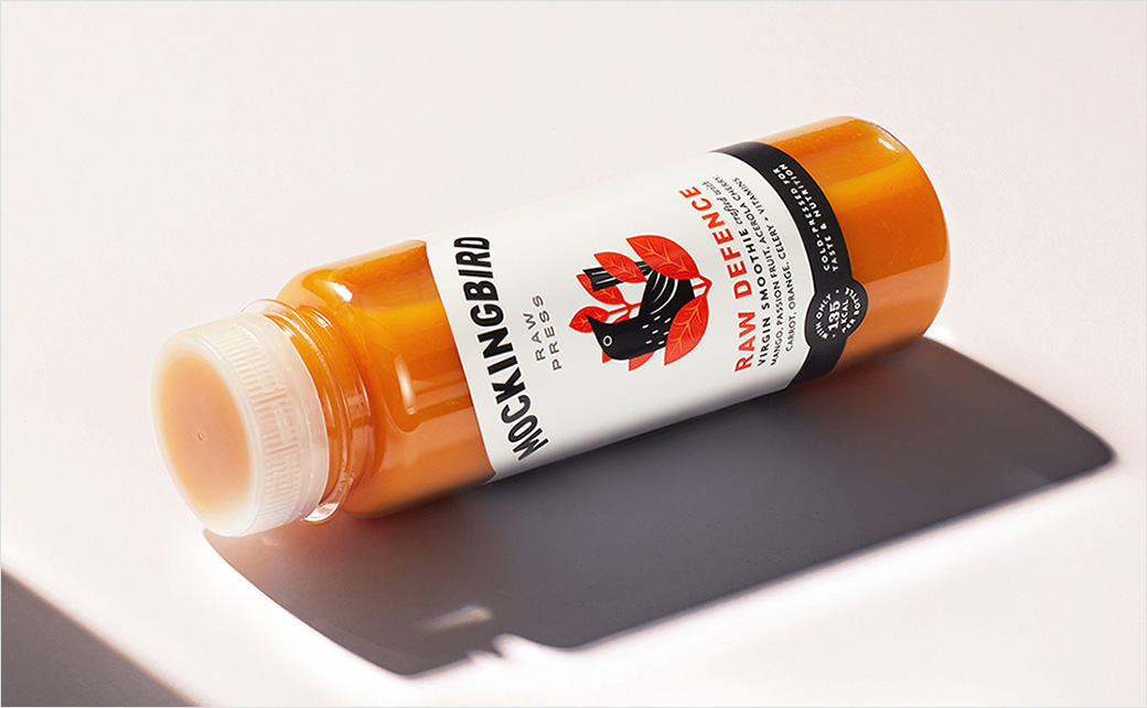
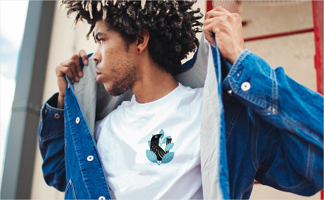
The above concept is encapsulated in the brand’s symbol – a playful bird icon that is protectively enveloped by leaves; the symbol is then heroed on packaging beneath a simple curved logotype and raw press descriptor, while the colours are deliberately restrained.
“Colour-coding is kept minimal, in the symbol’s leaves and product name, relying on the coloured liquid to communicate and challenging the category norm of full colour. The dominant monochrome palette of the label design signifies the brand’s more premium status and reinforces its craft positioning,” say the designers.
Mockingbird Raw Press is now available to buy in selected Waitrose Stores nationwide, Whole Foods Market and Planet Organic. Further retailers are expected to be announced soon.

B&B studio
www.bandb-studio.co.uk


