& SMITH Creates New Look for YO! Sushi
Design agency & SMITH has refreshed the brand identity for YO! Sushi, creating a new look for the global restaurant chain.
The designers say they wanted to align the brand closer to “the true taste of modern Tokyo” as part of the revised brand strategy. The visuals also take cues from Japanese anime and manga culture.
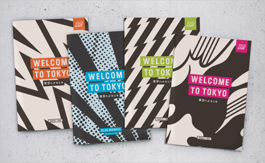
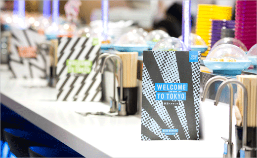
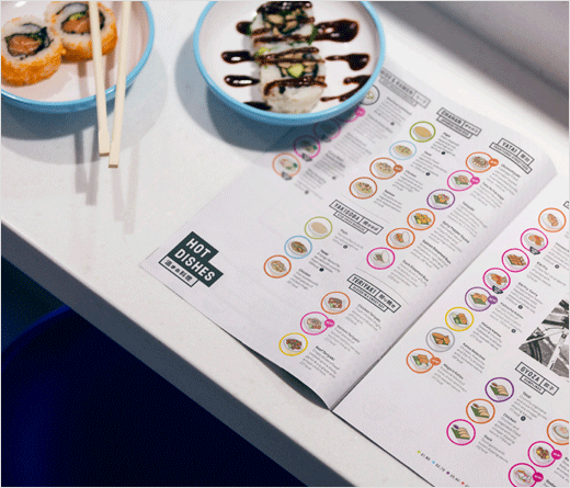
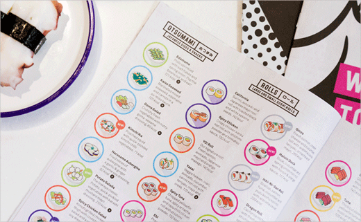
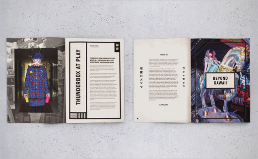
“We wanted to give everyone a taste of what’s going on in Tokyo right now. That’s where the zine/newspaper menu idea came from. It gave us the chance to show some nice snippets of art, fashion and music alongside their food. The idea is that the editorial content will change four or five times a year,” says & SMITH director, Dan Bernstein.
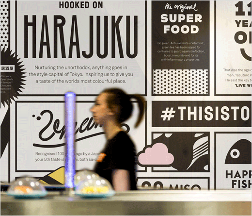
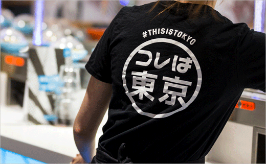
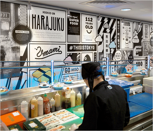
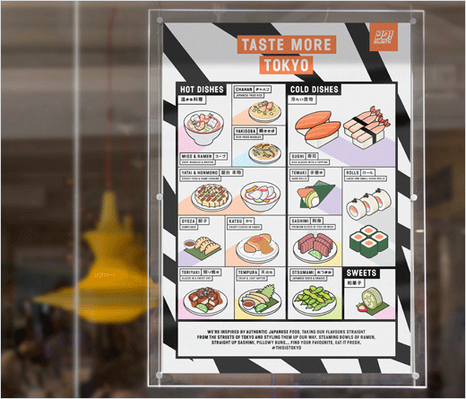
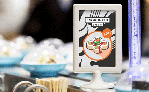
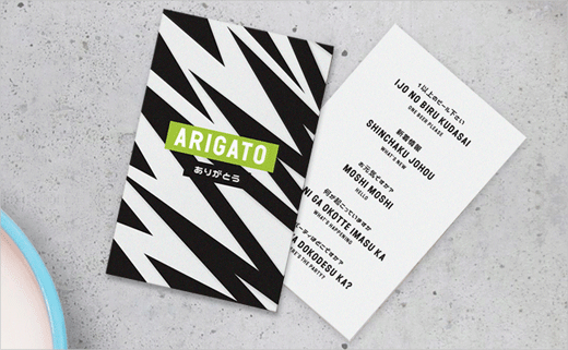
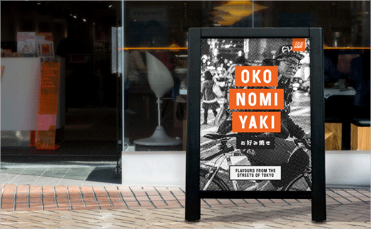
As well as new menus featuring authentic Kanji script, & SMITH created the launch campaign, A-boards, menu boards, interior graphics and window wraps as a part of the refresh. All of the illustrations were also created in-house.
The new design was rolled out across all 70+ sites in the UK over the last two weeks and is about to launch on all sites in the US later in the month.
& SMITH
www.andsmithdesign.com


