ŠKODA Rolls Out New Logo and Typeface
In keeping with its corporate design as revised in 2011, Czech carmaker ŠKODA is changing existing model lines over to its new logo. The first model to feature the revised logo has been the new ŠKODA Citigo. The ŠKODA Rapid compact saloon, introduced in autumn of 2012, also bears the new logo. The Fabia and Roomster will now become the third and fourth ŠKODA models to receive the new logo.
The logo appears in several locations both on the outside and inside the cars: on the bonnet, for instance, at the rear, on the wheels’ central covers and or on the wheel trims, respectively, on the steering wheel, the engine covering and on the vehicle key.
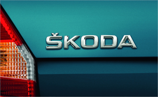
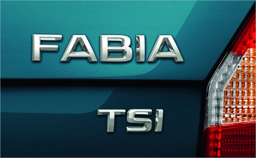
Another visual change for the ŠKODA Fabia and ŠKODA Roomster is the new typeface for the model designation on the boot cover. Engine and additional designations such as TSI, TDI, “GreenLine” or “vRS” will also take the new typeface. In addition, the Fabia and the Roomster will henceforth spot the ŠKODA lettering at the rear, a first for these models.
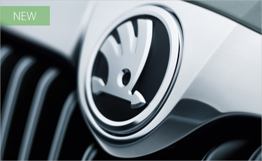
The most important change, however, affects the main part of the logo, the winged arrow, which in the new design (pictured at the top of the article) is much larger and more visible. The hue of the winged arrow has been changed from “natural green” to a more lush “ŠKODA Green”.
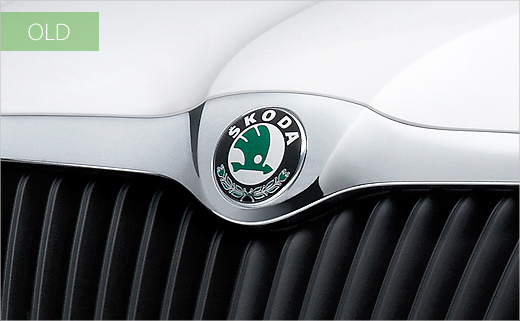
Compared to the existing logo, the new winged arrow in chrome and black aims to appear fresher and more modern than the outgoing design. The winged arrow is carefully contoured and stands out in chrome on a black-matte background framed by a chrome line. The current laurel wreath and integrated ŠKODA lettering will no longer be included in the new logo.
ŠKODA’s comprehensive revision of its corporate design underscores the brand’s entry into a new growth phase two years ago. By the year 2018, ŠKODA aims to raise its worldwide sales to at least 1.5 million per year. The new corporate design was first presented in public at the 2011 Geneva Auto Salon.
Source: ŠKODA


