Skincare Brand Erno Laszlo Reveals New Packaging Design by Free The Birds
Luxury skincare brand Erno Laszlo has launched a new brand identity and positioning, with design by creative agency Free The Birds.
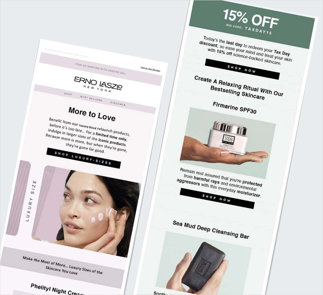
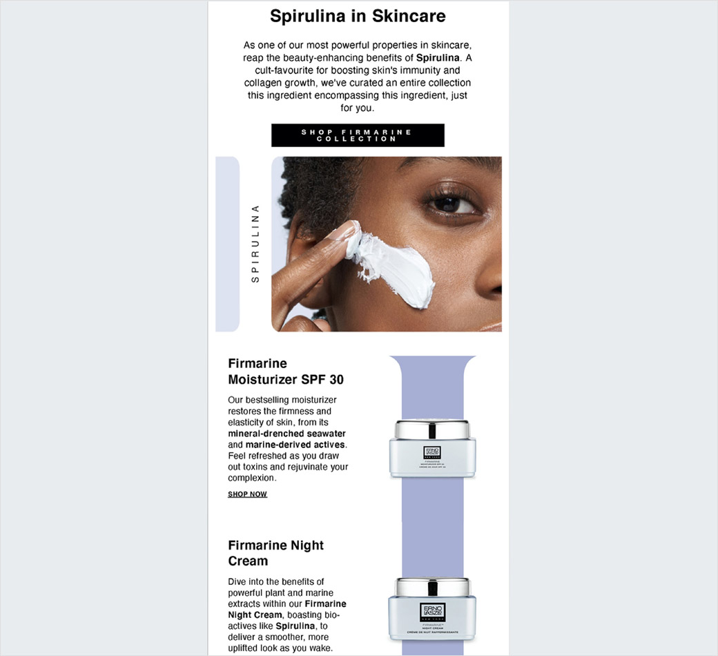
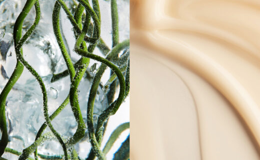
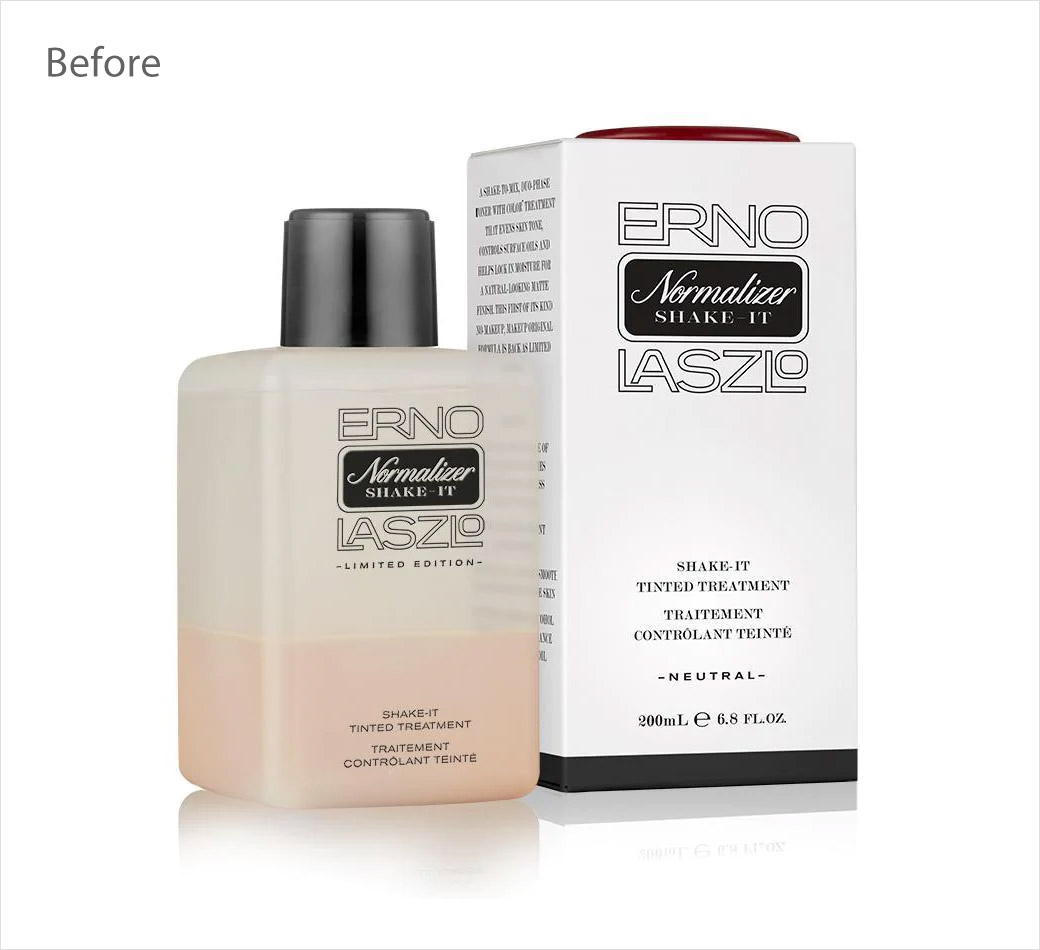
The new look encompasses visual and verbal identity, packaging design, and photography.
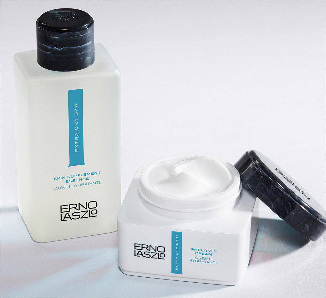
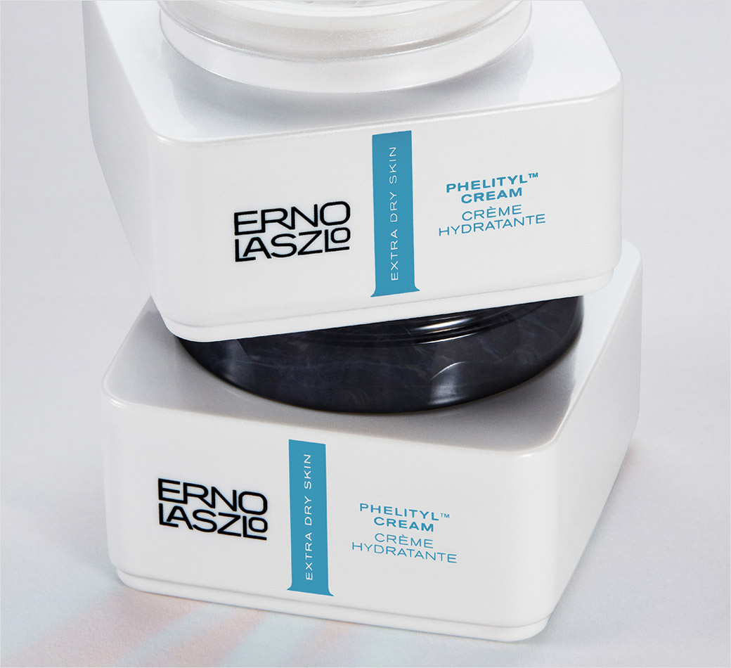
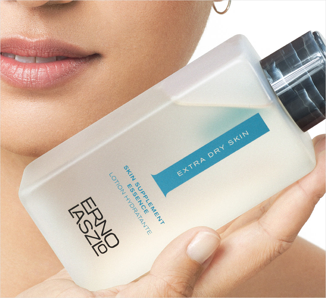
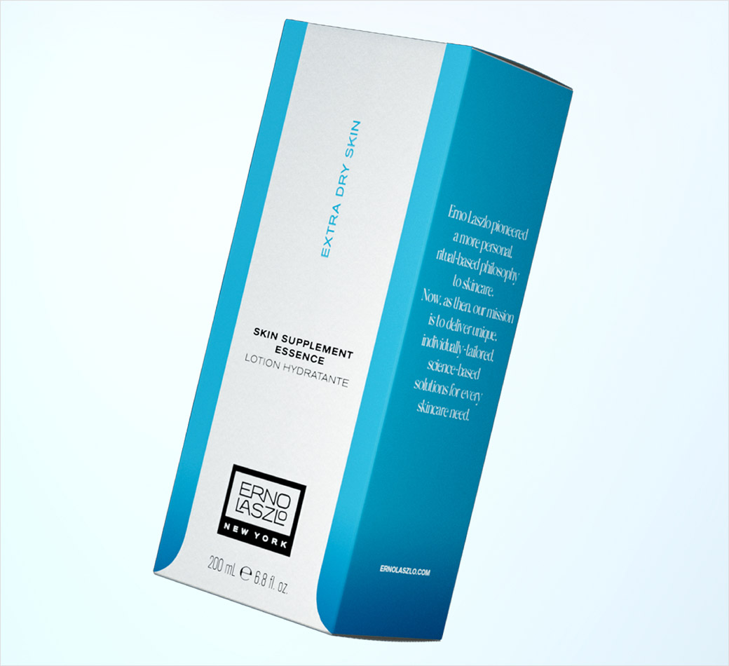
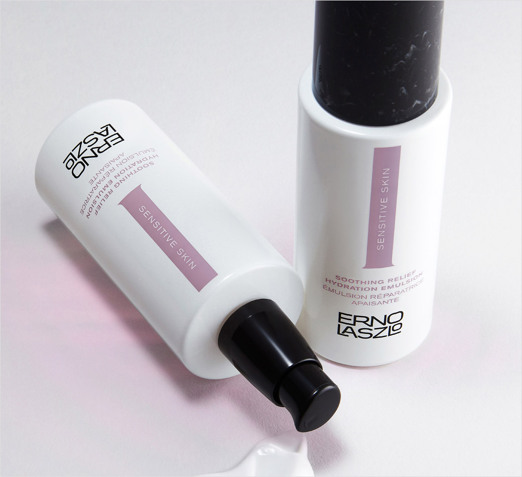
“The new brand architecture consists of a complete naming strategy of the core collections as well as a reinvigorated colour strategy that follows the skincare category semiotics for various skin types, for example, orange represents brightening and blue is linked to dry skin/hydration,” explains the design team at London-based Free The Birds.
Adding: “The new packaging brings synergy across the product ranges and a focus on specific skin needs while improving navigation within the brand’s online and offline environments.”
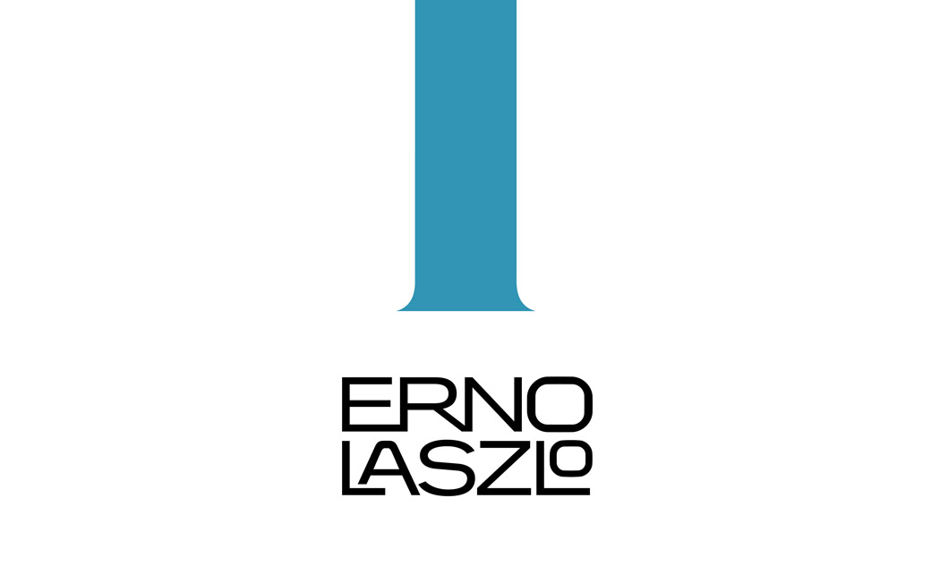
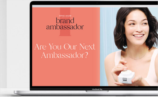
Additional elements include the introduction of a new brand device, namely an elongated letter “I”, which features on the foreground of the packaging “to reflect the brand’s focus on the ‘i’ndividual user and self-care.”
“As specialists within beauty, we understood the semiotics of the category instantly. It’s been a fascinating exercise applying these visual cues down to a luxury level, reinforcing the brand’s credentials in a way that appeals to new consumers,” says Nick Vaus, partner and creative director at Free the Birds.
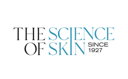
The cosmetics brand has a history dating back to 1927, having been founded in Hungary by Dr Erno Laszlo.
He would later take his skincare philosophy to America, winning over celebrity clients in the process, which included the likes of Marilyn Monroe, Jacqueline Kennedy Onassis, Greta Garbo, and Audrey Hepburn.

Free The Birds
www.freethebirds.com


