Simple Skincare Launches New Packaging with Design by Sunhouse
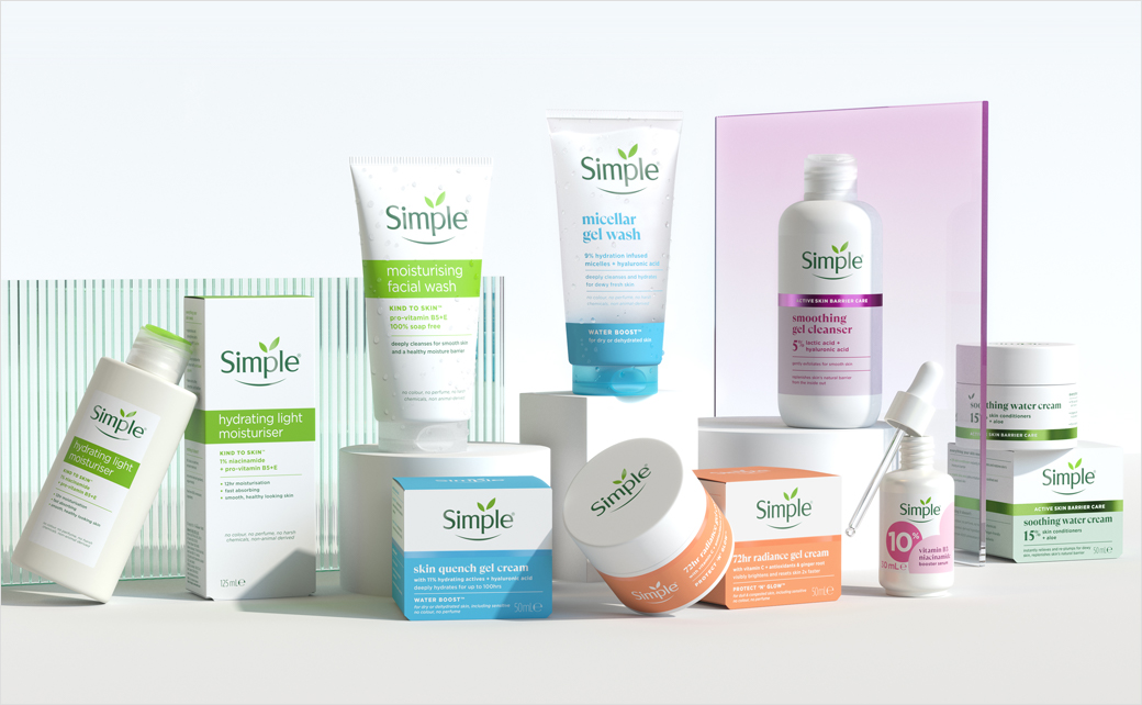
Design agency Sunhouse has collaborated with popular skincare brand Simple to revamp its visual identity and packaging.
The update is part of Simple’s recent improvements to its beauty formulas, which now include new ingredients like ceramides, hyaluronic acid, and cica to better align with consumer needs.
“Consumers are seeking more from their skincare – better results and from brands they know and trust,” says Sally Knapton, partner and executive director at Sunhouse.
Adding: “Our challenge was to evolve Simple in a way that both honoured its purposefully kinder approach and met the rising expectations of today’s skincare consumer. From a creative perspective, this meant unlocking the brand’s inherent simplicity as a strategic tool – using it to elevate Simple’s presence and effectively cut through the category noise.”
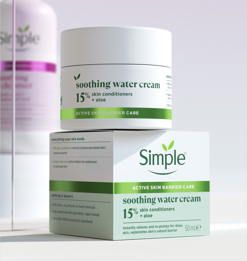
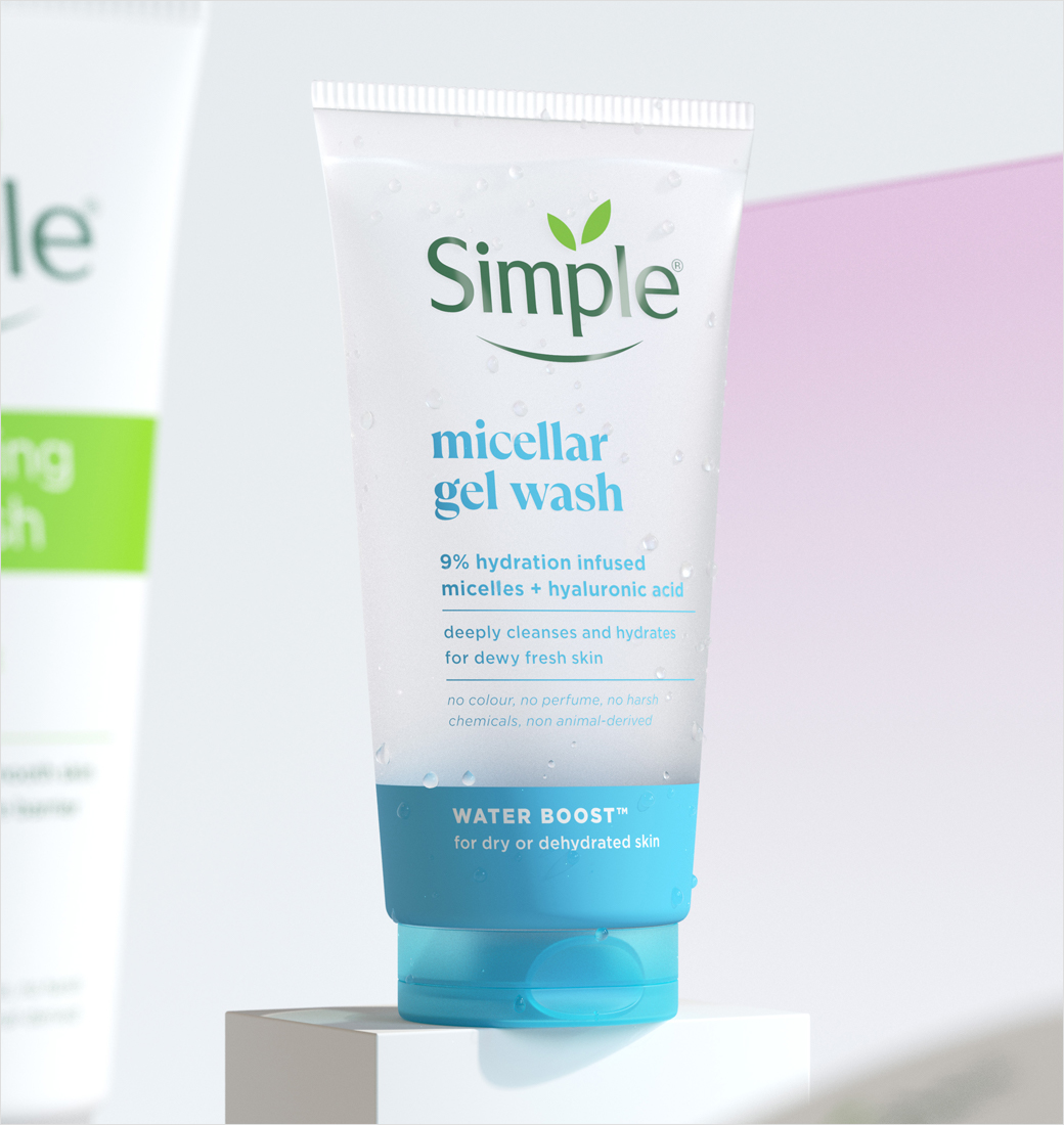
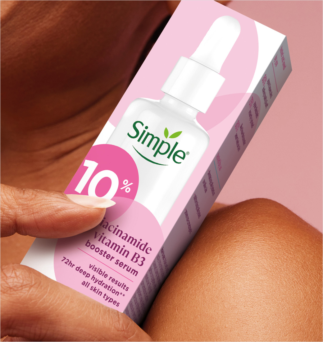
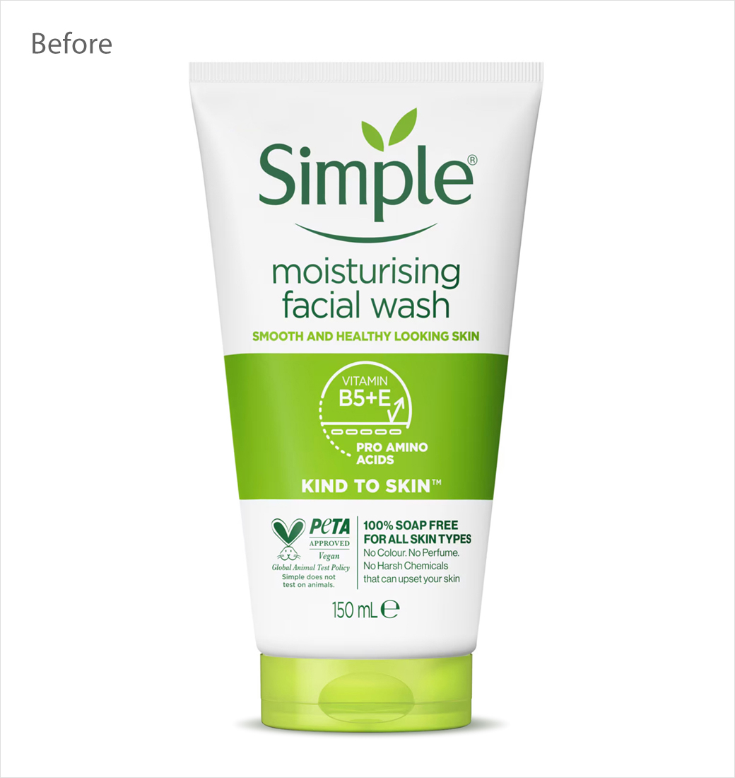
The new design features geometric shapes derived from the leaf in the logo, and the packaging has been simplified and sharpened through a mix of revised typography, colour selection, and finishes.
“Our goal was to recalibrate the brand’s assets and messaging in a more considered way, creating a framework that reduces complexity while highlighting Simple’s optimistic, open personality,” explains Chris Griffiths, creative director at Sunhouse.





Sunhouse
www.sunhouse-creative.com


