Silk Pearce Reveals New Logo for Independent Opera
Silk Pearce has designed a new website for Independent Opera (IO) to help promote the company’s programme of support for young artists in the field of opera, as well as their productions at the Lilian Baylis Studio at Sadler’s Wells, London.
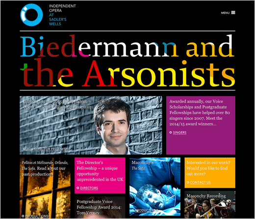
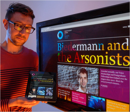
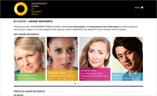
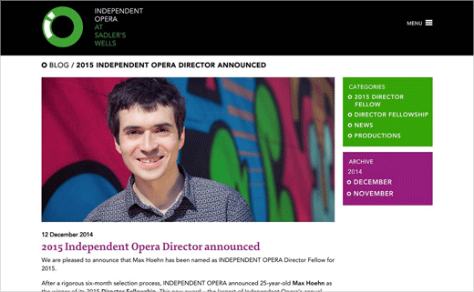
The IO site (www.independentopera.com) has been completely redesigned and restructured with larger imagery and more prominent navigation, and with a ’tile’ design used on its home page which the designers say encourages user engagement. The new site uses a responsive design for ease of viewing on tablets, smartphones and other devices.
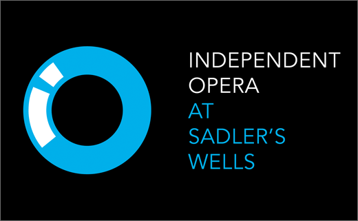
Silk Pearce has also refreshed IO’s visual identity to give the company’s printed and other online marketing materials a more integrated look. The new branding includes a new IO logo where the letters i and o have been combined into a single graphic device, new design style, typography and palette of corporate colours.
Independent Opera is celebrating its 10th anniversary this year.
Silk Pearce
www.silkpearce.com


