Sheraton Reveals New Logo Design
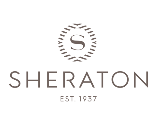
Sheraton Hotels & Resorts, Marriott International’s most global brand, has revealed a new logo that the U.S. company claims “pays homage to its past and depicts its vision for the future”.
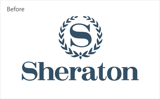
The updated design reimagines Sheraton’s famous laurel crest “as movement from the world and the energy of gathering, which point to the modernised Sheraton ‘S’ redrawn at the centre”.
The accompanying logotype, meanwhile, has been given an Art Deco-era style makeover and, in contrast to the old logo, it now also switches to all-caps.
“The logo’s evolution reflects the renewed energy and firm commitment we are making to our owners and guests to the resurgence of this iconic brand. More than a logo, this is a symbolic statement of Sheraton’s vision for our new guest experience,” explains Mara Hannula, vice president of global brand marketing for Marriott’s Classic Premium Brands. “This was the final piece of the redesign puzzle. This new logo offers a modernised look and feel to match the reimagined space while maintaining the powerful equity and recognition of the original logo.”
“There has been so much enthusiasm for the new direction of the brand and owners are excited about the change,” adds Indy Adenaw, vice president and global brand leader of Sheraton Hotels and Resorts.
Sheraton says guests will start to see the new logo design on collateral and websites starting in April.
Source: Marriott


