Sheraton Hotels & Resorts Reveals New Visual Identity
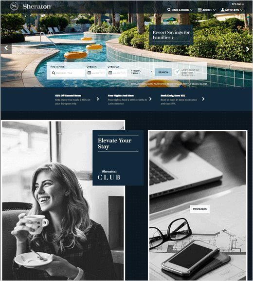
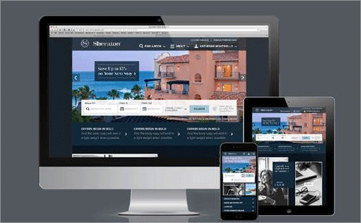
Sheraton Hotels & Resorts has revealed a first look at the brand’s all new visual identity with the re-launch of Sheraton.com.
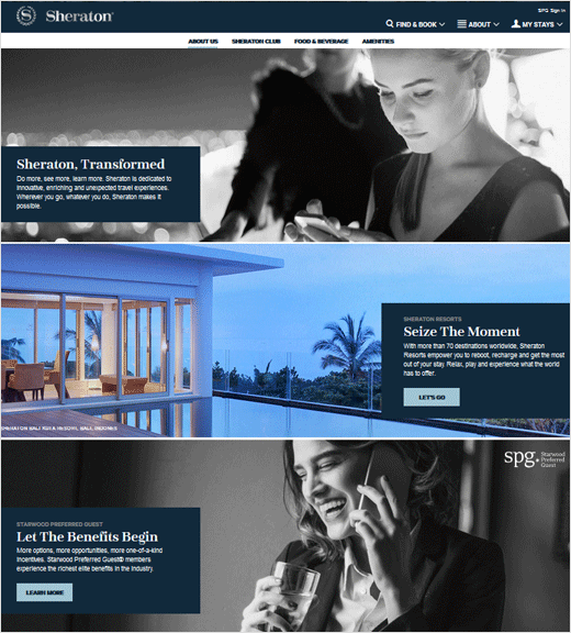
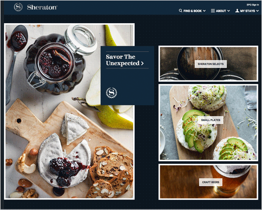
Said to be the first phase of a larger brand repositioning, the revamped website features an “enhanced” user interface design as well as a revised colour palette and new “aspirational” photography.
The redesign is the latest of several initiatives underway for Sheraton 2020, a 10-point plan to position Sheraton as the “premier global hotel brand of choice, everywhere”, according to parent company Starwood Hotels & Resorts.
Leading several design updates set to roll out, Sheraton.com features a refined brand logo, as well as crisp fonts which the designers say aim to underscore the “luxury and heritage” of Sheraton.
“Sheraton offers guests a high-end, contemporary experience at our hotels around the world, and it is important that our brand aesthetic have the same modern, sophisticated look and feel,” said global brand leader at Sheraton Hotels & Resorts, Dave Marr. “As we begin to roll out the new identity for Sheraton, we have first launched a redesigned website that features fresh, editorial-inspired content, more intuitive booking and search methods, and enhanced back-end technology to better engage consumers and drive revenue to our hotels globally.”
“Our goal for the new Sheraton visual identity was to reinforce the brand’s position as a leader and trusted voice in global travel,” added Mike Tiedy, senior vice president of global brand design and innovation at Starwood Hotels & Resorts. “The new aesthetic for Sheraton is more modern, approachable and engaging, designed to appeal to savvy guests and consumers around the world.”


Source: Sheraton


