ShareFile Modernises Brand, Unveils New Logo Design
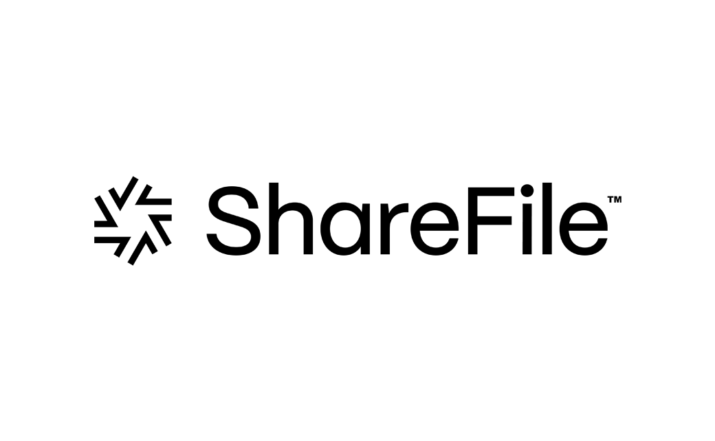
File storage company, ShareFile, has revealed a new logo as part of a brand identity refresh.
The new look comes on the heels of recent product updates that company bosses say have been designed to address the needs of its customers.
“At the core of our renewed brand identity is ease. We wanted to capture that feeling of checking off all the boxes from start to finish – without any roadblocks. Our new logomark, for example, brings this feeling to life by using the iconic check mark, a sign of accomplishment,” said a spokesperson for the North Carolina-headquartered firm, which forms part of the Cloud Software Group.
“We’ve dedicated ourselves to enhancing functionality, optimizing workflow efficiencies, and fostering collaboration for our customers navigating new challenges. We’ve received excellent feedback, especially regarding how these efforts have improved the client experience,” added Kurt Heusner, general manager and senior vice president of ShareFile.
Further commenting: “This rebrand is a testament to the enthusiasm for where we’re taking the business unit and the passion that defines our work.”
Founded in 2005, ShareFile is a competitor for the likes of Box and Dropbox.

Source: ShareFile


