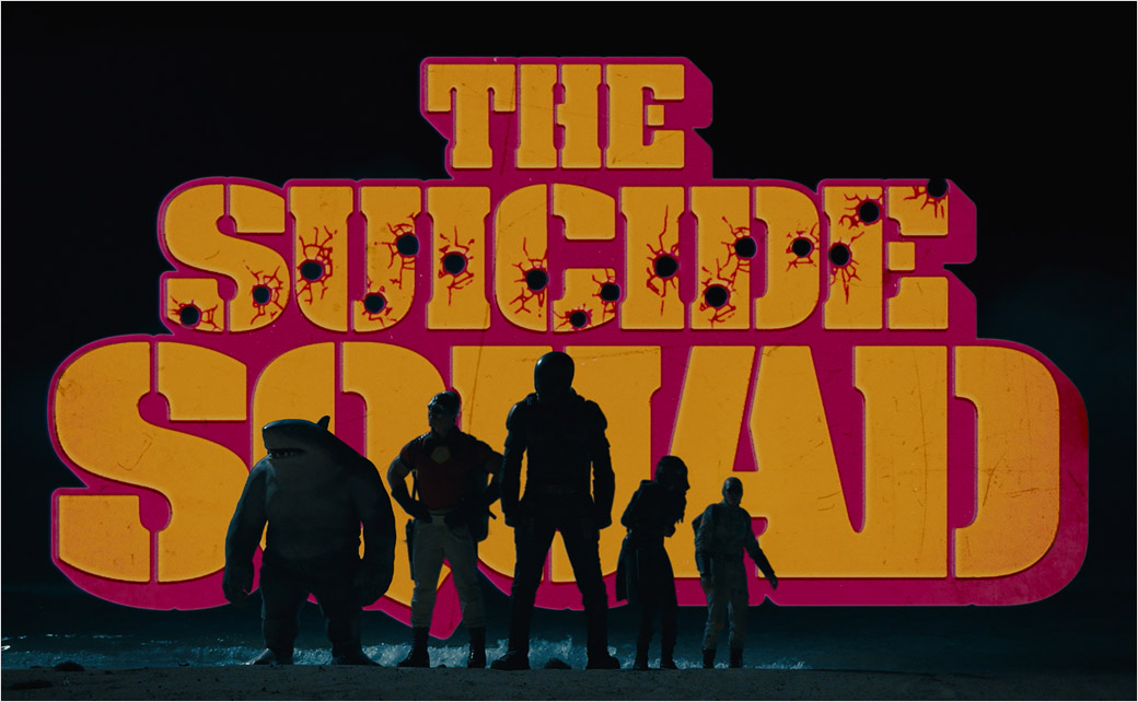
Sarofsky Designs Film Titles for ‘The Suicide Squad’
With “The Suicide Squad,” writer/director James Gunn and Warner Bros. Pictures have received positive reviews from critics for creating what some are now even calling the best DC Universe film of all time.
For the creatives and producers from media production company Sarofsky – who were tasked with creating the main title sequence, studio logo sequence, subtitles, and end crawl design – it was their third James Gunn superhero action adventure, following “Guardians of the Galaxy” and “Guardians of the Galaxy Vol. 2”.
To set the wheels in motion, together with film editor Fred Raskin ACE (“Once Upon a Time… in Hollywood,” “Guardians of the Galaxy,” “Guardians of the Galaxy Vol. 2,” “The Hateful Eight”), Gunn invited executive creative director Erin Sarofsky and creative director Duarte Elvas to screen a cut and discuss the mission.
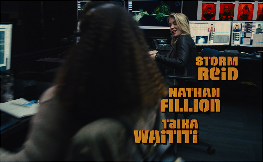
“Our discussion focused on creating titles that were bold, colourful, and worked with the dynamic underlying footage,” Sarofsky says. “We talked about a modern/vintage vibe… something that is very current but also has a nostalgic sensibility.”
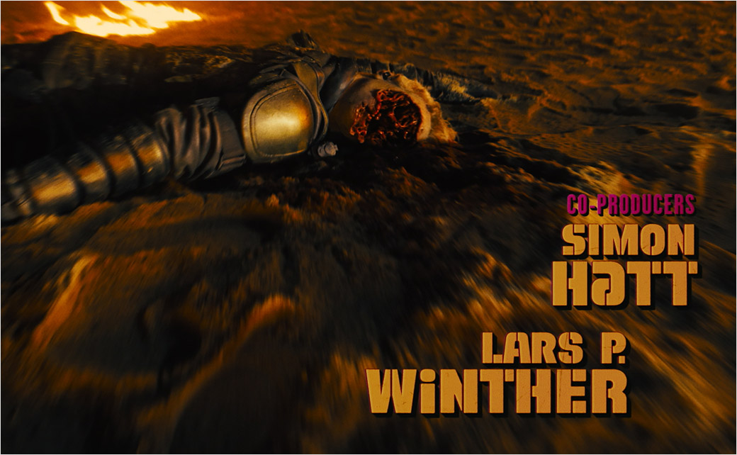
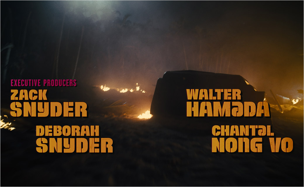
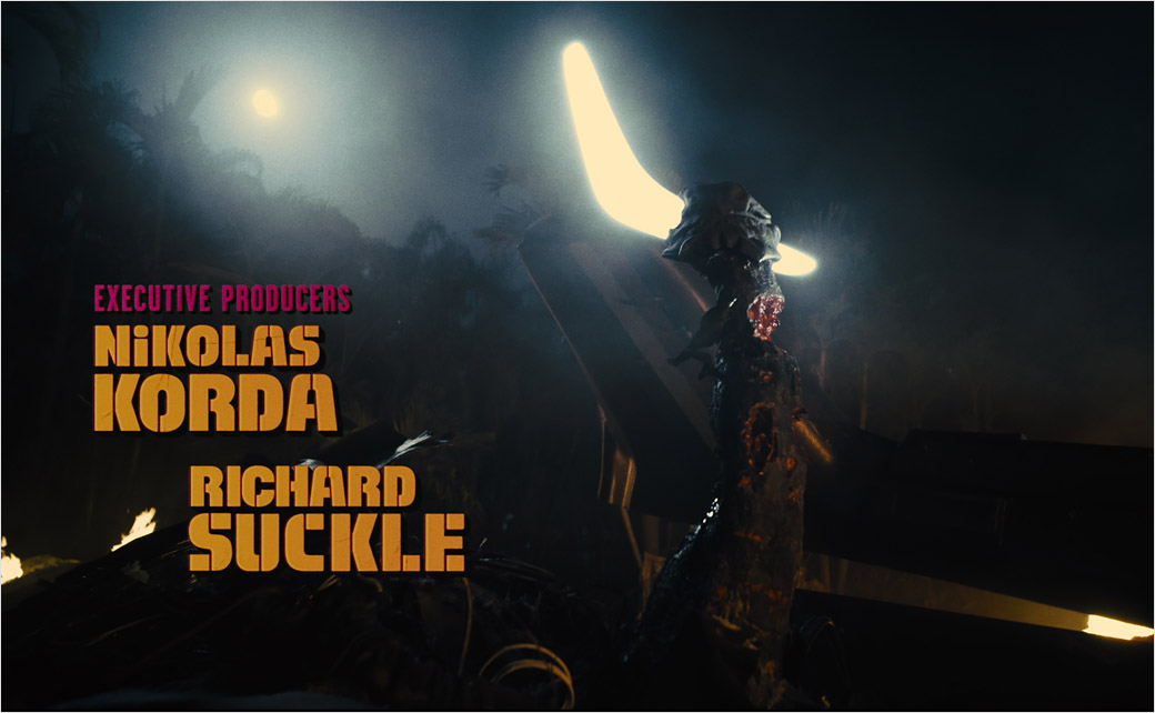
“James was clearly looking for treatments that were evocative of 1960s caper war films,” Elvas adds. “So, we looked at titling made for films like ‘The Dirty Dozen,’ ‘The Great Escape,’ and ‘The Guns of Navarone,’ and this really informed our exploration.”
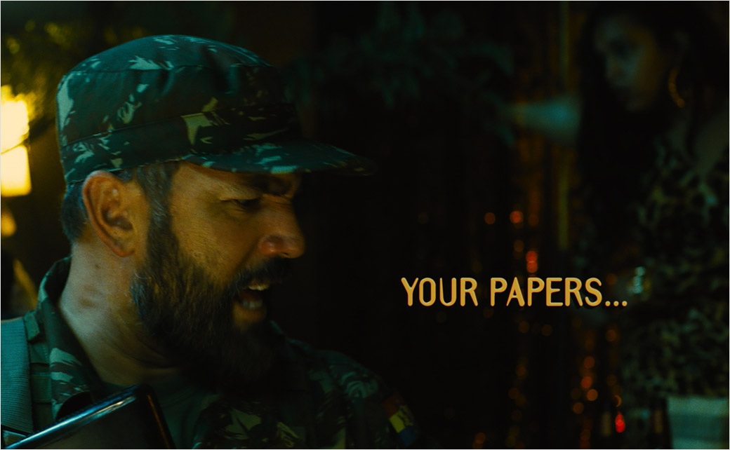
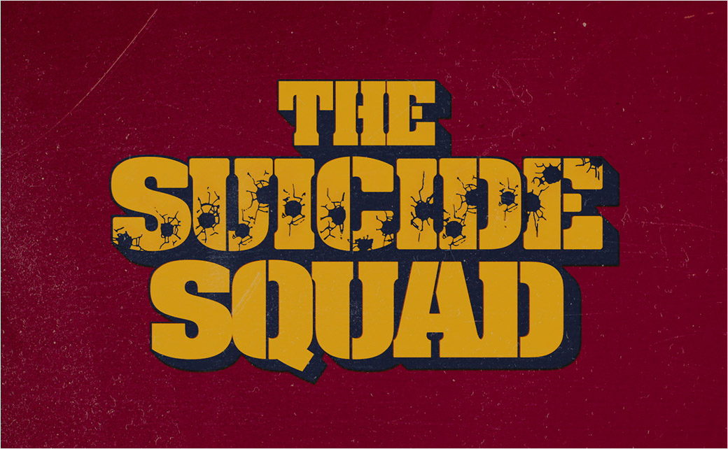
According to Sarofsky, Gunn likes to incorporate design into his films as another character – which is why typography has become a key element in their collaborations. This time around, to match the existing logo for The Suicide Squad while also embracing the period war movie vibe, the designers say they dove deep into 1960s films, printed ads, album covers, and, of course, vintage fonts.
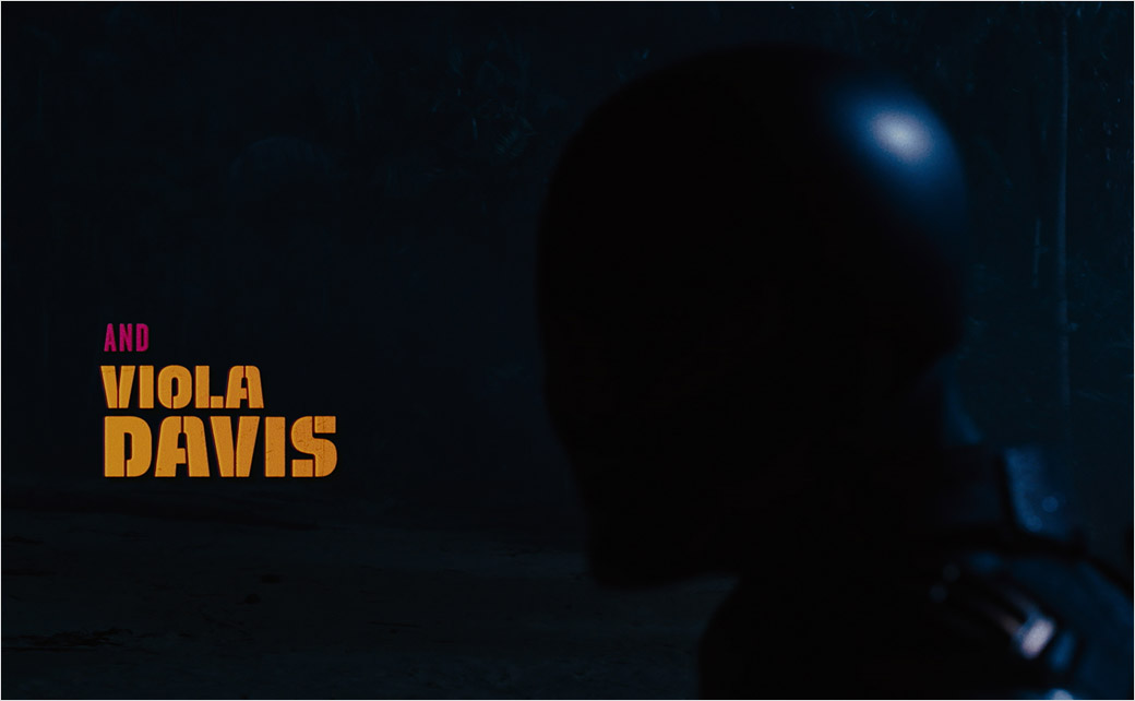
“For this job, the best tool we had was our years of typography expertise and our ability to problem solve legibility on a busy background in an intentional way,” Sarofsky explains. “After a few rounds of exploration with the filmmakers, we landed on Alpha Midnight, a 1969 typeface designed by Hiroshi Yamashita, for inspiration. We ultimately modified it so heavily, it could be its own unique font.”
Adding: “Addressing the challenge of creating many different elements for the film, it was really important to us to make sure that all the executions related to each other, while also working well for where they were in the film.”
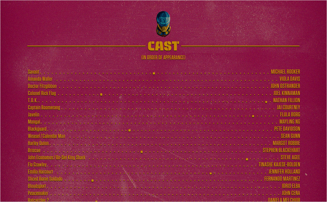
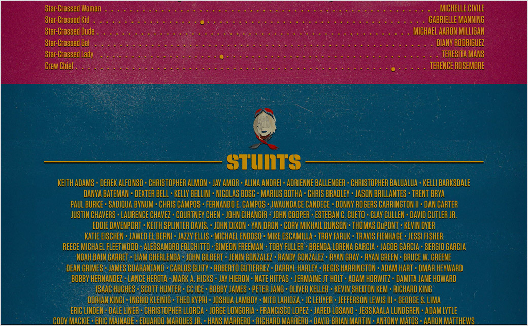
With type set in their custom version of Alpha Midnight for each moment of the main title, for each scene requiring a subtitle, and for the end crawl, Sarofsky’s makers then carried out further tweaks in an effort to tie into 1960s-era war pictures, visually.
“The steps we took to make the titles appear as though optically printed on actual film were key to making this look like a 1960s film,” Elvas says. “To get them looking just right, each graphic took at least a dozen Adobe After Effects layers, including textures, grain, glows, bevels, and drop shadows. There is also a very subtle gate weave to all the graphics that further emulates the film effect.”
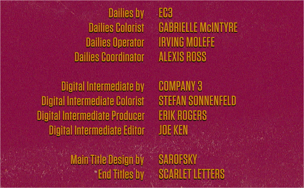
With Adobe Illustrator used for type design and setting, After Effects served the team for look development, layouts, and animation. Sarofsky’s approved end-crawl designs were then provided to California-based Scarlet Letters, which set the typography and animated the scroll.
Sarofsky
www.sarofsky.com


