Rolls-Royce Unveils New Identity Design
World-famous luxury car brand Rolls-Royce has today unveiled a new brand identity with design by Pentagram.
The British brand says it appointed Marina Willer, partner at Pentagram, to create a new look that would appeal to a younger demographic, particularly as the marque’s clients have decreased to an average age of just 43 in recent times.
Pentagram subsequently embarked upon a “deep exploration” of Rolls-Royce, including spending time at the car manufacturer’s headquarters at Goodwood in West Sussex.
“What soon became apparent is that Rolls-Royce has evolved from being regarded as an automotive manufacturer into a leading light in the world of luxury. It was essential for us to ensure that the brand’s new identity reflected this shift. We needed to present Rolls-Royce in a forward-facing, fresh and relevant way – speaking to new audiences while respecting the company’s loyal clients,” explains Willer. “I do not come from an automotive background. This vantage point provided me with the opportunity to observe Rolls-Royce as a manufacturer of luxury products. My ambition was to celebrate the luxuriousness of the brand while providing it with the means to visually communicate with Rolls-Royce’s younger, increasingly diversified audiences.”
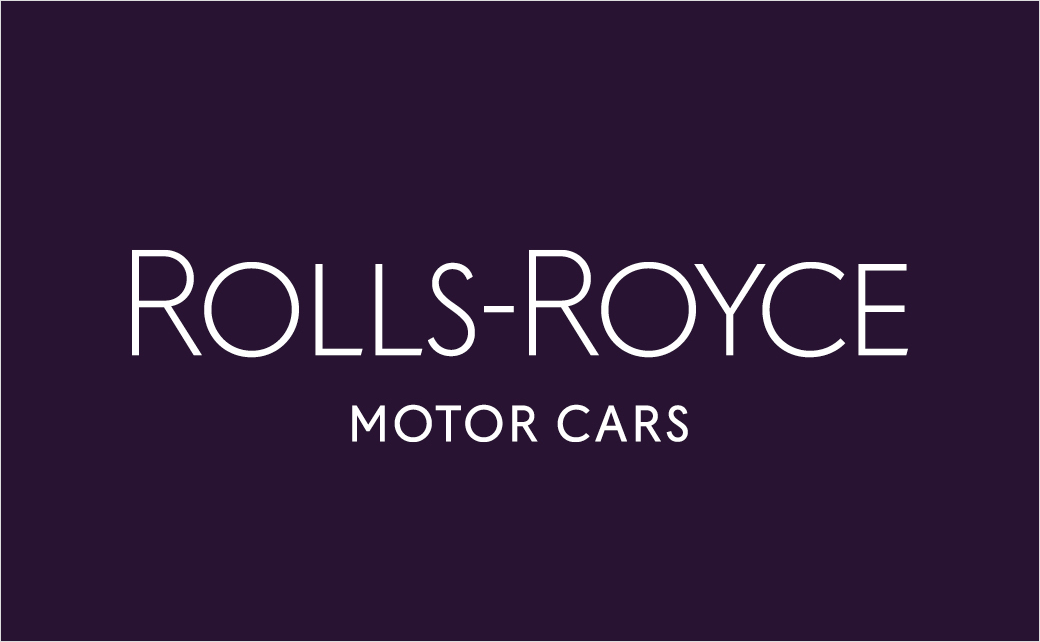
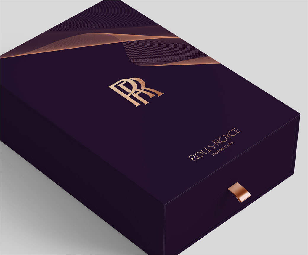
While the double ‘R’ monogram, representing Charles Rolls and Henry Royce, the marque’s founding fathers, remains unchanged, the wordmark ‘Rolls-Royce Motor Cars’ was found to be too corporate and has therefore been updated.
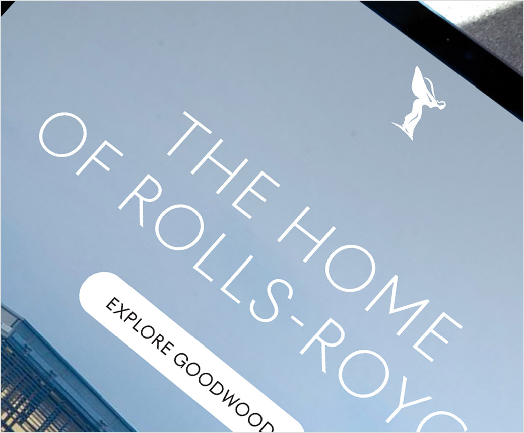
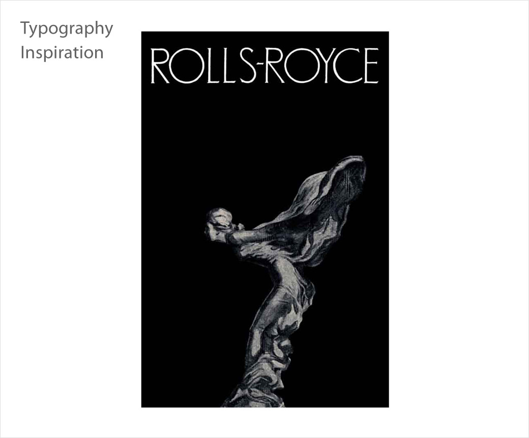
Pentagram’s design team is said to have uncovered typography in the marque’s archives from the 1930’s and used an art-deco style as the basis from which to create the new wordmark. The words ‘Motor Cars’ have also reduced in size, with the emphasis reverting to Rolls-Royce.
“The Wordmark has become more refined in its appearance, depicting the quiet, whispering power of contemporary Rolls-Royce. Special significance has been paid to the letter ‘R’, to provide additional stability and prominence to this important character in the Rolls-Royce script,” says the design team at Pentagram.
The chosen typeface, Riviera Nights, stems from the same family as Gil Sans Alt, the marque’s previous font, but with additionally crafted and bevelled letters.
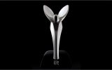
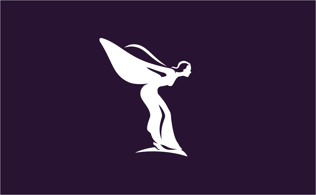
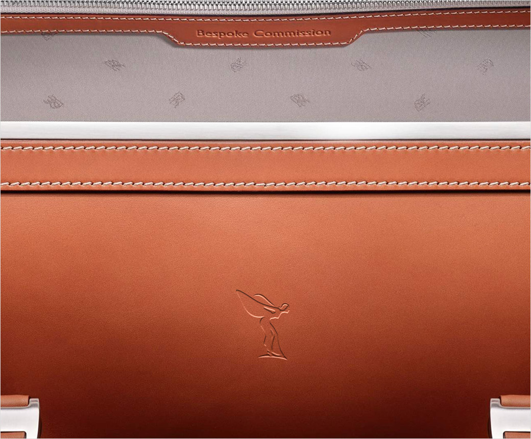
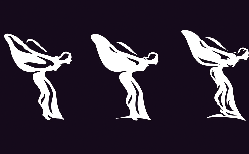
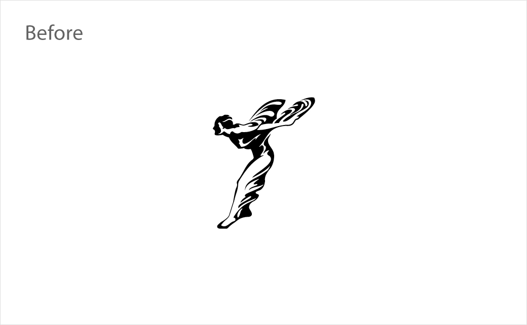
Like the wordmark, the “Spirit of Ecstasy” bonnet ornament has also been given a wholly new visual treatment as part of the identity refresh.
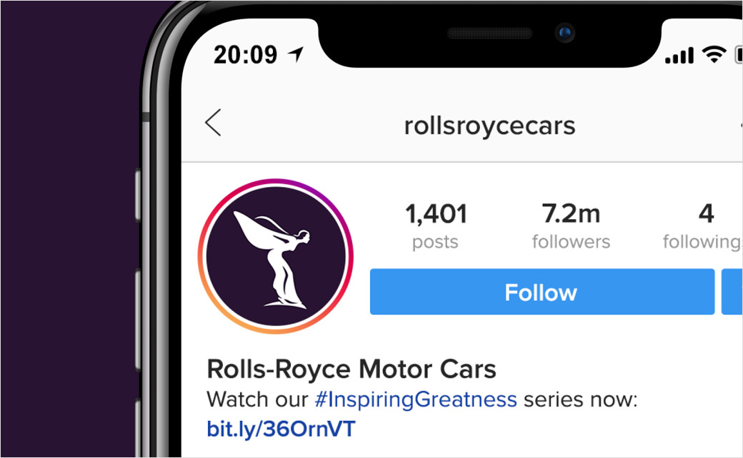
Having graced the prow of Rolls-Royce motor cars since 1911, the famous symbol – originally drawn and sculpted by British artist Charles Sykes – has evolved into the form of a streamlined mark, which Pentagram commissioned illustrator Chris Mitchell to create. In two-dimensional form, the figurine now flips direction from left to right, “boldly facing the future, reflective of the marque itself”.
“The use of the Spirit of Ecstasy marks a shift in the resonance of the brand – from an automotive to a lifestyle context. She commands an aspirational quality in the luxury sphere and by placing her at the centre of the visual language. The Spirit of Ecstasy can now be interpreted as the muse for the marque, in addition to the motor cars themselves,” explains Willer.
In terms of selecting a colour palette for the new identity, Pentagram’s design team initially turned its attention to the company’s products.
“Rich in textural materiality, wooden brown hues and graphite coloured technical fibres complemented a colourful array of Rolls-Royce leathers. Although true to their artisanal origins, brown and slate palettes confined the identity to the past. The desire was to seek a more expressive, luxurious colour palette, one appealing to both male and female clients, one with a future vision,” say the designers, who eventually settled on purple.
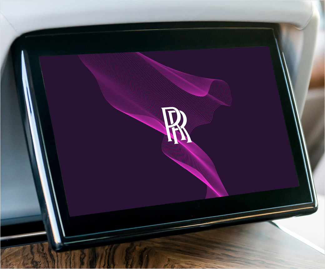
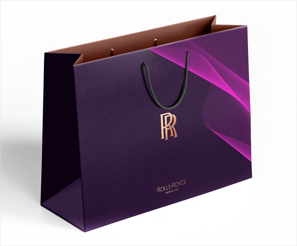
“Historically rare in nature and with roots in mythology, art, piety and royalty, purple has always signified wealth and power. In a nod to the Spirit of Ecstasy, a colour named Purple Spirit will pave the way for the future of luxury by becoming Rolls-Royce’s signature colour,” they add.
“Purple Spirit has a deep and powerful tone. It is a colour of modernity that evokes connotations of the dark and majestic night. It has an energy that conjures emotion with thoughts of strength and ambition – a tone well suited to inspiring greatness. This will be complemented by a foiled rose gold which will add elegance and grace to the marque’s printed materials,” further comments Sami Coultas, a bespoke colour and trim designer at Rolls-Royce.
“As the marque’s digital presence increases, there has never been a more important time for the visual language of the company to reflect our standing as the leading luxury brand in the world. We have embarked on a fascinating journey of modernising our brand identity to echo those changes seen in our portfolio, our client demographic, their lifestyle and the luxury world that surrounds them,” says the company’s chief executive, Torsten Müller-Ötvös.
Rolls-Royce’s new identity will officially start to roll-out from September.
Source: Rolls-Royce


